After discussing ideas and concepts with peers I have finally decided what my campaign is going to be. Through all of my ideas I have wanted to focus on the idea of personality within my campaign. This is the main element within my site and so think it is only fitting that I incorporate it with my print based media also. From this I have merged this idea with my previous idea of questions. The idea being the slogan of the campaign 'What's Your Coffee Saying About You'. I think this plays on the idea of something being said about you personally and so feel it creates intrigue to the viewer, without coming across as negative. I want to apply this slogan across all media so there is consistency across the campaign. I want to make the campaign more like a teaser. I want to explore the idea of using the content with my site without too much explanatory information into what this is. I think this adds to the idea that something is being said about you and so you want to find out what it is (hopefully making them go on the website). I am thinking of using the quotes as well as the key personality traits that are discussed on my website and using these as the content on my campaign. People will not know what they are describing until they go on the site, creation further intrigue.
I have decided to make my campaign on media that it found in coffee stores. I am going to use coffee sleeves, coffee cups, coasters and napkins for my campaign. I am going to also think about some sort of poster to include in coffee stores that may give a slightly more information to the viewer. After research into it, I am going to bare augmented design in mind for all of my designs, thinking about where it is the most suitable to apply something more.
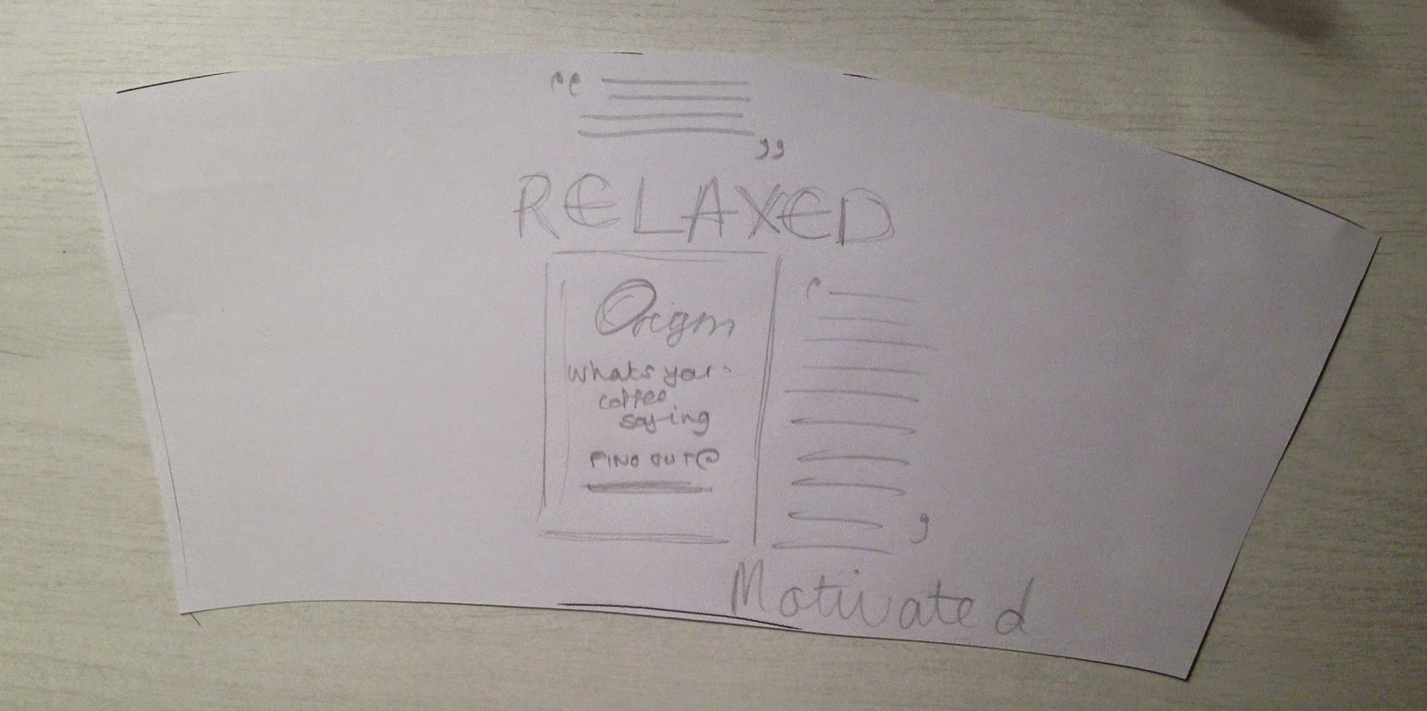
I have begun by designing the coffee sleeve for my campaign, as I knew I wanted something simple and to the point for such a small media. I am thinking of only having the logo for my website with also the slogan on the sleeve. This is due to having something that will create enticement. Viewers will not know what 'Origin' is, hopefully seeing this will make them want to find out what it is about. Combined together with the coffee cup I am going to produce, will hopefully create enough intrigue to get the public using the site.
I have started by measuring out a coffee sleeve mock-up to work out the measurements needed for digital design.
I have then used the measurements from my mock-up to work out how to make the correct size to fit on coffee cups. As I knew I only wanted a simple design I decided instead to play about with colour. I am sticking to the same typefaces and colour scheme used on my website. I think this will create a clear link to site and promotional material:
Using the same colour scheme I began applying different variations that I could possibly use. I am unsure how I am designing my coffee cup yet, but know I need something that will contrast against whatever design I do. I am thinking about using the purple but will wait until designs have finished for the cup before I make my final decision.
I have now decided to apply a QR code to the back of my coffee sleeve. This is to add a small element of interactive, although this is not my main form of it.
I have had great difficulty in developing this as when applying the QR code straight, once cut and made into the angle needed, the code does not sit straight but at a angle instead. I could not work out why or how it was doing this but played around with the angles to work out how I needed to position this digitally:
I attempted a number of different angles but could not get the code to sit straight:
Finally after a number of attempts I managed to realise my mistake. I needed to align the code up with the angles along the top and bottom of the sleeve. I had previously been aligning it to to end of the sleeve and this is why I had such a problem. I am now going to move on to designing my coffee cup and if need be refine the sleeve accordingly:

As the brief asks for the finals to be printed out I needed to figure out a way how I was going to get my design onto a coffee cup. I knew I would not be able to get a professional printers to do it due to time frame and cost, nor would I be able to screen print due to Christmas holidays. Because of this I peeled of the design off a Costa cup and realised there designs are stuck on to create a heat barrier instead of coffee sleeves. Although I am not going to use this method I could however use the same template and use this to stick on already existing coffee cups to show as an example for the module hand-in. I am going to look into how they would be printed properly professionally, but think gluing the designs will showcase my work well as an example:


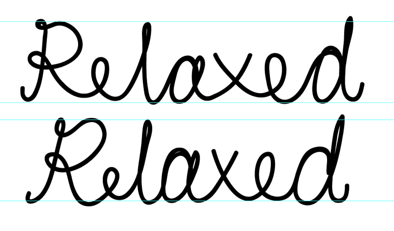
Through my research into coffee cups I knew the type of design I was trying to achieve. I wanted something that would showcase my content in a personalised/human form. I knew I wanted to this with typography as I thought this will be the most appropriate way to show this. I thought about showing this through hand-written type, to show a more humanised/personal feel. I tried to write my own digitally, however this did not work:
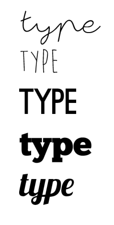
Seen as though I could not write the type digitally, I decided to look into using already existing typefaces that would showcase the idea of a more personalised\handwritten feel to it. I decided to use from a selection shown below although I did not use some of the more structured ones, as they did not covey my concept well.

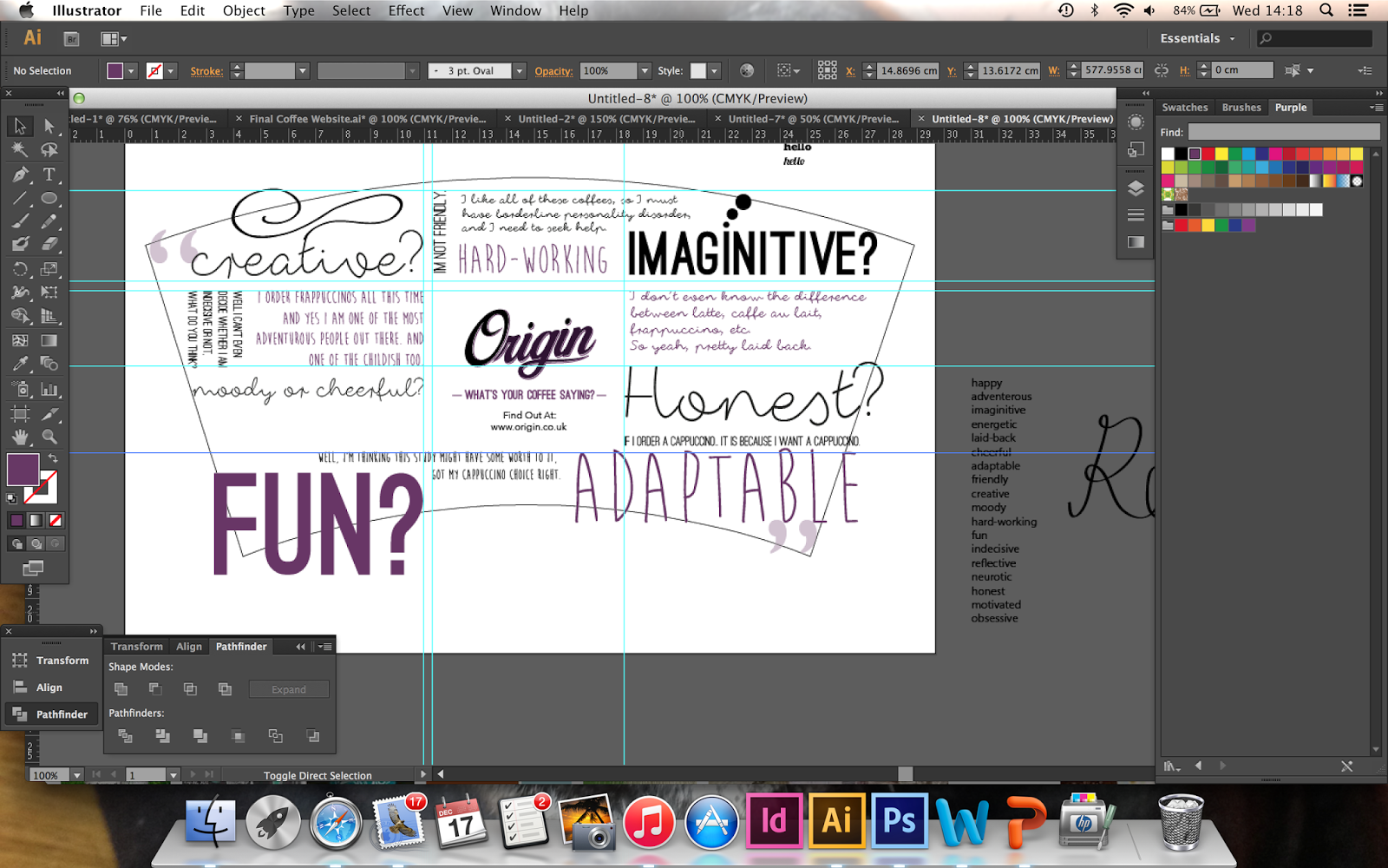
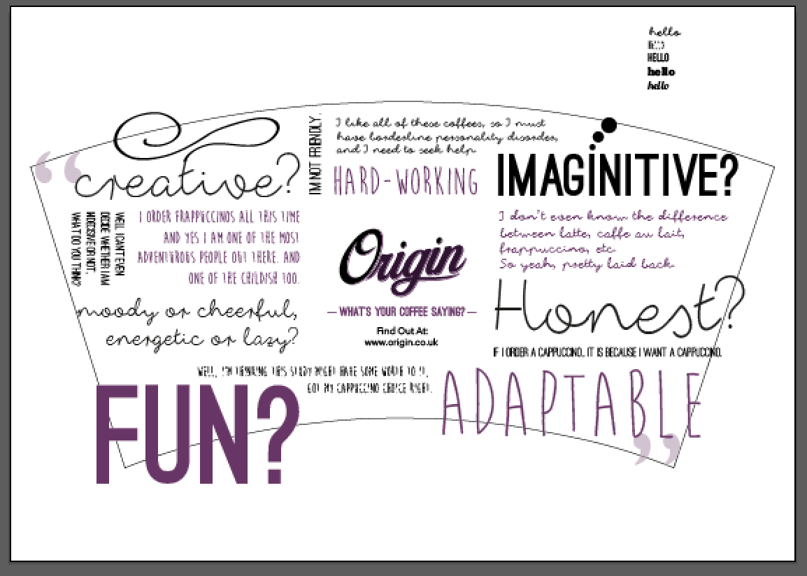
I then begun development on my cup design. The idea behind the design is to show the different quotes through different sets of typography, showing the diversity in personalities through the humanised type. Although it looks chaotic here, once placed into a cup form, think the spacing will come through. I wanted something slightly more overwhelming though to show the vast amounts of different opinions on the website. The idea behind showing the different quotes, is to get viewers reading the cup unsure of what they are about, hopefully intriguing them to go online and find out. I am also going to include a promotion within this element, if viewers go online and upload their thoughts, they can be in with a chance for their quotes to be featured on the cups. Again this will hopefully create an incentive to use and interact with my website.


I have included small detailing on certain words to play on this idea of personality. For example, the stem of the 't' comes out to expand into the detailing swirl to show the fun of creativity. I think this adds slightly more interest to the words and gives more 'personality' to the cup:
I have then tried the cup in the different colours but feel in doing so makes the type look illegible. I am going to keep with the white background as it makes everything more clear and concise.
I have mocked up my design onto a coffee cup. This was get an idea whether the design was working or not. I think small changes need to be made such as removing quote marks and creating more space between each of the different fonts. I have tried on the coffee sleeve and think the purple is well suited to the white cup. I am going to wait until I have purchased the coffee cups and scale the design on the cup accordingly. I then start to include larger margins between the type so it does not as overcrowded:
I also need to think about bleed. I need to remove any bleed on the cup so my final outcome has breathing space and does not look overlapped like this example:
I have now began development on my napkin design. I was unsure whether to continue to theme of having quite a lot of content on the napkin (the same as my cup) or have single words. The single words would be in keeping with the same idea of the teaser campaign. There would be a personality word or quote, and again viewers will not know what it is about.
I have tried applying the different texts but felt it did not work as well as it did when on the cup. From then on I tried single words to see if that worked better:
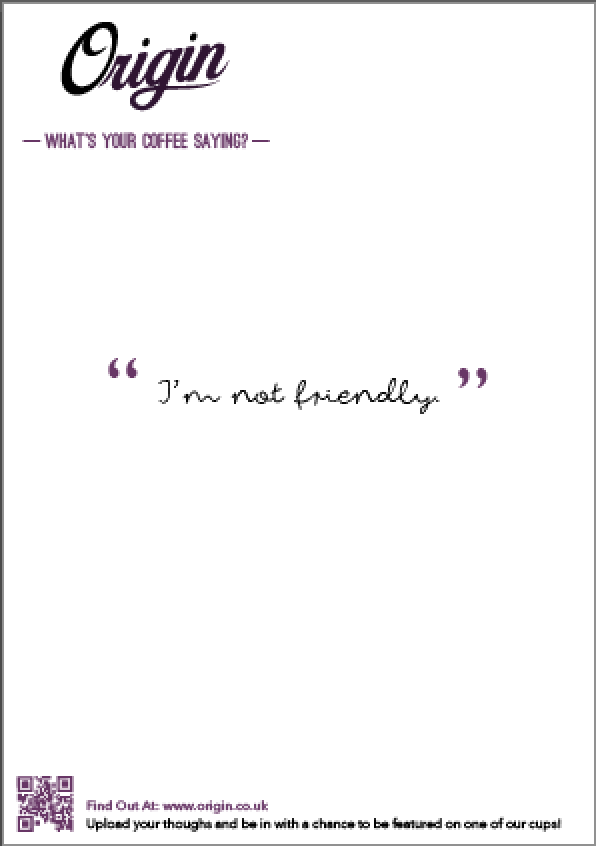
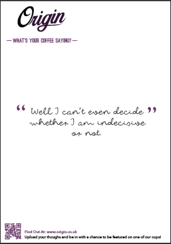
I much preferred the idea of having a single quote from the website. I thought this would add to the idea of this being a 'teaser' campaign much more effectively. I think this will get people asking questions about the site, making them want to explore further. As I have now decided on my content I am now going to play about with different layouts for the napkin:
I have added the website link to the napkin so it makes the website more accessible to viewers and they know exactly what to look on. I have played around with central alignment (in keeping with my original website layout) however feel it does not have an effective hierarchy:
I have reduced the size of the logo, while also removing the drop shadow (below, right). I think this makes the logo much clearer and because of this have now decided to remove the drop shadows from all logos, as on smaller medias it is not as clear as it is without. I have increased the point size of the quote, making this the focal point of the napkin. I think this creates a much stronger hierarchy for the content:
I have then started practicing printing methods with my napkin. I have decided to experiment with my own printer at home to get an idea of what this could look like. However it took me a while to understand where to place the document in order for it to print solely on the napkin. I have secured the napkin to a sheet of printer paper so the printer could take it through. However due to the alignment of the document it printed half on the napkin, half on the paper. I now know how to rectify this and will practice again.
I noticed how the ink was bleeding on the napkin and also creating other ink marks that are not supposed to be there. I asked a family friend who works in printing how I could avoid this problem, he explained because I did not have the setting on the printer for this type of material, the printer was not slowing down enough for the ink to be fixed properly. He suggested to maybe get the napkins professional printed as I was as risk of damaging my printer. I am going to look into this as I would like to have the napkin correctly printed for the module hand-in.
I also thought about how I could expand this design further. I feel the design is diverse enough to be transfer onto poster or flyer designs also. I feel they could work as 'teasers' just as the napkins do, except I would include a QR code for viewers to scan:


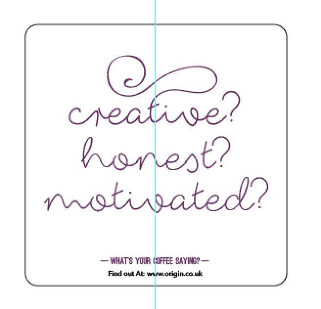
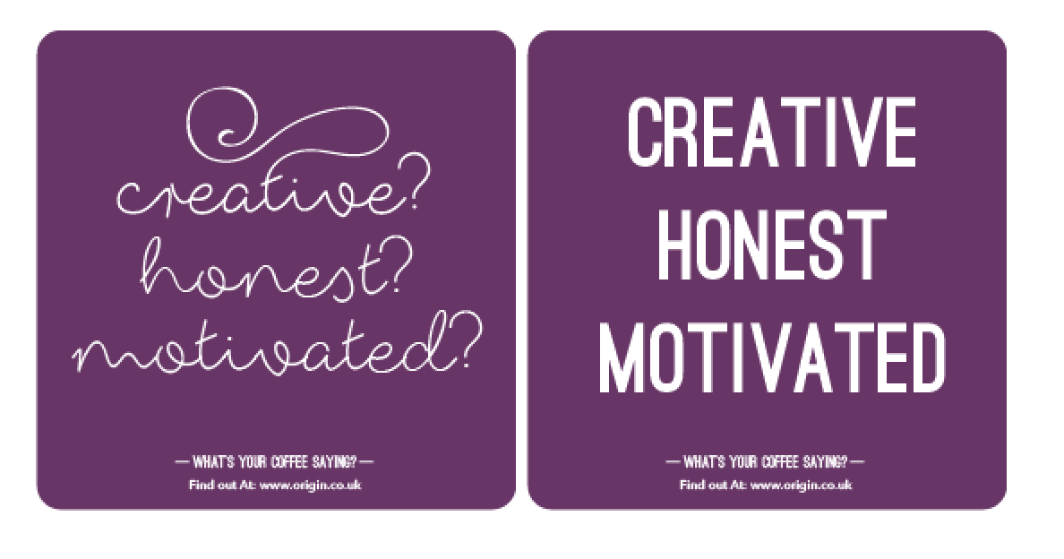
I have also thought about the idea of a coaster as a from of printed media. I have used the key personality traits as the content for these, as I thought this could be a interesting way to link all content of the website together but across a number of different medias. I have explored the idea used on my cup, of taking a word and using the type to expand into a sort of image (i.e. the use of the swirl on the stem of the T for creative) and tried to apply this to all coasters. I have sectioned the coasters into the six coffees I focused on within my site, each one describing a certain coffee. I think this adds variety in the coaster, perhaps making them a sort of collection that viewers will want to gather all six? I have also tried different types and colours that are within my chosen collections on fonts and colour palettes. However found the most appropriate to be white type on a purple background as I feel it shows more depth and intensity, perfect for showing personality. I have kept with the script typeface to show the idea of humanity further:


This is an example of what I mean by expanding the type into some sort of imagery. The word is here is 'reflective' and so the stem of the 'r' has been transformed into a question mark, illustrating the word further. I have done this with the one word on all coaster to show the continuity between all.
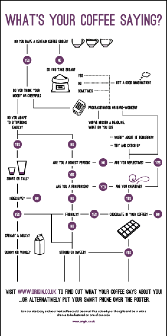
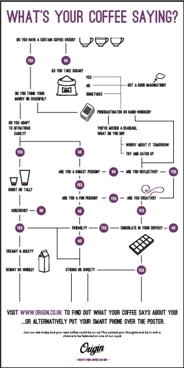
The main element in my augmented design campaign, was the idea of an interactive poster. The idea behind this was a flow chart asking viewers questions that would take them to what coffee they are, but instead of giving them the answer, they would have to go to the website to find out. They could either do this flow chart in person through the printed side, or scan the poster to be taken to a app that also does the question. Once the app had finished, this then too would take them to the website.
I started development, including info graphics to illustrate certain points in the chart and to make the whole aesthetic slightly more pleasing:
I had to work out the questions so they flowed in accordance to what the study said, once I did this I started girding everything up so there was structure to the poster:
Instead of giving the viewer the answer to the chart straight away, this below would be there instead, directing them to the website to find out. I think this adds to the idea of the campaign being a sort of teaser. As this will intrigue them into wanting to go and find out further. I also think being able to do the chart through the app as well as through print gives the viewer choices so whether they have an android phone or not, they can still interact with something.
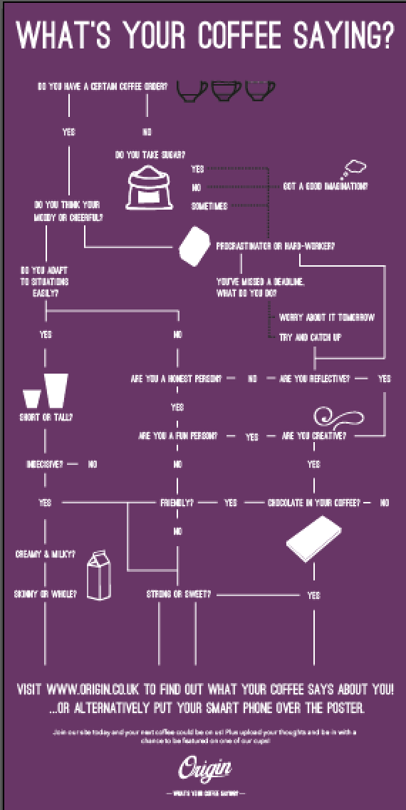
After I had worked out how the poster would work from question to question, I needed to think about colour. I tried inverting the colours but found as there was so much content is was not as clear on the purple background as it was so dark. Certain elements ended up illegible, because of this I am going to keep with the white background as it is much clearer:


I thought about how I would like my poster to look, due to the nature of a flow chart, I thought it could be quite interesting to have the poster a 2:1 ratio. However after looking back at my research I realised it would be more appropriate to make this into a magazine or newspaper advertisement. Through my research I found out more people who drink coffee are siting reading a magazine or newspaper, I feel in creating this into a advertisement rather than a poster will target my target audience more. I do however think it would work in either format but will ask peers opinions on which route to go down when we return after Christmas. I think the overall aesthetic though will engage viewers as it is interesting to look as without being overwhelming:

Here is the app that the viewer would download to scan the poster. I have kept the logo without the drop shadow as on such a small scale is it clearer to see without. I have used to purple applied to all on my products and used a gradient to keep it looking like an actual app. I have put this in context, shown on the menu screen on a iPhone below:
Here is an example of what the app could look, overtime I would develop this properly but this is showing a possible mockup of how it would work. The idea being the questions are the same as what is on the printed media, however on the app it takes the viewer straight to the site, showing them which coffee they are. This gives the viewer options, either they can use their smart phone or not. It is not constricting to any audiences:
How the poster would work as a magazine or newspaper insert:


