Our initial idea consisted of a range of possible outcomes. The first being based around encouraging people to use public transport due to the CO2 emissions. This I think is slightly dull but peers in the group suggested we could make this idea more interesting by adding humour. This then formed the idea of a polar bear in some way. Another possible route would be the idea of a flash mob of celebrating people when they bought a ticket at a bus or train station. This I think will be very unachievable though due to budget, time-frame and the amount of people needed to achieve a successful flash mob.
We then moved onto think about celebrating people who use public transport. I then came up with the idea of explaining how getting the bus does so much good for the planet, this however would be done in an interesting and humorous way. Peers in my groups however thought this would come across slightly dull. I do disagree but understand there worry and so we did not move forward with this concept. The final concept was thinking about safety in public transport, and the idea of coming up with a 'scary' themed video to support this.
After a group conversation with a tutor, we all then agreed with expanding the polar bear concept. I wasn't entirely convinced this idea would be successful as I feel it may not come across as well as we think it will, but at this stage it is too hard to tell. I will need to be positive for the group and do my bit to make sure the idea works.
The concept being, we would create a polar bear character to base our campaign for 'encouraging public transport'. This would be representing the thousands of animals that are losing there homes to CO2 emissions and how using public transport will help reduce this. The idea being our character will be in short videos of both encouraging the people who use public transport and rewarding them, and been un-impressed with car users and try and inform them why. This will be done in a hopefully comical and humorous way. These will be produced in a montage video and will hopefully go viral by not only getting filmed by my group but the general public too. This will hopefully be uploaded by a variety of people which will increase the campaign going viral.
This video will be supported by a small of amount of printed media to promote the campaign and give it depth and information. The idea being we give handouts to passers by when doing the video. This will both explain what we are trying to achieve, but also promote a twitter account which will hopeful encourage them to tweet about seeing the 'polar bear'. This will also go viral by creating a Facebook or Twitter account from the bears point of view. This will be an interesting way of getting the information or statistic of CO2 emissions rather than information on a flyer. I am concerned this may all come across as slightly 'tacky' or child-like but think as a group we can work so that does not happen.
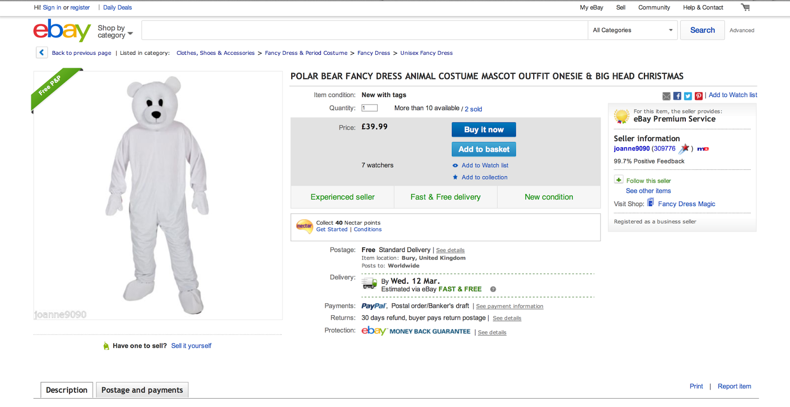
As a group we have bought a polar bear suit for our character:

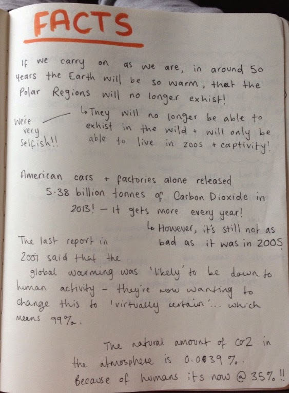
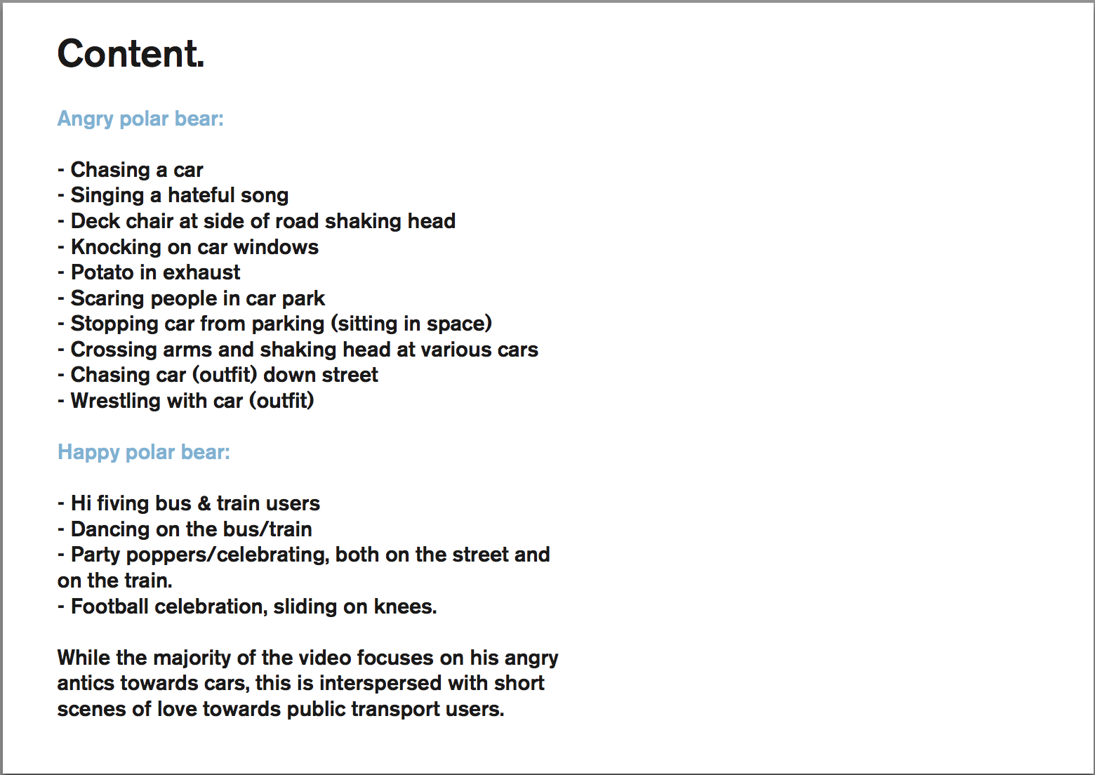
For the content within our video, we have thought up both happy and angry situations our polar bear could act out. These will hopefully come across as humorous but we fully except some of these not to work or be longer/shorter than we anticipated. I think as we are out filming, more ideas and situations will arise for possible scenarios. We need to think about restrictions with filming too. We need to think about if we need permission if we go into a car park or bus station etc. We also need to think about the general public, as we need to make sure we don't offend or upset anyone when acting this video out. As were aware of these, we will take the necessary precautions when out and about filming. We also need to look into statistics and facts on polar bears and CO2 to include on either the twitter page or the printed media. We do not want the information to be boring or overwhelming, but to the point information that is informative and interesting. I have found a few statistic on these that could be used.


I have drew out some of the scenarios to get an idea of how these could possibly work in the public domain:
For our character we wanted to make it more humanised so more people relate with it. Not only that, but think people will recognise the campaign through a name rather than 'save the polar bear'. We wanted to use a human name, that could both be used for when the polar bear is 'happy at bus/train users' and 'angry at car users'. We thought of having a more 'random' name, due to a younger audience using the internet, would relate more to it, as they prefer more 'random', 'different names'. As a group we are swaying more towards the name 'Keith' as we feel it answers this.
We came up with the idea of 'Keith Kares' to try and personify the polar bear caring for the environment like a human. We all feel however the name may need more work and the brainstorming of tag lines etc, will need developing.
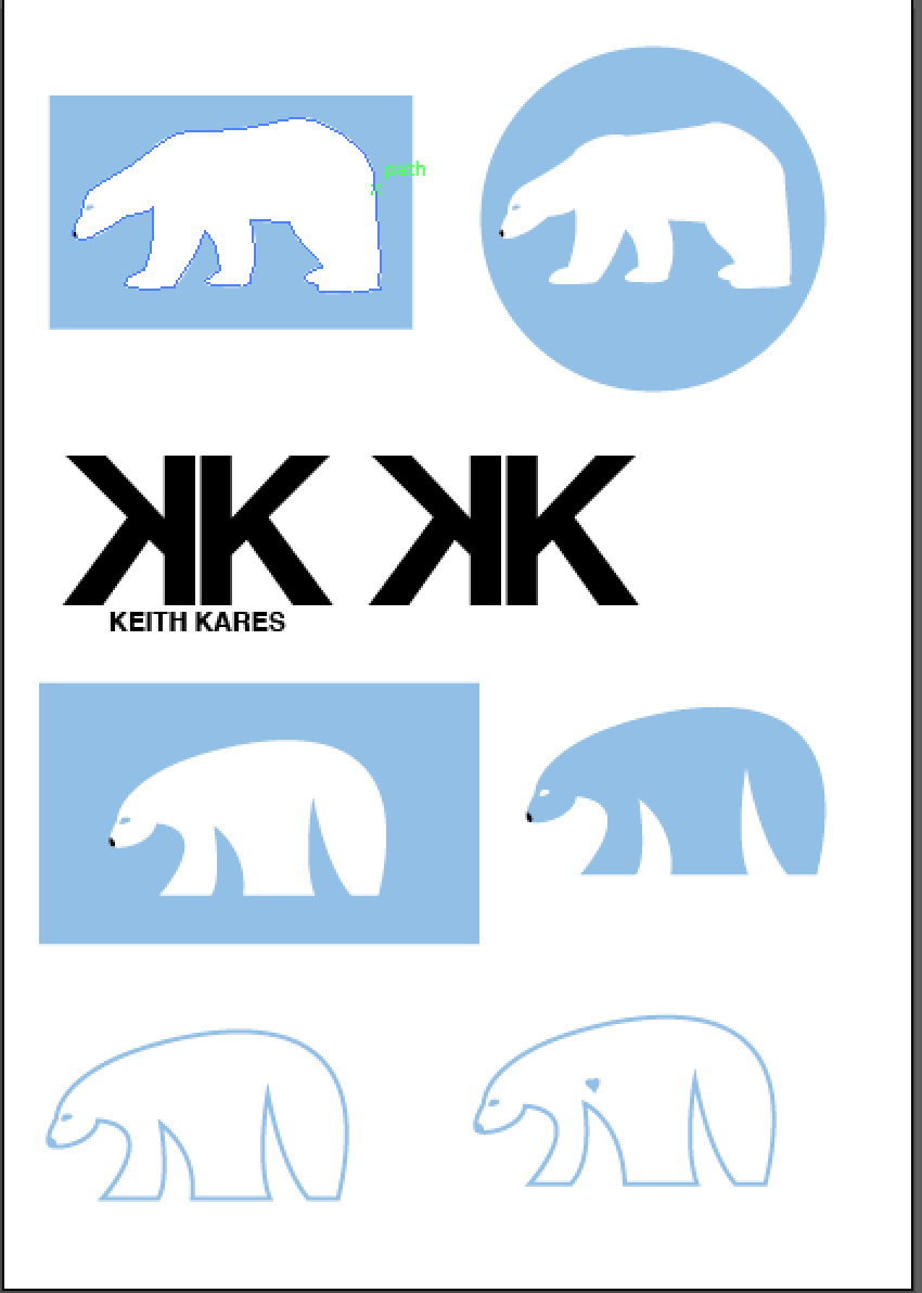
For our presentation I started designing some rough sketches for possible logos. I started by having a more detailed polar bear then moved onto creating a more flowing, less detailed vector. If I where to continue on these they would definitely need more developing as the proportion are not correct. I also moved on to experimenting with type as the logo, but the overall aesthetic did not look visually effective. I felt the type looked far too masculine and did not represent the overall tone our campaign was trying to achieve. We have decided quite early on to go for a black, white and a pale blue as our colour scheme. This was to represent the 'ice' and 'cold' of global warming. I do like this as it has a very clear link but perhaps it would be interesting to explore other colours as I feel this is quite obvious? This is something I will discuss with my groups when we design further:


One of my peers also designed a logo for our presentation which is the one we used. I feel this has a much clear link to both polar bear and public transport as it includes a representation of the city. I failed to include this in my design which makes me think this logo is far more suited to our campaign. Suggested in our presentation was to make the polar bear more obvious that it is Keith. I think this is a viable suggestion and one we can definitely look into when developing:
Another peer designed possible layouts for the printed handout. I think these will work especially well as it is not overloaded with information. I think this will make the handout straight to the point which will be quick and easy to understand:
I also designed possible postcard handouts that follow on the idea of simple, to the point information. I went on the idea of it being a literal postcard, almost as though the polar bears have sent them? Or would this be too 'tacky'? We talked about having two different designs, one for the positive using public transport and the other for negative car users. This is what I went off and tried to think of instantly recognisable positive or negative words, but in the same sort of aesthetic. I am unsure whether these work but they are a starting point for our campaign:


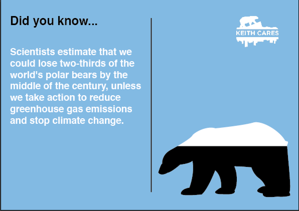
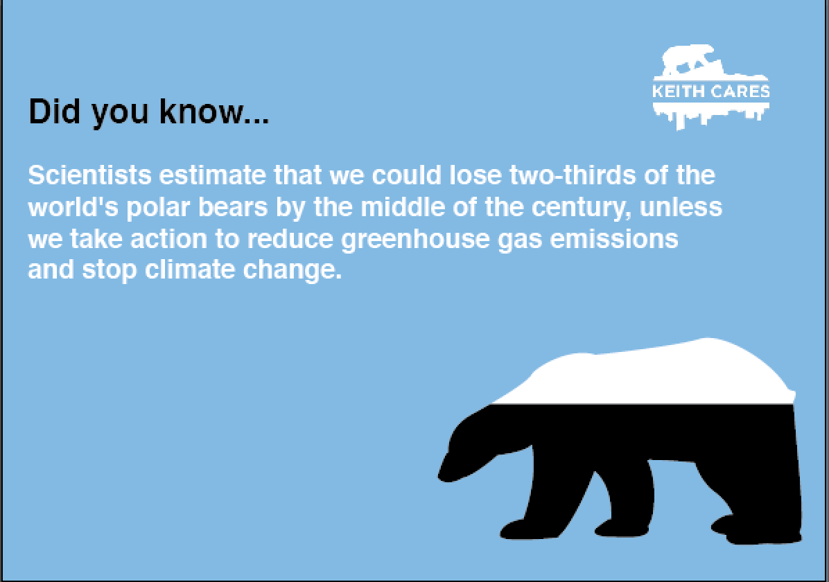
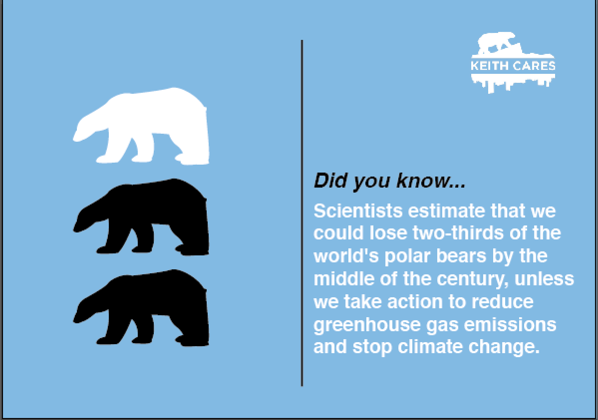
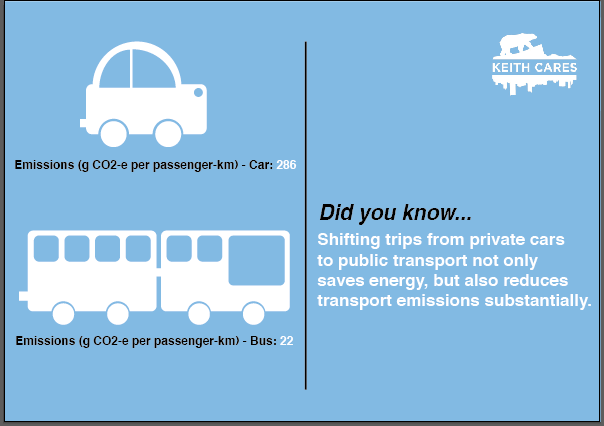
I have also made a start on what would be on the back of the postcards. We discussed having some sort of statistical information that would be straight to the point and not overwhelming. I have tried to keep the statistic as short as possible so there is not too much text for the viewer to read. I have also included small info-graphics to represent the fact/statistic that is on there. I have kept in keeping with the logo and the previous design my peers had created to make sure they all link. However I am unsure whether these designs suite the overall feel of the video we are putting together. The video itself will be quite humorous and light-hearted, while these printed media at this point is quite strict and serious. Maybe this is something are group needs to think about:


To add to extra depth to our campaign, I thought as well as the handouts we could also include either stickers or some sort of business card. These would also be given to the public to explain what the aim of the campaign is about. If we where to go with this extra printed media these designs would need refining, however I do not think this will be included in are campaign, as I do not think it is something my group would be interested in pursuing:
To make our campaign go viral we have set up a Facebook account for 'Keith'. The Facebook account will be a page for people to see what Keith has been up to i.e. the videos of the scenarios, as well as the status updates from him to explain the problems of Co2 emissions. We think this will be more engaging way to inform our target audience on the facts of emissions as it will not be as overwhelming and boring:
We have started shooting some of the scenarios Keith will be doing in the public domain. We have edited these down into 'teaser' videos which will be short clips that are both uploaded to the Facebook page and YouTube. We will be uploading these 'teaser' videos throughout the week to introduce Keith to his followers and get the public engaging with out social media pages. By the end of the week our aim is to put all the teaser videos together to create the main montage video. The video will explain why Keith does not like cars but why he loves public transport.
These are some of the initial scenarios we filmed as a group when out and about in Leeds:
A couple of the 'teaser' videos:
The teaser videos been uploaded through the week to the Facebook site:
We then went back to think about the printed media that is getting handed out to the public. A peer started sketching some design for Keith Cares which we all liked the look of. We then discussed having more fun, handwritten design for our printed media. This was so both print and video link together better as the previous designs looked too formal:
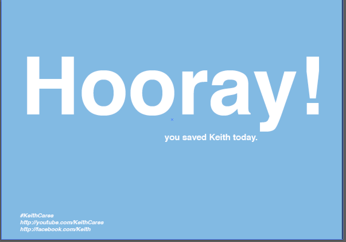
We then started designing the prints so they had a more friendly feel to them, which was represented by the handwritten type. We wanted to further include this more 'friendly' feel in the content we use. I had previously mocked up some postcards with positive and negative sides to them. One postcard was 'Tut Tut', we took this saying and expanded on these types of phrases, as we thought the language would suite the audience. We want to inform people while not been patronising and we all agreed phrases like this would be better received as it is different and light-hearted.
The designs are not as restricted and serious like the previous digital versions and so as a group wanted to change the overall aesthetic to this more welcoming 'style' while still keeping the same colour scheme of black, white and blue:
Finals and Evaluation
For our campaign, we ended up with a main montage video of 'Keith Cares' with smaller teaser videos, which acted like prequels to the montage. These where uploaded to YouTube as well as our Facebook page for Keith. On the Facebook page we not only added the videos but also added facts and statistical information on Co2 emissions, to add knowledge and depth to our campaign. We also created a small serious of printed media, to handout to the public when we where shooting the scenes for 'Keith Cares'. This was to make the public aware of our campaign and to hopefully get them interacting with the social media pages.
I am pleased with the overall result of our campaign. I had doubts at first that the overall concept was going to be too childish but feel this was not the case. I think the videos have been humorous and engaging to our target audience which has helped in the campaigns success. The campaign has definitely been successful in the fact that it has gone viral, as it has had plenty of views and likes from the general public. To this date we have had - add stats of alex, which I think is definitely an achievement in a week. I think the printed media has worked extremely well in conjunction with the video however the only downside is the logo. Although the logo is well designed, it does not link in with the rest of the campaign. The overall feel to the campaign is fun and light-hearted while the logo is quite serious. I feel if we where to continue this campaign the logo would definitely need re-designing.
 I have received and email from Facebook showing that stats on how our social networking page has gone. The numbers are really impressive to say that it has only been active one or two weeks. I think it has definitely been a success as the campaign has gone viral and has reached a high number of people:


