Wednesday, 31 December 2014

Design Production, Brief 4 - Coffee Campaigns (Augmented) - OUGD504

After looking at augmented design generally, I decided to some research more focused into coffee brands. I wanted to get an idea of what has been done and what made them successful. 
The first augmented design I found was for Starbucks, upon scanning their red Christmas cups the printed characters would come alive, allowing the viewer to interact with the characters, share on social media, send e-cards etc. The aim of this promotion was to 'surprise and delight' customers over the holiday season. I think this is a really interesting use of augmented reality as it gets viewers not only engaging with the product, but gets the public to have a keen interest in Starbucks over one of the busiest times of the year, bringing in customers. This makes this campaign extremely successful in terms of getting new business and promoting the brand:


Another campaign Starbuck released was augmented reality butterflies. In Japan they  have created a new Starbucks card which could be scanned, making the butterflies come to life. The customer could then take photos, as though butterflies where flying around them while drinking their coffee. I am not sure how I feel about this campaign, I feel it is most likely to only appeal to women (restricting the target audience). I personally cannot see why a customer would want butterflies flying around their coffee. I think it is a slightly odd concept as butterflies and coffee do not seem to work in relation to one another, nor do they link to the brand in anyway. It seems arbitrary for Starbucks to promote this, however I understand Starbucks frequently bring out new campaigns to maintain a brand image that's showing expansion. I personally do not like the over flourished illustrations as I feel they are far too decorative for a coffee brand. The over-flourished illustrations seem slightly out of place next to the structured Starbucks logo:


An Israel coffee chain have used free coffee and QR codes to promote their brand. This to me is one of the most simple but most effective coffee campaigns I have seen so far. It uses the idea of people drinking their coffee when reading a newspaper or magazine, choosing well the ideal location to target the correct audience. The print advertisement would feature in one these forms, which includes a QR code on the advertisements. The viewer can then scan the code which takes them to an locator app. The app uses the readers current location and tells them just how far away they are from the one of the coffee stores (this is something I have done on my coffee website). To get the viewer to visit the store, they have given included a coupon on the app for a free coffee. 
I think this seems like a more likely way to get new customers visiting the stores. They have simply directed the viewer into what they want to show them, then entices them with a free purchase. Even if viewers do not go to collect the free coffee, they have still used the app, which has got the name of that brand into their heads for next time:


Costa Coffee have released a TV advertisement in where it features men and women, as well as Costa baristas singing to 'Kiss - I Was Made For Loving You'. The accompanying app allows viewers to record and upload themselves singing along to the ad, with a chance to be featured on later TV advert. The aim of this campaign is to 'bring to life the pride and passion that Costa baristas have for the coffee they make and the customers they serve'. I can understand the aim Costa are trying to achieve but personally do not like the advertisement. I think it is an interesting take on combining a TV ad with an app but feel the overall outcome uninteresting and slightly childish:


Design Production, Brief 4 - Print Based Advertisements - OUGD504

I have started my research by looking into print based advertising, this was to get an idea of what makes an advert or campaign successful or not. 
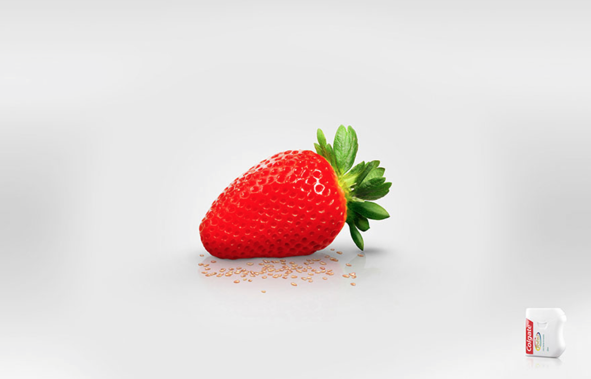
The first advert I came across that appealed to me was a set of prints advertising Colgate dental floss. The simplicity really makes the ads, as the message coming across is communicated instantaneously. There is no text or slogan as the imagery speaks for itself. The image of the dental floss is all the information the reader needs to understand what the adverts are communicating. I think as an overall campaign this works extremely well. There is slight variation in each advert of the changing of the fruit, but the concept is followed throughout all. I think this is what makes the adverts so strong, the concept, as it can now be easily applied to a number of different medias while still showing a continuous theme. I think this is something I need to bare in mind when production ideas for my advertising campaign. Whatever I produce will need to be a strong enough idea to be able to work across a variety of different situations and medias. 


Nivea's Night cream advert is slightly obvious perhaps, but still works extremely well. This is due to it simplicity and how the imagery speaks for itself without no need for masses of information. This is something I need to think about, the advertisement I have seen so far have used very little text and let the imagery speak for itself, would doing this work for my campaign though? The idea of using the product itself as the imagery is extremely well throughout through, as it is not only showing off the product, but the concept also, all through simply using the product as the main feature. Perhaps this is something for me to think about within my campaign? The solid colour of blue works well in showing both the idea of 'night' but also the brands colour too, benefiting both. The positioning cleverly shows this idea of the half moon, and would work well across a number of medias. It would also be a wide enough concept to show variety if needed, i.e. different sizes of the moon (full moon) etc. 


Playing on stereotypes, these set of adverts for Oogmerk opticians causes controversy. The tagline that follows these set of prints are 'Get The Respect You Deserve'. In my opinion this could be taken two ways, either lightheartedly and not to be taken too seriously or could causes offence to people (without the glasses) in those fields. After looking into this advertisement I found quite a few opinions in where some thought these where offencive to truck drives and butchers. However I am unsure whether the debate has just be taken too far and people may be being oversensitive? After all I feel these adverts are supposed to be humorous and not offencive. In looking into this advertisement it has interested me to see the impact an advert can have amongst the public. Whether it good or bad it has got people engaging and talking about these sets of advertisements, increasing awareness of the opticians company, which isn't that the point anyway? Does that make an advertisement successful if it increasing the knowledge of a brand or business, or does the negative connotations discard the advertisement completely?


This clever print ad for the annual Velo Marathon has an extremely interesting concept behind it. The supported tagline works in conduction with the imagery, linking both text and image together. The idea of having the city within a bike gear shows this idea of the 'Move the City' tagline. Almost showing the idea movement within the print. What makes the poster even more effective is that is not done through illustration nor digital vector, but with 3D figures. This created depth and the idea of interaction within the piece as apposed to showing being illustrated and flat. It really shows dimension to the poster, creating more of an interest to something that would, if done differently, be just another poster:


Again what is appealing me to this advertisement is the simplicity of print. I think this advert for the Guardian is well suited to the newspaper itself. This is due to the guardian also having well designed info-graphics within there papers, and so there is a nice correlation between advert and company. There is a corporate tone to the image due to the dark background, while also showing some informality with the pop of bright colours on the pie-chart. Again, I feel this shows the newspaper and the type of image it presents itself being. Again like previous adverts I have looked into, the minimalist amount of body copy is all the advert needs. The type is working both as the slogan and the key to the chart, which I feel is a clever way in showing the text.


The detailing in these adverts are what really draws me to the set. I love the imagination of the imagery and how detailed the prints are. The aim of the campaign to these poster are to promote the 'Schusev State Museum of Architecture', which holds a collection reflecting the thousand-year architectural heritage of Russia. The concept behind these posters are definitely well thought through. The tag line 'Discover the full story' connotes this idea of something more, this shows the imagination of the print but also shows the discovery of the history behind the buildings and how there is so much more to learn within the countries architecture. The one thing I do not like about these posters are the type, although they are well suited to the individual imagery, I do not like there is no consistency to it. However, the nature of each building is completely different and so in that respect feel the type is well suited in an individual way:

Design Production, Brief 4 - Augmented Research - OUGD504

I have now moved my research on to looking at augmented design in print campaigns. This is to get an understand of what works in interactive print and to understand it's limitations. 
I have begun looking at the recent Vodafone campaign... 

'In where they hosted a one-day summit in Berlin called "Digitising Europe - Opportunities for the Next Generation". 
Attendees were surrounded with opportunities to experience Augmented Reality from the very start as the events invitations featured scannable content. Additionally, the event programs, wall banners and table displays could be scanned with Layar to reveal extra content, including videos of speakers and social media links.'

I feel this is an interesting way to use augmented reality as it engages viewers much more with the event. It shows a great extent in what the technology can do, and shows me what to bare in mind when producing my campaign. The idea of making everything scannable is something to bare in mind, although I would have to think about cost. The idea of linking social media to the designs is another way I could get my website promoted as social media is such a large basis for the public to view and share information. 
The overall designs for the Vodafone event however, on a print basis, are not very engaging. If they did not have elements of augmented reality I think they would be something viewers pick up and put down. There is nothing visually interesting as it is very corporate and bland, making it all rest on the augmented aspect of the campaign. This is something I do not want to do on my campaign. I want everything to be visually engaging first, then let the augmented reality (or whatever I choose to do) push the interest further. I want the digital reality to add to the campaign, not solely rely on it, which is what I think has happened here with Vodafone:


Another way of using augmented reality is making the imagery move. The use of video is something that is also possible. Here they have used the technology to add an element of interaction to an exhibition. What is well thought through with this exhibition is it can be enjoyed whether you have a smart phone or not. Viewers can choose to either interact and see the imagery move, however if they don't, or do not have a smart phone the pieces can be viewed on there own. I think this is something I am going to try and include within my campaign. Unlike the previous Vodafone campaign, I need to make my printed designs visually appealing and intriguing firstly without the interaction so it can appeal to both smart phones users and non smart phone users:


Again the use of video has been applied as AR within this printed magazine. Viewers can scan both cover and inside spreads with an app, which will take them to additional content related to either the magazine or article. This is extremely popular with AR and is something that can be done across all printed media. I am unsure how I would apply this type of AR to my campaign, although it is something to bare in mind. 


Similar to the previous magazine, The Times have applied some elements of AR with their Saturday issue. Featuring Graham Norton, both the front cover and article imagery can be scanned, which will take the viewer to extra content of the comedian and the article: 


Argos have now updated their catalogues to work in conjunction with an augmented reality app. Viewers can use their devices in conjunction with the catalogue to scan products which will then compare different models (in the app) to see which is the best deal for them. This app also includes 3d models and interactive games to engage the viewer further. This gives the reader further choice in products and allows the app to do the work. I am unsure how successful this will be as people who use the Argos catalogue tend to normally know what they would like to purchase, however I understand how the app compare models could be quite useful to the reader:


Recently Harrods have released their own mobile app, in where shoppers can scan limited edition Christmas merchandise to reveal digital media. Once scanned, the AR reveals the prestige of the Harrods brand and its products. I am unsure how this would work successfully, I feel only people with a keen interest in Harrods would scan the limited edition products. I can't help but think it would not appeal to a wide target audience and would be very specific to who would have interest in using the app or not. However the designs of the limited edition products I find really visually appealing. I think the old-style designs work well to connote the brands history and how the company has developed through time. This is shown through use of colour and the look of the hand-rendered type:


The videos are shown in black and white to show the history of the brand:

Design Production, Brief 4 - Initial Ideas - OUGD504

BRIEF - To produce a print-based advertising campaign across as least 3 advertising deliverables. This will accompany and promote my website from Brief 3, 'A brief history of…'. The advertising needs to explore some sort or elements of interactivity. There are several methods, platforms and technologies available that can be exploited in providing interactive elements to print media therefore it is important that you research these thoroughly in order to develop an effective augmented design.

Augmented - Make (something) greater by adding to it; increase.

I have started this brief by brainstorming the different medias I could possibly use for my three deliverables. Seen as my website from Brief 3 is a coffee website (that focuses on your coffee order saying something about you) I knew it would be within the campaigns best interest for the medias to be something that would be seen in coffee stores. This way I would be targeting my key target audience, creating awareness to the correct people who I would like engaging with my website. From my summer research project when I was first looking into coffee I went into different coffee stores. From this I knew the types of products that would be available for me to print on. Things such as cups, coffee sleeves, napkins, stirrers etc. This is the type of media I would like to explore printing on while also including maybe one or two more obvious printed media such as flyer's or posters so I can get more information across:


I have been into stores again, looking at medias I could possibly use as printed deliverables:


I have then started thinking about possible concepts I could I use for my print campaign. I went back to look at my website, thinking about key features I tried to focus within the site and seeing whether there could be any ideas that would work on the campaign. My problem at the minute is that I want to explore so many option I do not know how to narrow down my ideas. I think this is better than having no ideas at all, but am unsure how to figure out which are the strongest and which ideas will not work at all. I am going to discuss all my ideas with my peers to get other opinions in which route I should go down. 

As my website is all about personality I thought about the idea of making coffee cups have personality themselves, illustrating different characters for the coffees I have included on my site. The augmented element to this idea could be the characters move or talk in some way. I discussed this idea with one of my peers and she suggested this may seem slightly 'creepy'. From that I decided to move on away from that idea. I then thought about creating something personal for viewers to interact with. Again as stated before, the idea is to bring personality to the coffee, so what could be more personal then getting the viewer involved on the cup. My idea would be to have space on the cup for the viewer to right their name, put down their personality traits and then through digital interaction they could then scan this to take them to my site. Although after a critique with peers some suggested they do not feel they anyone would use this, some people do not carry pens, other may not be bothered to and so feel the whole campaign may be slightly disappointing if nobody interacted with it. It would have to solely focus on members of the public to engage with it and so that could be a huge risk.


I then had the idea of basing my campaign all on questions. I thought this was a huge part of a coffee order as we are asked what we want, whether we want milk and sugar etc and so this could be a nice link to actually ordering coffee. The idea would be these question would be applied across a range of mediums that where around coffee stores, sugar, stirrers etc. These questions would be specific to whatever product the question was on, i.e. a sugar packet: 'Having sugar with that?'. After discussing this idea again with peers, a friend suggested to make the question slightly more interesting. For example of the sugar packet: 'Aren't you already sweet enough?'. I really like this idea but am struggling to come up with 'quirky questions' that I could apply across a range of different medias. I have tried thinking about possible phrases and sentences I could use but none of them are very interesting at the minute. Although I think this could be a interest concept to use on my campaign  unless I think of more effect question, do not think I will be using this route to do down. 


I have been thinking back to my initial idea of making a selection of cups that have different personalities. However, instead of showing faces, I could show the personality through pattern. I have also thought of showing each section of the coffee on take-out cups as well as thinking about heat reaction. I have thought about using the heat of the coffee to possibly show a design underneath, however as it is getting closer to Christmas am unsure how I would have time to do this with the workshops been closed. This is something I am considering but need to think about further: 


I have now wrote down all my concept and ideas that I am thinking about taking forward and after discussing them in critiques, will make a decisions in what route to go down.

Design Production, Brief 4 - Study Task 13: Print Finishes - OUGD504

The secret of a successful print job is a well-designed layout, some good scans for repro, and the correct choice of paper and ink. If all these aspects are right, a good printing company can be relied upon to produce a pleasing result. Thinking about finishes on final pieces of work can play a huge part in making work stand out more if done successfully. 

VARNISHINGPaper varnishes are applied to paper stock to give the page a smooth and consistent texture as well as having the added benefit of sealing the printed material to help preserve it better. Varnishes can be either glossy or matt finishes. Usually varnishes are applied to cover the entire pages without adding too much weight to the stock, making them suitable magazines. 


LAMINATION - Lamination adds a layer of protective coating, often glossy or matt while also improving the sturdiness and water resistance. Lamination also adds a tactile feel to the printed surface, which is a smooth finish. Laminate also works well for high quality images and photography, improving the sharpness and overall look. However you can also have matter laminated prints which show a more luxurious feel to the work, this is not unlike applying varnishes however lamination tends to be much more expensive. 


SPOT UV VARNISHES - The result from a spot varnish results in a glossy coating on the surface of the print. This adds texture as well as a focal interest to certain parts of work. Textured Spot UV creates a specific texture; ie: leather, rubber, etc.


FOILING - Foil Stamping is the use of malleable metallic material plied to the print surface by using heat and pressure. The stamping transfers a foil coating from a carrier roll of polyester, by means of a heated die. The coating can be metallic, matte, pearl or even a hologram. Hot foil stamping uses heat and pressure to attach the foil to the substrate, either using a rotary method or using an off-line hot-stamping press. There is also cold-foil stamping which is much cheaper. 


EMBOSSING & ENGRAVING - Generally embossing refer to raising parts of the page for emphasis and texture. The print finish adds physical depth to the embossed elements, creating shadows and highlights within the design. 


LETTERPRESS - Letterpress printing is one of the oldest forms of printing. However it is now largely used for producing fins editions of books and prints. Large letterpress machines have been converted to flexography , in which the heritage of the letterpress lingers on. The effects of letterpress show a high quality impression however the downsides are that it is inflexible in its design and is now expensive, due to big presses now been largely taken out of service. 


THERMOGRAPHY - A freshly printed image is dusted with transparent thermography powder. This sticks to the ink and, when heated, swells into the third dimensions; high gloss and matt finishes are available. However, sheets printed using thermography can later be a problem if put through laser printers, as the thermographic printing can melt. 


DIE CUT - Die Cutting uses sharp steel rules in a wooden die cut shapes from paper. 


HEXACHROME COLOURS Using six colours instead of the standard four, it is possible to expand the spectrum (or gamut) possible on a full colour print job. This system developed by Pantone© allows enhanced visual impact as well as allowing for special colours to be introduced to a print run without the wash ups and spot plates normally associated with additional spot colours.

PERFORATION - A ‘half-cut’ that allows parts of a substrate to be easily removed.


MIRRI - Mirriboard is the closest thing to a mirror on a paperboard and is available in a range of colours. It is used extensively for premier cartons, POS, greetings cards, or any product that requires a premier cut finish and the ultimate in decorative print finishing.


The possibilities for print finishes are limitless, especially if you find the right printers to work with. Print finishes can give designs the extra push it needs however, it can sometimes make or break a design. The challenge it finding the most appropriate finish for a piece of work and making sure it is suitable. However, some print finished are not cheap and so it is important to bare budget in mind when deciding which ones to go with. This is something that I will think about within my work also. However, I do not think it would be appropriate to apply one of the more unique finishes to my work as there would be no reason to do so. I feel I would be doing this for the sake of it. I will however be using a matt varnish stock as I feel I am wanting the work to stand out, for this a clean and clear stock (like matt) is going to be the most appropriate for my print campaign.