Photoshop
When working with Photoshop, keep these rules in mind:
1. CMYK or greyscale
2. Always save as a Tiff or PSD
3. 300DPI (PPI)
4. Images need to be prepared at actual size (see below)
InDesign
Rather than scaling images down, edit in Photoshop, save and place.
If you transfer the image from Photoshop in InDesign the colours used will appear on your swatches panel. This will work with tones (eg: Duo tone etc) as well as spot colours.
Use your Links palette and open up the link info to check that the images haven't been scaled
Actual PPI: The image in Photoshop.
The Effective PPI: The image once it has been reduced/changed in InDesign.
Scale Percent: This is useful to edit the image and place back into InDesign. Edit with, Photoshop and scale it using this percentage.
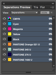
CMYK Spot Colour Separations
InDesign


The last three colours are available as they are in your swatches preview whether you have applied them within your design or not. It is good practice to delete the unused swatches as not to print them.

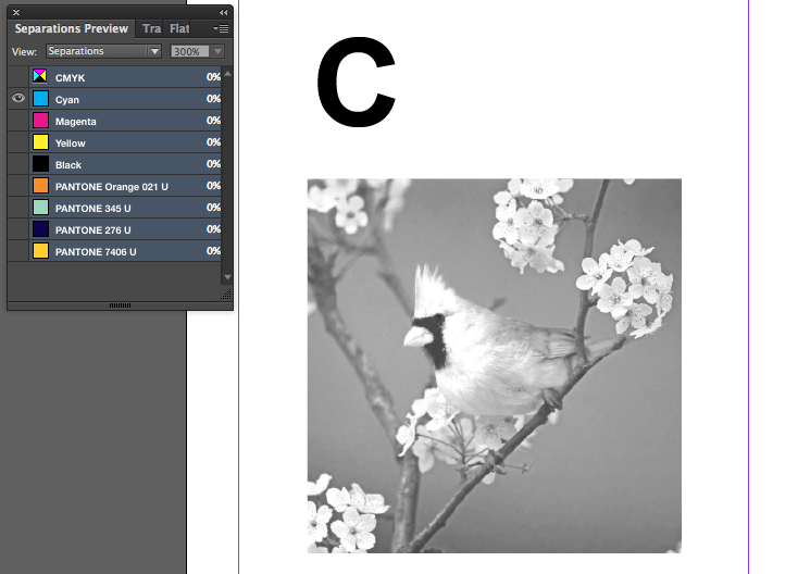
As you can see, only Cyan is selected. The darker the colour on the image (the 'C' is black) represents how much colour will be used in this area. This is similar to when you separate to create positives for screen printing.
This is a good way to check that you are only using CMYK.
Print
Composite Grey: When you usually print whatever you see on the screen will print)
Separations: Ink section needs to be activated (your colours should be visible). This is for Laser printers only, not your Inkjet at home or Digital Print downstairs.
Ensure that you have separations selected. You can then choose (using the icon of the printer) which colour/separations to print.
Halftone:
If you are outputting positives you have to work with halftone dots. The printer will do this. Ye it is useful to know.
150DPI is what the printer would set itself to in commercial printing.
Halftone Angles:
Cyan 15º
Magenta 75º
Yellow 0º
Black 45º
If you are using spot colours use these percentages;
15º
75º
105º
155º
Frequency Angle for 4 colour. You would apply this on Output/Printing.
View- Overprint
This will de-activate the separations preview.
Knocking out: the colour will be 'knocked out' when overlapped.
Overprinting:
Output, Attributes: Main purpose it to deal with overprint and knocking out. By taking advantage of this you can create a 3RD colour during the printing process. This is useful when you have a limited colour palette.
Spot varnish can also work well with this.
You can specify whether it knocks out or overprints.
Printing InDesign Files:
- Create PDF
- 'Press Quality' (for commercial print) This will then contain all of the information about spot colours etc
- Export
To send the file and all of the images etc, 'Package' them together. It saves everything together, type, image etc.
File, Package, (IDML File allows you to open it in an older version of InDesign).
You can also include a PDF file to provide a reference as to how the design should look.
"Legality Of Copying Fonts" CAREFUL CONSIDERATION.
To get around this, turn all text to outlines (Type, Outline). No font's will be necessary, no laws broken.


No comments:
Post a Comment