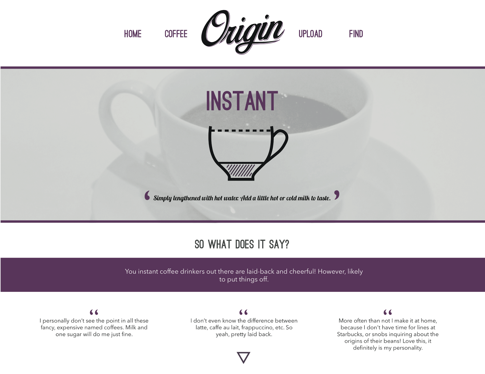
This is my final coffee website. Due to not coding the website, I have included a video of the coffee steam (how the webpage would move) and a still of the homepage to show the composition and layout:
My website is an informal,
lighthearted coffee site that people can engage with. It was aimed at
coffee drinkers and people who visit coffee stores regularly. After
looking into research, the idea for the site was based on a study I had found on
'What Does Your Coffee Order Say About You?. This is what the website is about,
the separate pages explain the different coffee personalities,
alongside an 'Upload' page in where people can posts their opinions on the
study, discussing whether they feel it is correct on the drink they
order. There is also a 'Find' page in where they can use a locator to find the
nearest coffee store near them. I was unsure whether this would work as a site,
but feel due to the informality, it could be something the public use when sat
drinking coffees.
Like the rest of my outcomes within this
module, I am unsure how I feel with my website. When I first started designing,
I thought it was going really well however after development and refinement
I have started to get more and more judgmental and self critical
throughout the brief. I feel this has definitely impacted my work within
this module, as I have now not enjoyed the brief as much as I would have liked.
I was shocked in how different I have found
designing for the web has been compared to print. At first I struggled
with getting to grips with thinking it can continue down the page instead
of been restricted to one size. This is what I struggled
to understand the difference of and changing my designs accordingly. I
think the overall designs and interaction of the website would work
if made into a fully functional website. I feel including
interactions such as the single page for the 'coffee' section and the moving
image on the homepage creates move of an interest to the site instead of it
being so simple. I think the colour scheme works in relation to the
subject without connoting another brand of coffee. This was a huge
concern when starting this brief, so feel I have overcome this with the dark
tones of the imagery and the contrasting purple which shows the intensity
of coffee itself. This is where choosing a web safe colour came into play.
I thought it was going to be much more of a struggle to select a colour I was
happy with, however think it works with the concept of my site well. This was
the same for selecting type that would be web safe. I used Avenir as
my main body copy, followed with Ostrich Sans for the headings.
The mix of these and the hand-rendered inspired logo works well for the
audience, as the fonts are quite structured but informal at the same time.
The layout and grid system I used was inspired by the single page layout I was
aiming for. The 'coffee' page, if coded, would be a single page, for
this reason I have applied everything centrally as well as bleeding the
imagery off so nothing was aligned to the left or right. I think this
would work as a single page due to the arrangement.
For further production I would code this
website into a single page with separate pages for uploading and finding.
If I could expand on this I would create more in-depth pages with longer and
more detailed content. The aim would be to attract as many viewers as possible
to the site to get as much content as possible. I would also expand
on the 'Find' section, making the locator a reality. I would also maybe expand
the website by including more content of the find pages - maybe information on
each store and a link to their websites? I would make the moving image much
clearer on the homepage and begin to think about apps and social media. I feel
even though I am not 100% happy with the site, I feel I worked the pages as
well as I could have with the content I had. I feel if I were to do this
brief again I would get more content for the site as well as creating the
homepage first instead of the coffee pages. I would also work further on
apps and responsive design. I feel with this brief it has made me think
much more about designing for web and the differences it has to
print. Although I only learnt a very small amount of coding, it has opened my
eyes to the possibilities of coding something. I
am definitely going to keep in mind the idea of designing for
web on other briefs, as well as trying to learn more about coding for the
future.


No comments:
Post a Comment