Whenever we scan an image the mode of the image will be RGB, RGB is the mode that all the calculations work with. It is the default mode of Photoshop.
Colour Gamut/Range:
The image above shows what we can detect (all of the colour) and the gamut of colour that is possible to use/print (highlighted with key).Converting the image to CMYK can shift the colour to the nearest printable colour we need to work with these potential colour shifts when working in Photoshop.
We immediately get a shift in colour when converting colour ranges. Dramatic shift in the colour, as it is not in the CMYK gamut.
There are reasons why we do not always work in CMYK, even though it would help. The reasons for these are some features will not work when in CMYK mode. For example, some of the filter effects. All in cmyk the files are much larger, unnecessary large files. We should work in rgb while we are adjusting and editing, then convert to cmyk at the last point.
The gamut warning will tell us which colours are outside the printable range. This is a useful tool we can use before printing:
We could just convert the image mode, however we may want some more control over the conversion. We can do this using adjustments, saturation/brightness and contrast, levels etc. These will help the conversion:
Spot Colours - Select the larger area that is solid and adjust the colour manually, pinpointing and adjusting the ares that need it.
Proof Colours - Showing on screen how the image will look when convert to cmyk, but the mode of the image is still rgb. All the colours we now see will be in the cmyk colour gamut. (CMYK preview):
Swatches - (Linking back to the last workshop)
Eyedropper tool: each time we use this tool, it appears in the temporary panel in the swatches panel. Above, I selected the sky, as you can see it has appeared top left of the swatch file
To delete unused swatches. ALT and click, to delete.
To add another colour, select a colour and click in the now empty space to add.
To save the empty swatch file (so that we don't have to do this again, you need at least one colour in the swatch. Use the top right option, save swatches and save under 'Empty Swatches'
When opening a new file and wanting to use this empty swatch file, go to the top right option, replace swatches and find the 'Empty Swatches' file.
Colour Picker:
This is another way to find and add colours to your swatches.
When the warning triangle is visible is is telling you that this is a non-printable colour with CMYK.
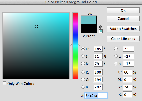
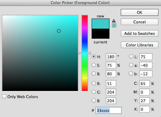
If you select the cube (web safe) or the triangle (printing) it will automatically select the nearest possible colour. Then click 'add to swatches'.
To transfer the swatches to Illustrator/InDesign you simply need to ' Save Swatches for Exchange'. This will allow you to use on other pieces of software.
Spot Colours:
Go to the 'Colour Picker' tool and see the 'Colour Libraries' Which will reveal the Pantone Spot Colour reference systems.
(For this example, choose solid coated)
To select a colour type in the number and select okay. This will add to your foreground colour. Click in the swatch file to add the colour. The problem with this is that this is simply a spot colour- we need to have the name of the Pantone colour Name.


The problem with this is that when you covert this to CMYK, the colour will change slightly.
Left: RGB Right: CMYK
Using Spot Colours in Photoshop:
In order to use spot colours within this image we have to work with a greyscale image. The mode of this image is greyscale. The ink that will be used to print this image all of the various tones will be printed with black ink (one ink to print)
One of the reasons we use spot colours we are producing something that has to only use a limited number of inks/for aesthetic reasons.
We start with this image and instead of printing with black ink we want to use another ink to print with. This is known as 'Duotone' image.
Using RGB/CYMK the 'Duotone' option is not available.
Image, Mode, Duotone
Black will be shown first.
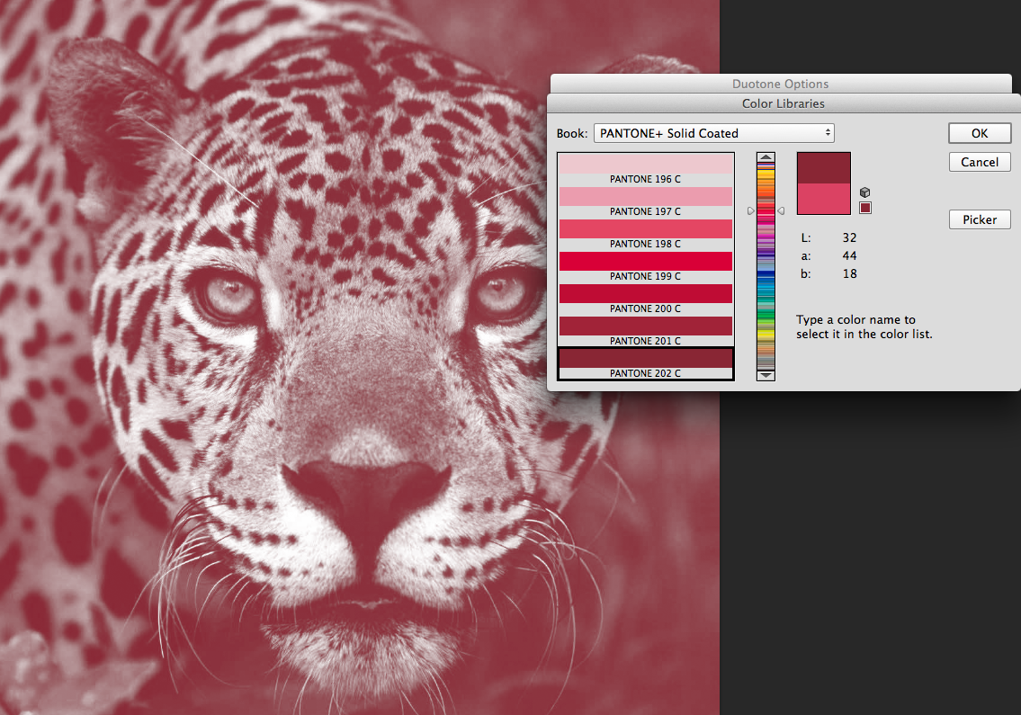
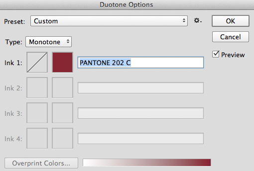
Colour picker- select a spot colour using the colour library. We can now choose a different ink to print this image. If you where just using one ink, this is the end of the process. This colour can be changed by going back to Image, Mode, Duotone and alter it.
To check that this has worked, look at the top bar, Monotone will be shown. This is simply as only one colour has been used.
Duotone can be selected to add another colour. Or Tritone, 3 or Quadtone, 4. As you can see, since Duotone is selected, another box is editable.
I added a yellow to the image. This is my second colour/Duotone.
Selecting the left, crossed out box allows you to change how the ink is mapped to the original shades of grey in our greyscale image.
Along the bottom shows the original shade of the image.
The new ink sits along the Y axis.
Here I have changed the curves of the maroon/red colour. This is shown within the previously crossed out box as well as on the graph itself. This has applied the red differently across the image as to look more aesthetically pleasing.
I then adjusted the yellow so that it was only applied where the grey was at 30% ink. So depending on the number of inks that you have available, the more you can use on the image- yet the cost will start to rise too.
This is very useful since the inks that you use to Screen Print are spot colours.
You can introduce the black spot colour just to Key the colours. Tip: Adjust the curve so that the black is only applied at the darkest side of the image. This will darken the image in the blackest areas.
Saving Your Image
When looking at the file format options, you have to save it as Photoshop. You cannot save as JPEG or TIFF.
- Save As
- Photoshop
Greyscale- CMYK
You can apply this to any mode of image that you like.
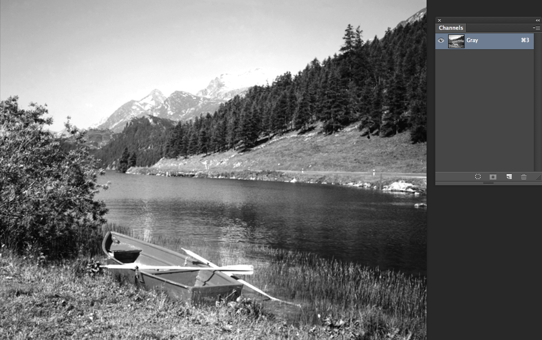
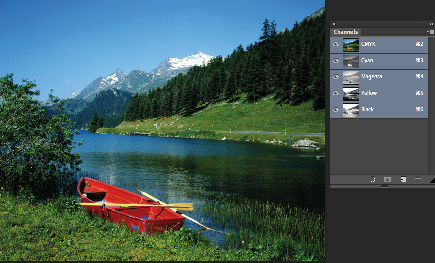
How Photoshop records the mix within the image and how it is created.
CMYK- there would be 4 channels
Greyscale- there is only one channel
In order to see how this works, you need to look at Channels.
I only have 'Cyan' selected. Where the colours is darker- this is where more of the ink will be printed.
(change the image to CMYK firstly: Image, Mode, CMYK)
This shows the Magenta and Yellow together.
Creating Spot Colour Channel:
Create new spot channel. Select colour box, then go to libraries and select pantone colour.
Make sure that black is selected 9bottom left) as you can see, the paint then adds the ink to the page.
In reverse, change the colour bottom right to white to remove the ink.
To change the spot colour is will change anything that you have painted over already.
Type On A Channel:
Type will mask the image in red
The word will be selected ready for you to fill with the brush tool.
Solidity Of The Ink:
The majority of inks are transparent. This solidity simulates either the opaque or transparent ink.
0% represents the transparent ink- allows you to see the ink/image below it.
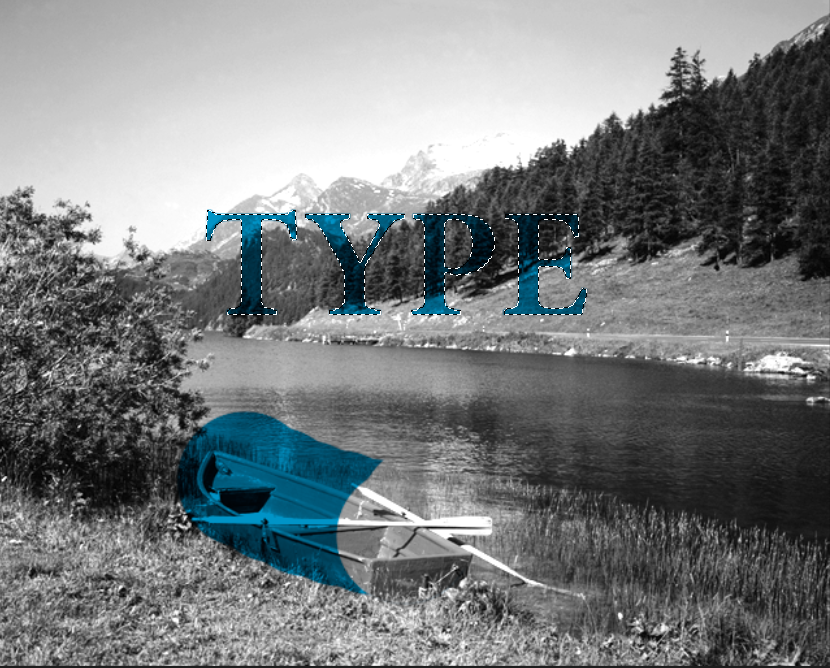
0%
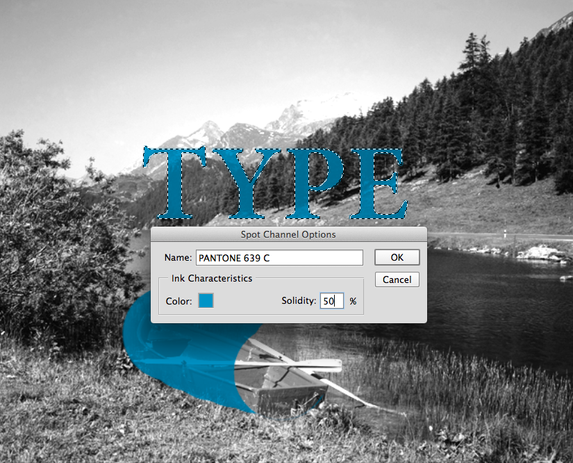
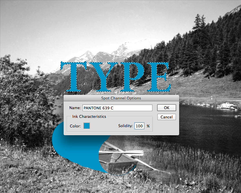
Changed to 50% Changed to 100%
This is useful when using spot colour/screen printing to simulate how your image would look once printed.
To Save Spot Colour Channels:
Save as TIFF or Photoshop
*Select 'Spot Colours*
Finishing Options: Spot colour varnishes: over certain parts of the paper you want varnish to the particular part of the image. You could create a spot colour channel and colour it with one that is not the the image already. Tell the printer that Pantone #247 is for varnish.
Focal Tone: This technique allows you to select certain tones on an image, for example an image of a person, it highlights specific skin tones and ares to edit individually.


No comments:
Post a Comment