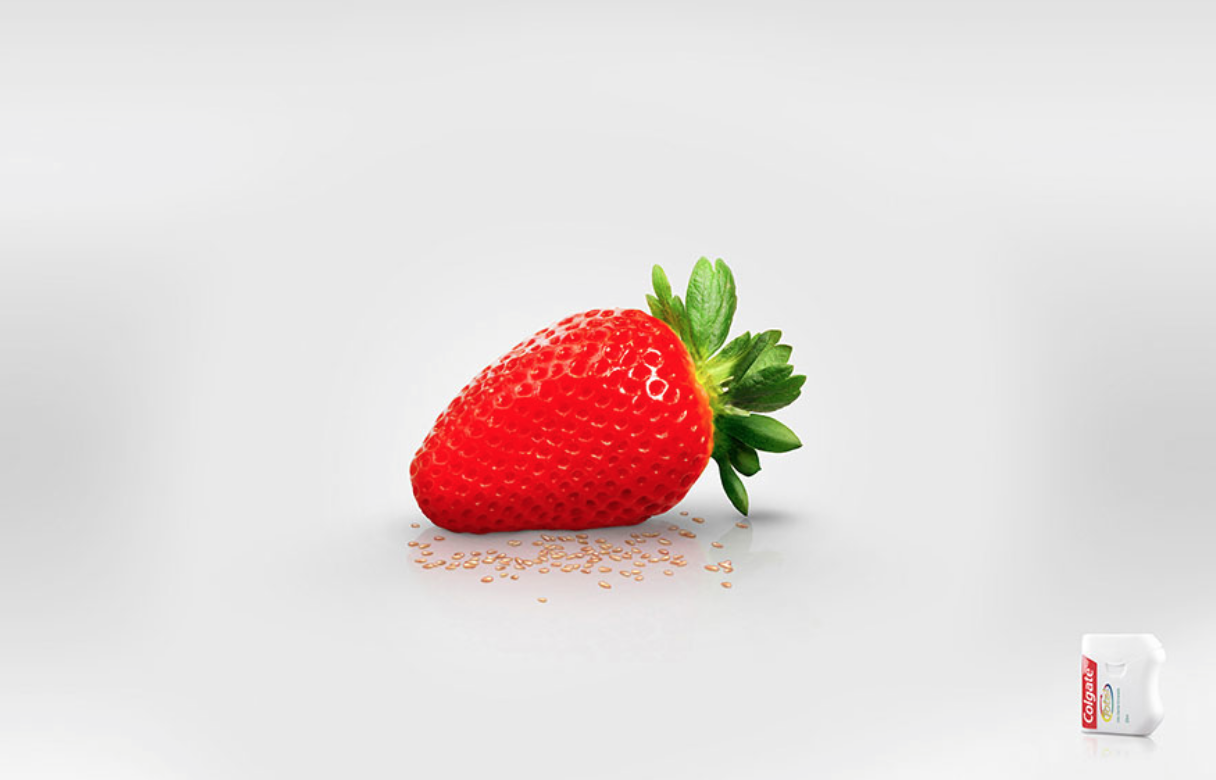
I have started my research by looking into print based advertising, this was to get an idea of what makes an advert or campaign successful or not.
The first advert I came across that appealed to me was a set of prints advertising Colgate dental floss. The simplicity really makes the ads, as the message coming across is communicated instantaneously. There is no text or slogan as the imagery speaks for itself. The image of the dental floss is all the information the reader needs to understand what the adverts are communicating. I think as an overall campaign this works extremely well. There is slight variation in each advert of the changing of the fruit, but the concept is followed throughout all. I think this is what makes the adverts so strong, the concept, as it can now be easily applied to a number of different medias while still showing a continuous theme. I think this is something I need to bare in mind when production ideas for my advertising campaign. Whatever I produce will need to be a strong enough idea to be able to work across a variety of different situations and medias.
Nivea's Night cream advert is slightly obvious perhaps, but still works extremely well. This is due to it simplicity and how the imagery speaks for itself without no need for masses of information. This is something I need to think about, the advertisement I have seen so far have used very little text and let the imagery speak for itself, would doing this work for my campaign though? The idea of using the product itself as the imagery is extremely well throughout through, as it is not only showing off the product, but the concept also, all through simply using the product as the main feature. Perhaps this is something for me to think about within my campaign? The solid colour of blue works well in showing both the idea of 'night' but also the brands colour too, benefiting both. The positioning cleverly shows this idea of the half moon, and would work well across a number of medias. It would also be a wide enough concept to show variety if needed, i.e. different sizes of the moon (full moon) etc.
Playing on stereotypes, these set of adverts for Oogmerk opticians causes controversy. The tagline that follows these set of prints are 'Get The Respect You Deserve'. In my opinion this could be taken two ways, either lightheartedly and not to be taken too seriously or could causes offence to people (without the glasses) in those fields. After looking into this advertisement I found quite a few opinions in where some thought these where offencive to truck drives and butchers. However I am unsure whether the debate has just be taken too far and people may be being oversensitive? After all I feel these adverts are supposed to be humorous and not offencive. In looking into this advertisement it has interested me to see the impact an advert can have amongst the public. Whether it good or bad it has got people engaging and talking about these sets of advertisements, increasing awareness of the opticians company, which isn't that the point anyway? Does that make an advertisement successful if it increasing the knowledge of a brand or business, or does the negative connotations discard the advertisement completely?
This clever print ad for the annual Velo Marathon has an extremely interesting concept behind it. The supported tagline works in conduction with the imagery, linking both text and image together. The idea of having the city within a bike gear shows this idea of the 'Move the City' tagline. Almost showing the idea movement within the print. What makes the poster even more effective is that is not done through illustration nor digital vector, but with 3D figures. This created depth and the idea of interaction within the piece as apposed to showing being illustrated and flat. It really shows dimension to the poster, creating more of an interest to something that would, if done differently, be just another poster:
Again what is appealing me to this advertisement is the simplicity of print. I think this advert for the Guardian is well suited to the newspaper itself. This is due to the guardian also having well designed info-graphics within there papers, and so there is a nice correlation between advert and company. There is a corporate tone to the image due to the dark background, while also showing some informality with the pop of bright colours on the pie-chart. Again, I feel this shows the newspaper and the type of image it presents itself being. Again like previous adverts I have looked into, the minimalist amount of body copy is all the advert needs. The type is working both as the slogan and the key to the chart, which I feel is a clever way in showing the text.
The detailing in these adverts are what really draws me to the set. I love the imagination of the imagery and how detailed the prints are. The aim of the campaign to these poster are to promote the 'Schusev State Museum of Architecture', which holds a collection reflecting the thousand-year architectural heritage of Russia. The concept behind these posters are definitely well thought through. The tag line 'Discover the full story' connotes this idea of something more, this shows the imagination of the print but also shows the discovery of the history behind the buildings and how there is so much more to learn within the countries architecture. The one thing I do not like about these posters are the type, although they are well suited to the individual imagery, I do not like there is no consistency to it. However, the nature of each building is completely different and so in that respect feel the type is well suited in an individual way:


No comments:
Post a Comment