TASK - To investigate the typographic hierarchy and the information hierarchy and compare the two. Compare three newspapers, magazines and websites.
WEBSITES
First Direct
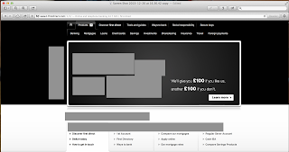
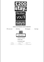
The first direct website advertises their loans/bank accounts etc, this information is on there initial homepage which would grab the viewer instantaneously. I recognised 9 fonts with 1 typeface which is Helvetica. It has very little imagery with just a couple small vector shaped images at the top this makes the percentage of type to image around 99 -1. I think this has been done to make the website as professional and clean cut as possible - some might say boring? The percentage to the information to advertisement of loans etc is around 50 - 50 as the advert for £200 is the first thing you notice.
The first direct website advertises their loans/bank accounts etc, this information is on there initial homepage which would grab the viewer instantaneously. I recognised 9 fonts with 1 typeface which is Helvetica. It has very little imagery with just a couple small vector shaped images at the top this makes the percentage of type to image around 99 -1. I think this has been done to make the website as professional and clean cut as possible - some might say boring? The percentage to the information to advertisement of loans etc is around 50 - 50 as the advert for £200 is the first thing you notice.
As the first thing that stands out is the £200, this was the first thing to go. It stands out so much due to the scale and contrast in colour:
I then took the 'stay' as this was the same size as the '£200' but the pound sign is what made the previous stand out more to me:
I then removed the 'first direct' as this was in a heavier weight than the rest of the website. This stood regardless that it was a smaller scale:
I then proceed to remove the rest of the main advertisement. These were relatively light weights but on a large scale:
I then removed the donation link. This stands out due to the composition and that it is a link which makes the type underlined. It is on a smaller scale but a bolder font:
I have removed the titles of the other sections of the websites. These lead your eye along the website in stages. They are a decent sized scale and this is what draws you too them:
I then removed the '£100', even though they are a smaller scale to other type left on the website. They are bold and contrast against the black background which draws you to them. This also makes the viewer think this information is important and the fact is it stating money tries to increases that:
Again removing a link button, as the black type on a white box draws your attention:
I have then removed more of the smaller subheading links that are a small point size and something you would probably not read. The bullet points next to each category however, makes them stand out more:
I have now removed the rest of the 'advert'. It was a small body copy but again the contrast in colour made them stand out:
I then removed all the smaller sections at the top of the website. These were the smallest fonts on the websites which made them the last to be removed:
Final Type Hierarchy:
Final Information Hierarchy:
The information hierarchy gives a different representation to the type hierarchy. I feel the type gives more of a fair representation of what you would look at first, due to the size and scale of the type. Where as the information hierarchy give a literal view however I do not think the information is correct in terms of how you would read this website:
Apple
When you first open the Apple website, it straight away advertise all of it's products. With this in mind the percentage for type to advertising is around 10 - 90 and percentage of type to image is around 30 - 70. I counted around 7 fonts with the 1 typeface, which is either Helvetica Neue or Lucida Grande.
I started by removing the title of the main advert for the iPad Air. This was due to it being the largest scaled font on the homepage, as well as it standing out due to it being central on the page:
I then removed the small caption/subheading, as after removing the previous type this is the next type you read, due to it being where your eye naturally falls:
Next I took out both links, as they a similar scale to what I had previously removed. The colour of the type also attracts you to them further:
Again removing the second link. What makes this stand out is it's composition and again them being central to the webpage:
I removed the heading of the other products advertised. I did this due to the coloured backgrounds drawing you to the type. The type itself was also in a heavier weight compared to the rest of the type on the page:
Next I removed the product bar at the top of the page. The type was relatively small but still contrasted against the grey background that they were on, which added to them been the next type that stood out. They were also in bold:
I finally removed the terms and conditions at the bottom of the webpage, as it was the most smallest font and the least unnoticeable:
Final Type Hierarchy:
Final Information Hierarchy:
There is not much difference between the information and type hierarchies. I feel both are quite clear but with slight differences. I feel like the first direct websites, the type hierarchy gives a more fair representation of what you would read first.
Ebay
Within the Ebay website there was a vast difference in typefaces with no clear consistency. There was around 11 fonts with a mix of 4 typefaces which I struggled to identify. This was due to there being such a mix of typefaces that I did not have the range of letters for each to answer identifont questions. However I managed to identify the 'ebay' logo typeface which is Univers.
I think there is a percentage of 60 - 40 for image to type and the same again for adverts to text.
I started by removing the main caption for the xbox advert. This is the largest scaled typeface which stood out not only because of this but because the white text contrasts with the green background it is on:
I then removed the ebay logo, due to the bold colour choice and it being the second largest scaled typeface:
I then removed the 'Get' due to the bold background it is on and the fact it surrounded by negative space which draws you to the word more:
Removing more of the xbox advert as the green and white arrow that surrounds the type draws you eye to the text. It is a thin and light type but the colour accentuates it:
Removing the last of the xbox advert as this is the type my eye naturally fell to after taking the previous text away:
Removed the search bar due to boldness of the type. The colour makes it stand out further:
The composition of this made me remove this and the fact it is a heavy weight type:
Removed more links that was near what I have previously removed, as this were my eye followed the webpage to:
I then removed the drop down menu. The reason this did not stand out to me before is due to it been light and small scale and so did not stand out as much as other type on the website:
I have then removed things like the 'sign in' as this was near the drop down menu (where my eye was lead to):
I have then removed the '50% off' sign. This was in a bold, heavy weight font which was standing out due to the red background it is on:
Removing the search bar as it is the largest scaled type left on the webpage:
Removed the categories as they stood out due to them being links which are both blue and underlined:
Final Type Hierarchy:
Final Information Hierarchy:
Both hierarchies for the Ebay websites have been the most difficult compared to the other previous websites I have look at. This is due to the mix of colours and type used. They both where chaotic to organise because of this. What I found with the type hierarchy compared to the information was most of the coloured type was at the top of the hierarchy, which differed to the information as that was a mix.


