TASK - To investigate the typographic hierarchy and the information hierarchy and compare the two. Compare three newspapers, magazines and websites.
MAGAZINES
g2 - (The Free Newspaper from the Guardian)
I chose to use the free magazine within the guardian newspaper as I thought it would be much like the Metro and rely hugely on the advertising. Within the page I chose I found 4 fonts and 1 typeface, which was the same that was used within the newspaper itself, Egyptian.
The percentage for type to image was around 50 - 50 and percentage for story to advertisement was 100% story which I was surprised with. Does the newspaper pay for the magazine and doesn't need to rely on adverts? It was also interesting to see the link between the newspaper and the magazine, with the typeface used throughout both. They both work in sync with one another with a clear and consistent theme.


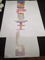
There was no clear headline within the page I chose but a caption that stood out the most. This is due to the bold purple colour used and the fact it is a heavier font to the rest of the type on the page:


Secondly I picked out the smaller caption. This again was not exactly standing out but due to it's heavy weight, stood out more compared to the bodycopy:


A even smaller caption was next, that was around the same size of the bodycopy. However it was bolder than the bodycopy font and in the same shade of purple as the first caption I removed. This links the two together to give a consistency to the page:


I then removed the journalist name as this was not standing out due to scale, but again due to weight. This is a re-occurring theme throughout this page and that it has used a lot of different weights rather than point sizes:


I then began to remove the bodycopy. As the composition was all grouped in the bottom half of the page, I found it easier to recognise what stood out to me first. It wasn't surprising that I cut them out in terms of the paragraphs the type was in and in a way that I would read them (right to left):


Again I sectioned the next type I removed within it's paragraph:


Final Type Hierarchy:

Final Information Hierarchy:

The information hierarchy was a lot clearer than the newspapers. The pages were much simpler in terms of the information on a page. I again organised this with the headings (captions) first and the bodycopy last. The information hierarchy did not differ greatly compared to the type hierarchy, both where quite similar in what I would look at first.
Take A Break
I chose Take A Break due to it being know as a cheap 'cheesy' woman's magazine. It is very chaotic and 'messy' in terms of it's design, which in my opinion, puts me of reading it. There is no consistency to the magazine as I counted at least 14 different fonts within the page I chose and 5 typefaces. I could not identify all 5 as there was not enough letters to answer the questions on identifont. If the magazine had being more consistent I could have possibly has more letters to work with.
The percentage of type to image is around 35 - 65 and story to adverts is about 50 - 50. What I think is not helping this design is that it has too many type and colour changes. It feels overloading and distracting to look at. I think if it had a more consistent colour scheme and less font choices it could be a more successful design.


I started by taking the advert headlines out first. I had great difficulty in determining which stood out the most and in what order. I took out all three main advert titles out and went by what colour was making them stand out the most:


I then went for the bottom advert of snickers, this stood out as they type was on it own with a lot of negative space around. The blue against brown helped with this and the fact it is a heavy weight as well:


I then took out the main headlines. The word 'toilet' stood out more due to the colouring used, even though it was the same scale as the rest of the headline:


I then went back to the advert side of the page as this was very type heavy and was all standing out for different reasons. I think I was having such difficulty in determining what was going to be removed next, due to all the colours merging together, nearly all the type was in heavy weight fonts and all at similar scales:


After most of the text within the adverts was cut, I went back to the editorial story and removed the subheading. It was in a thin font but was scaled up relatively big:


I then started to remove the captions within the story. This was because the type was slightly bold but it was also on a contrasting purple background which made it stand out against the bodycopy:


I then took out the smaller captions that were on a red background. The type itself was quite small but the colour is what grabbed my attention:


Removing more of the captions that were on the images due to coloured background the type was set on:


After I had removed things like the journalist names and all the smaller captions, I started on the body copy. This was easier to remove to due the images helping me in terms of what I thought stood out the most:


I first took out the bodycopy that would have been running around the imagery:


Final Type Hierarchy:

Final Information Hierarchy:

The type and information hierarchy have not differed greatly from one another. They both are extremely disorganised in whatever hierarchy and I feel this is due to the design of the magazine.
Vanity Fair
I chose vanity fair as it is a more expensive woman's magazine that focuses more on high end fashion. I wanted to see the difference, if any, between advertising and design between this magazine and the previous two. It was interesting as the design is much more cleaner and consistent compared to the others. However the advertising is far greater than the other two combined. Nearly all the first 10 pages were adverts for a high end product or designer which I was quite surprised with. As I got further into the magazine to the page I chose to deconstruct, nearly all the pages was like my chosen one - one half story, the other a full paged advert.
Within the spread I chose, there were 11 fonts and 3 typefaces. These were two specifically design for Vanity Fair and the other identifont could not find. I think this was due to the limitations of the letters I had. The percentage of type to image is around 45 - 55 to image and story to advert around 40 - 60 to adverts.


I started by removing the slogan at the bottom, as this stood out more than the headline of the article. This was due to the scale of the type as it is the same typeface and weight used throughout the article:


I then removed the main heading on the page as it was central aligned and had a decent point size:


I then proceeded to remove the tittle of the page. This was due to it being a different heavier font but on a smaller scale. What accentuated this type further was the colour, it was a white type on a red background:


I then removed the initial of the first paragraph. This was due to it again being red which contrasted against both white background and black bodycopy, but also do to the scale and size of the 'A':


I then removed both smaller subheadings that were above and below my first piece of text I removed. These were a regular weight but didn't stand out as much as they were a light grey colour. This looks aesthetically pleasing but not exactly ideal as they do not stand out:


The second light grey subheading:


I then took out the second, smaller initial of the last paragraph. Again the same as the 'A', it was in a contrasting red colour but on a much smaller scale:


I then moved onto the type on the advert. This did not stand out as it blended in with the background of the ad. It was also a very thin, light weighted font which did not help the type to stand out:


Again removing another part of the advertisement, the same typeface as the previous but in a smaller point size:


I then removed the editors name of the article. This was in a small but bold font, it also stood out against the body copy as it was all in uppercase:


Then proceeded to remove the bodycopy in the paragraphs it was set out in and the order in which I would read them:


Final Type Hierarchy:

Final Information Hierarchy:

The information hierarchy and type hierarchy both have consistency to them. Due to the design of the double page spread it does not look chaotic and both hierarchy's would be clear and easy to read. With the information hierarchy however, I again ordered the page with editorial content being the first thing the viewer would read and then the advertisement.
No comments:
Post a Comment