I was unsure where to begin with developing my website as I am still in the dark about coding and so not sure what is possible and what is not. However I began thinking about a possible name and logo for my website. I looked into words that could possible represent the ideas of my website however after consideration decided to go with 'Origin'. This is due to the nature of my website focusing on personalities, and how we all develop but our personality stays with us and is almost how we develop and come from. It also focuses well with the different coffee, and how each all start with the coffee bean - making that its 'origin'.

I have then started developing ideas for logos. As I wanted to show the personality traits of certain coffees, I thought creating something that had a humanised touch, such as a hand-written element could work well. From this I began sketching possible ways in which I could create my logo. I developed on the hand-written elements, thinking about how the type would flow and how the letterforms work with one another:
I decided I preferred the 'O' to have a flourish, rather than flowing onto the other letters. With this, the 'r' sits nicely and creates movement in the type. I am going to develop on this idea digitally so it is correctly proportioned and aligned:
Instead of scanning in my type, I decided to change an already existing typeface for my logo. This was due to me not been able to hand render the line width correctly and so thought doing this digitally would make it more precise. I chose a suitable script like font to work with and began removing elements such as flourishes that I did not think was suitable.
The changes I made to the type were subtle. I decreased the line weight, as well as slanting the type to create movement within the logo. I closed the bowl on the 'O' as I think it made the letterform seem more solid and structured, which I think contrasts well with the script like element. I also added a flourish to the 'g', underlining the word to create a sense of 'togetherness' within the logo.
I then began playing about with different colours, I started off experimenting with teals and purples as I wanted to think of a colour that could be different to the popular coffee chains, and that something that would not be mistaken for a different brand. I also experimented with adding drop shadows, both with solid colour and stroke. I think adding the drop shadow created extra depth to the logo, making it stand out more. I think this could be beneficial for my website as then the logo is the object that is going to grab the viewer attention.
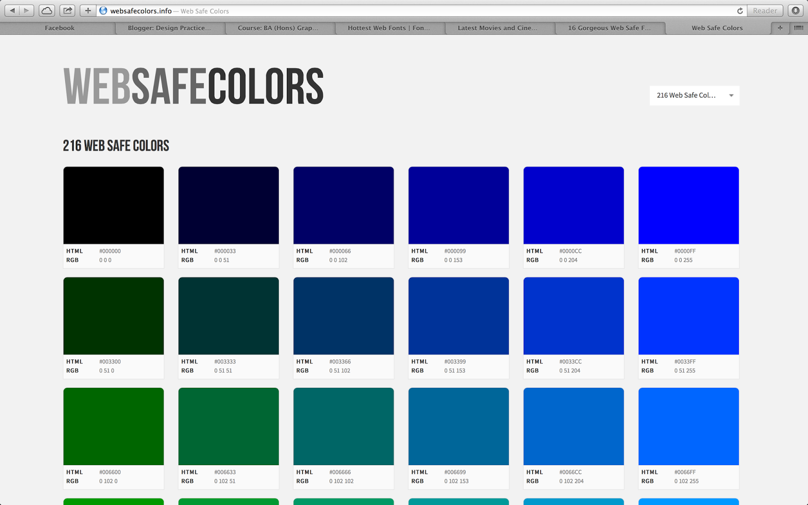
I then began looking into web safe colours. I was unsure on a solid idea for the colour, but knew I needed something that was unique to my website. Something that had its own identity, without connoting another brand or product. I also needed a strong colour to represent the idea of coffee, I knew I needed to stay away from browns and creams as I really do not want to be cliche with my colour choice. I though working with blacks and grey could possible show the dark, intensity of coffee as well as adding a secondary colour to create informality. From this I began quickly mocking up some possible ideas for colour:


I played around with selecting a teal and purple within the RGB colour mode. I also experimented with blue, however thought this would link back to Caffe Nero too much. I tried yellows and pastel however they seemed far too feminine for what is suppose to relate to both genders. I am going to keep with experimenting with teal and purple before coming up with a solid decision for my colour palette.
I have moved on into creating more detailed scamps for my website. I wanted to mock them up in more detail so I had a better idea of the what the design will look like. I have also tried to think about sizing and dimensions so I have an easier time when mocking my designs up digitally.
I have now moved onto creating my designs digitally. Within my design I knew I needed a cup illustration, this was due to me including how the different coffees look on each page of the website. I have sketched out a few different cup ideas to possible take forward into small info graphics:
I have digitally drew out a cup illustration and added the representation of the coffee and water. I am going to change this illustration accordingly on each drink to show what the different coffees are made up of.
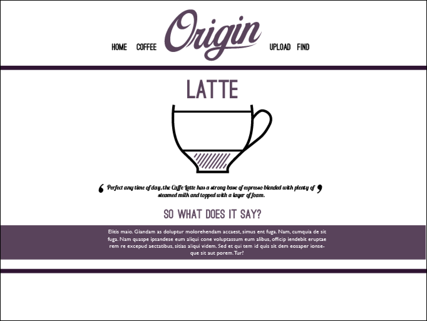
I have then begun mocking up layouts for my website starting with what a 'coffee' page would look like. Here, I have tried to follow my scamp with the same grids and measurements. However the design is very ineffective. The composition definitely does not look as though it would be suitable for the web. I feel the 'Latte' is far too big for the page, as it takes the attention away from the logo, while still not guiding the eye to the illustration. I feel the whole layout is un-proportioned and not breathable:
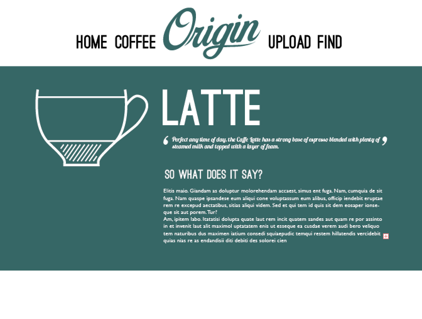
I have then tried a block colour to hold the information, that would bleed off the page. I feel this is not successful as I do not think the white text would be legible enough on screen. I also think I needed to create a smaller navigation as the type is far too big in conjunction with the logo. I feel at this moment in time my type hierarchy is completely wrong and I really needed to re-think the point size and keep in mind how this would look like on the web.

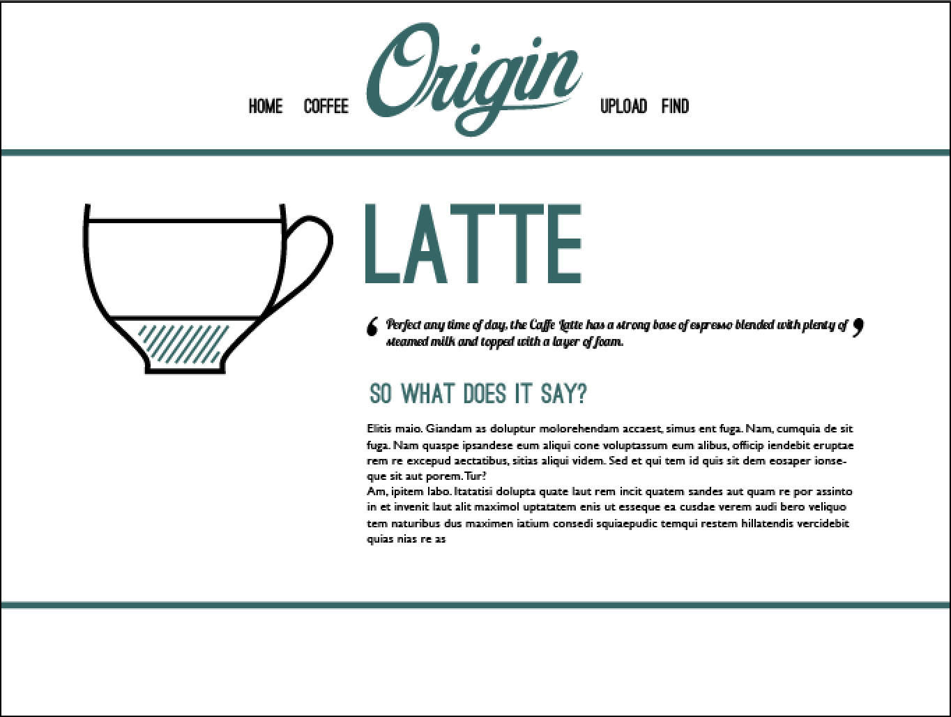
Following on from my previous experiment I have taken into consideration the point size of the navigation and feel this is far more appropriate for the screen. I feel it also has much more breathing space within the navigation, as well as not overshadowing the logo. I have also changed the block colour onto the stroke which I feel works far better than a full bleed of colour. I think I could work this border into my grid and create a continuation with this through all of my pages. I am going to develop on this idea and try it out on other pages of my website.

I was not overly impressed with the colour choice of teal and did not think it was working. I then moved onto experimenting with purple which think suited the page far more appropriately. I feel the purple shows the intensity of the coffee and contrasts well with the blacks and grey I am going to use. This is due to purple being quite a deep colour, while also still being quite friendly, hopefully this will invite viewers in. I am still looking for the most appropriate purple but am going to keep trying out layouts before settling on the colour.
I changed the layout quite drastically here. In keeping with the 'border' idea I tried everything centrally in the page. This was due to my previous experiments looking rather un-balanced and wasn't girding up well with the navigation. I thought if I aligned everything on the screen, it would flow much better with the logo, as well as creating a flow to the page too. I am wanting to create a single-page website for the 'Coffee' section and so feel the central alignment will suite this idea well.

I thought the page was slightly bland at this time but was unsure on how to move forward with my design. I then thought of including a bleeding image of each coffee behind the content. I thought this would give the page some depth and context. I much prefer this with photography, but feel it still has a long way to go in terms of composition. I have made the photography black and white, as the greys used show the intensity I am looking for without being cliche. I feel if I used colour images, the pages would not link together as well.
As I am going to have six different coffee pages, I needed to create the different drinks and how the beverages are created. I have used different lines to represent the different elements such as milk, water, cream etc to make up each drink. These are not supposed to show how to make each drink but are there as a focal point for each page and to briefly show the different layers in each drink and how they differ (just like how the personality differs).
I did not receive much feedback from my interim critique on how I could develop my pages aesthetically, they seemed to focus more on content. However I do not need to change my content it was more that I did not explain myself in the interim critique. However the small amount of feedback I did receive for the visual where as followed:
Work After Interim Critique
As I previously thought, in my critique it was suggested to perhaps use the logo with the drop shadow. This was to create more depth and make it more of a focal point to the website. They also suggested to make it black to focus of this idea of intensity. I completely agreed and have changed the logo accordingly:
I also need to come to some sort of definite decision on typefaces, for now I have been playing around with different fonts however have now chosen the following.
For my main headings and information I have gone with 'Ostrich Sans', this was due to me wanting a type face that was slim and structured to contrast with the hand-written element. Also as due to my research there are certain fonts which coffee shops use that are thin but bold and felt this typeface showed this perfectly.
For bodycopy I was undecided between gill sans and avenir. After discussing with peers I have decided to go with Avenir, I feel this linked well with the Ostrich Sans far better than Gill Sans due to the structured nature of the letterforms. I also feel the line weight is far lighter than Gill Sans, which again matches well with my heading type.
I have now moved on to developing my navigation buttons. I was unsure how to do this as felt I could not show distinction between a selected button or not. I tried using a grey however it looked far too washed out. From then I tried having a hover bar which worked far more appropriately:
I am wanting to include a gif as the main element on my homepage, however have not had the chance to research this properly. For this reason I am not yet developing my homepage till all other pages are complete. Because of this I have decided to start on mu 'Upload' page, in where viewers will read what coffee they are and upload thoughts and opinions on the study. I have started on some rough sketches for the upload page, thinking about how I could use my coffee icons as selecting ways to upload, while also thinking about different layouts and compositions.

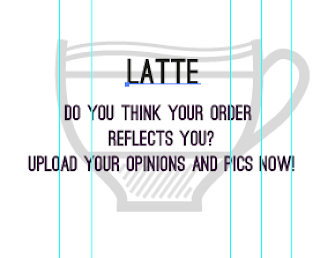
For the upload page I have used the different coffee cups as a way for people to select the coffee they are, which would upload their opinions to a particular coffee page they chose. This is all suggested of course as I would not have the time or knowledge to do this, but would definitely purpose this if this was to be taken as a live website. Each cup would have its own section for separate uploading. I have then begun developing the layout. After sketching I knew which layout would be the most appropriate and which would suite the coffee pages I have previously made. I have used my grid to place the coffee cups in line with the navigation. However I felt in doing this it did not have the same look the coffee pages have.
From the previous experiment I added the bleeding border/lines, showing consistency throughout the pages:
I then needed to create a hover button for each cup, to show the selection of which coffee they have chosen. When the viewer hovers over the image, the cup below will replace the full opacity image. It will look as thought the opacity has been dropped and the type will appear. When viewers click, it will take them into uploading something. I think this will work well as though it shows consistency, it can still be different due to the image and name of the coffee.

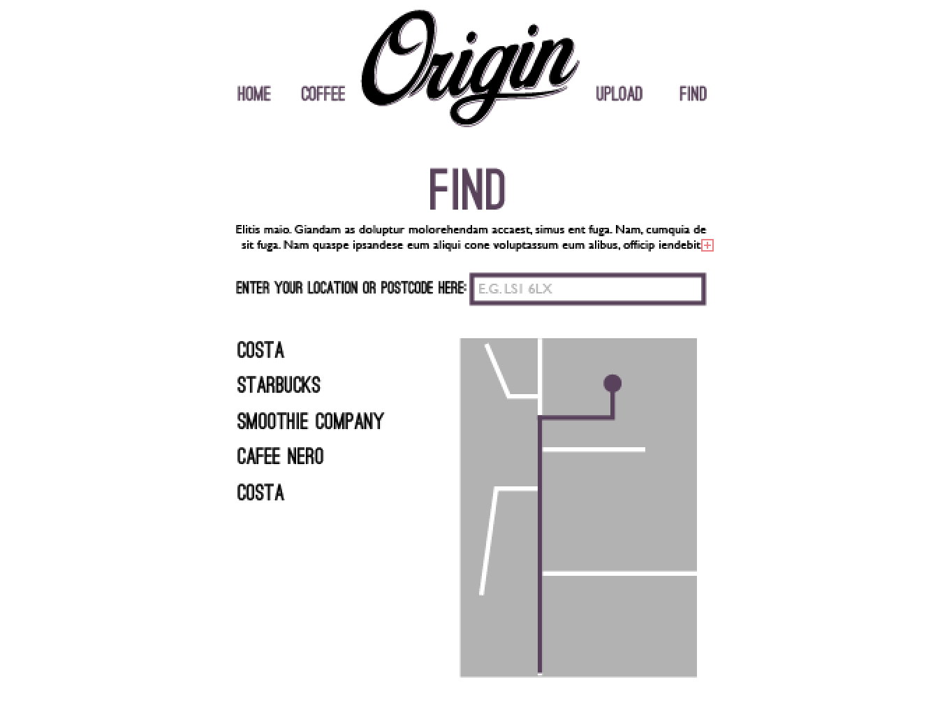
I am also going to include a 'find' page on my site, in where viewers will be on the website - reading about coffee - while also being able to find a store near them. It will work using the persons postcode to locate the nearest coffee stores near them. I have began developing a map digitally although new it was not work in keeping with the rest of my site. This was due to it being very flat in comparison to the imagery I have used on the coffee pages. I was unsure where to go with this and so discussed this with a tutor. He talked about how I could just include a google map on my site, as this is not going to be fully functional, he said it may just be worth while including an already existing map rather than trying to make one of my own accord. I much preferred this idea as I could work the map in a way where I could match the colour in relation to the rest of my site. Again like the upload page, if this was actually going live I would look into including an actual locator on my site, to make it have a more meaningful purpose.

I then screen-grabbed a googlemap and transferred the information across onto my site. I then changed the map into black and white (to match the rest of my coffee imagery) while including the purple used on the rest of my website for the markers and route.
In keeping with the rest of my site I decided to keep the same grid and border lines for the layout to keep consistency across all pages:
I have now finalised my colour scheme, I started off with trying out the purple to the left (#330033) however it was far too dark and to the peers and tutors I showed, thought it was black. I then thought about drooping the opacity (the middle colour) to 80% to create a lighter tone than I could apply to all my pages, it was rather de-saturated and seemed slightly bland. My concern with doing this is coding both colour and opacity across a number of elements on my site and so knew it would be beneficial to select a different shade of purple. After looking through the RGB colours, I have selected the #663366 (the furthest right). The colour is far more intense and effective and I will now not have to worry about opacity unless needed:
This is my final colour scheme, I have chosen black, a lighter shade of grey (#CCCCCC) which will contrast well with the purple:
I have now gone back to working on my coffee pages as I was not happy with the previous experiments. I am taking my own photography for my pages which, like the illustrations, will match the page accordingly. I played around with overlaying the type on the image and getting rid of the illustrations. The overlay made the type un-legible and so would not be effective for the site:
I have then worked the illustration back onto the photography as well as placing the type in a bleeding box across the bottom of the site. The typography itself is aligned with the navigation bar so everything is central. I prefer where this is going, however know it isn't quite there yet. There is something not working with the photography, and think there needs to be more breathing space across the whole site.
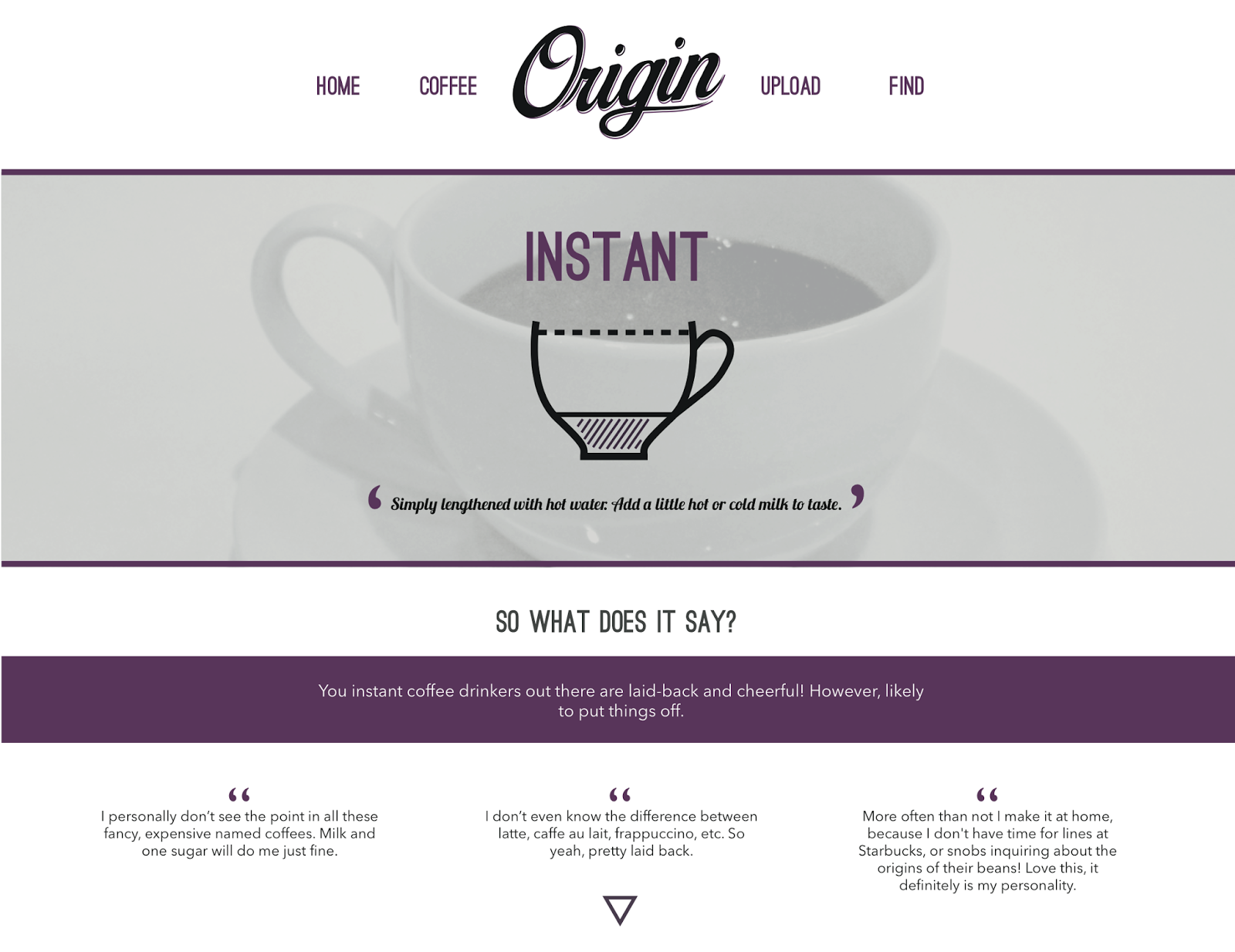
I had a small critique with my tutor asking his opinions on how to take it further. He agreed about the space, suggesting that I make things such as the logo smaller and reduce the size of the bodycopy. For the imagery he suggested to overlay a grey box to reduce the contrast within the image, so it doesn't look as white and noticeable. He suggested to make the image background noise as apposed to making it stand out further. In doing this the type and illustration become the focal points, which is what I am was aiming to do:


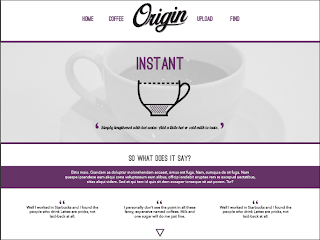
I developed on the page, changing the suggestion my tutor had made. I have also reduced the size of the illustration so it does not take up too much of the space. After also reducing the logo, and moving up the navigation, everything can breath more, making the site less overcrowded. I played around with different compositions, moving certain elements. I much prefer the image with the grey overlay as it definitely makes the rest of the content stand out and become the focal point.

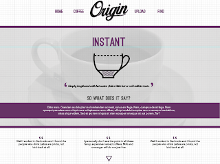
I then moved the bodycopy down towards the bottom of the page, making the photography smaller. I think I prefer this due to it allowing more white space across the page. I have added the quotes from different people opinions of the study, along the bottom of the page. All this is done to lead the viewers eyes down the page (hopefully continuously if I can make this into a single page website). If a single-page website cannot be done, I am going to make the 'Coffee' section a scroll, so the viewer still gets a sense of continuations through the different beverages. The only problem with that is the viewer would not be able to jump to a certain coffee. I will need to bare this in mind before coding:

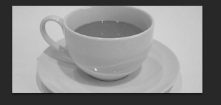
I have began photographing coffee for the imagery on the 'coffee pages'. I have resized these accordingly, however I feel I may use a mix of both my imagery and secondary imagery. This is due to me having to photograph in a coffee store, restricting my lighting, composition etc. I feel I have some good shots of certain coffees but none for others. This is where the secondary imagery will come into it. The drinks I was unable to shots of, I will use sourced images from the web. I initially wanted all primary photos but feel the mix of half primary and half secondary was the most appropriate to work with due to the restrictions:
Resizing from original image. I have made these black and white to show the intensity and darkness of the coffee, I also think in doing this the imagery will contrast well with the purple:
Coffee pages using the photography:
I have now moved onto creating my homepage. As shown in my scamp I wanted to create a moving image or gif for my homepage which showed some sort of steam that could create interaction to the site, inviting viewers to look further on the webpage. I experimented with steam even though I knew I wanted to film a coffee cup. I have done this before hand as I have never made a video before and was unsure on the software and how to create. I also realised I would need to film the cup or steam on a black background, as on white the steam would not show.
I began by converting my footage into black and white to link with the rest of my website. I played around with the tools on quick time, tools such as trimming the video, playing around with sound, type etc. This was to get an idea of how to work the software for when I film my actual footage for my homepage:
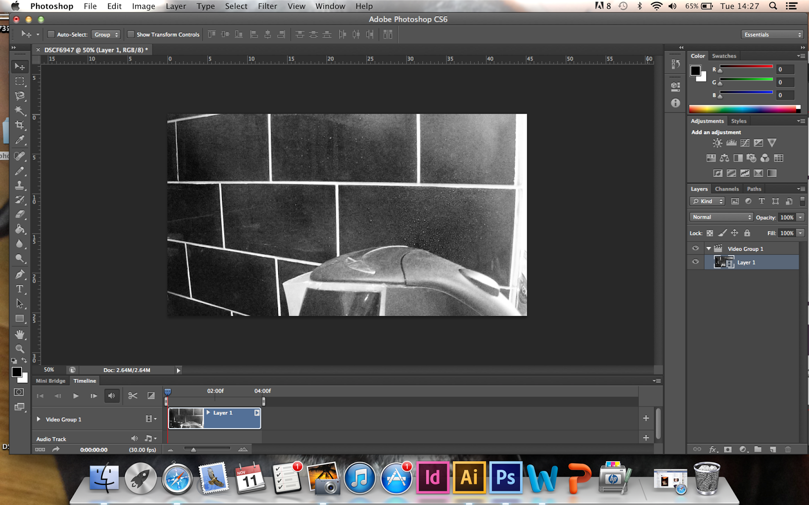
I then experimented with making this into a gif using photoshop. I exported the quick time file and made the video into layers that I could use to put into a gif maker. I feel in doing this experiment, it has now helped me know exactly what I need to do once I have filmed the correct content. Even though it is not an advanced thing to do, I feel it still has helped me develop a new skill, however small it may be:

Using the skills I learnt on my experiment, I have now filmed the 'coffee cup steam' that I am going to use on my homepage. We have now had an amendment to the brief that we do not have to code the website anymore. I am slightly disappointed that will not be shown how to code, but at the same time relieved due to the work load at the minute. I feel if I have time I am going to attempt to code a small bit of my website. However, because of this I am unsure how to show the gif with my content on it, to show how it would work as a website. Below I have shown the video that I would use (it would need to filmed on a better camera as it is not as good quality as I thought it would be) as well as showing a still of the video with my content overlaid for hand in:
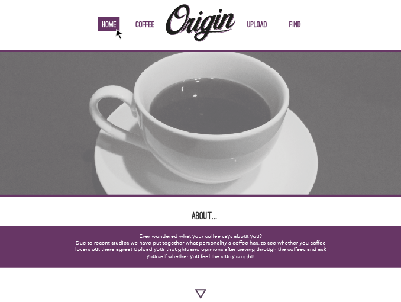
As I cannot code it all to work as a site, I have began using a still from the video to show how it would be laid out. I have used my initial scamp as reference for the homepage, tweaking certain elements to link in with the rest of the pages:
 Here the still shows where the video would be. I have cropped into the video as well as reducing the opacity to match the photography on the other pages of my site. I have used the same grid system as on the other pages, as well as continuing through the lines of block colour. I am unsure how I feel on the body copy as it seems like it needs more work, however I need the website to follow through, so think adjusting this will make the website not seem as consistent. I am unsure of my homepage, I am not sure whether it works on its own, but feel it would work in conjunction with the rest of the site.

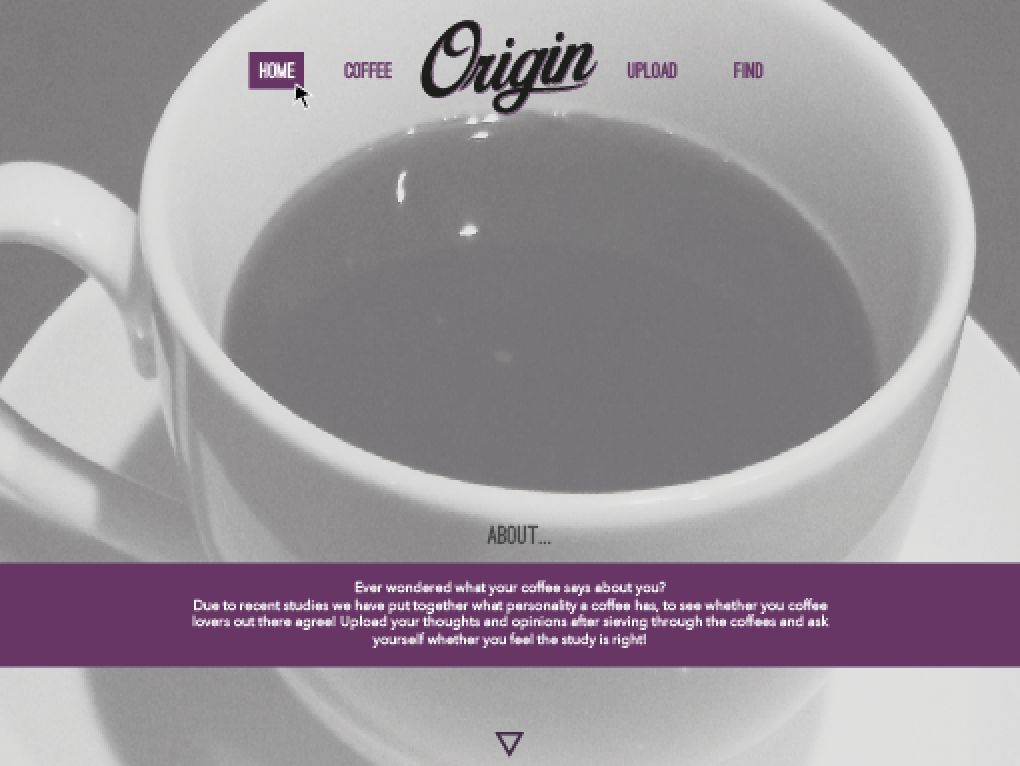
As I was previously unsure about my homepage, I started thinking about different ways I could develop on my scamp. I have tried bleeding the video of the page but feel the would not suite the rest of my website. For this reason I do not want to develop in drastically different as it is not going to work as a 'whole'. If I could re-do the site, I would definitely start designing the homepage digitally first as apposed to the coffee pages that I have originally started with.

I have then developed the responsive mobile site for my webpage. When I have scaled the type and illustration down, the line weight on the image has become far too heavy. For the mobile site I an going to select a thinner line weight for the illustration, as well as removing the quote of what the drink is. I feel the content does not need to be as heavy for a mobile site and so am going to remove any unnecessary information and content for smaller screens. I have also cropped into the photography more so the images are not as larger to load on the smaller sites:
Responsive Site (Mobile):


