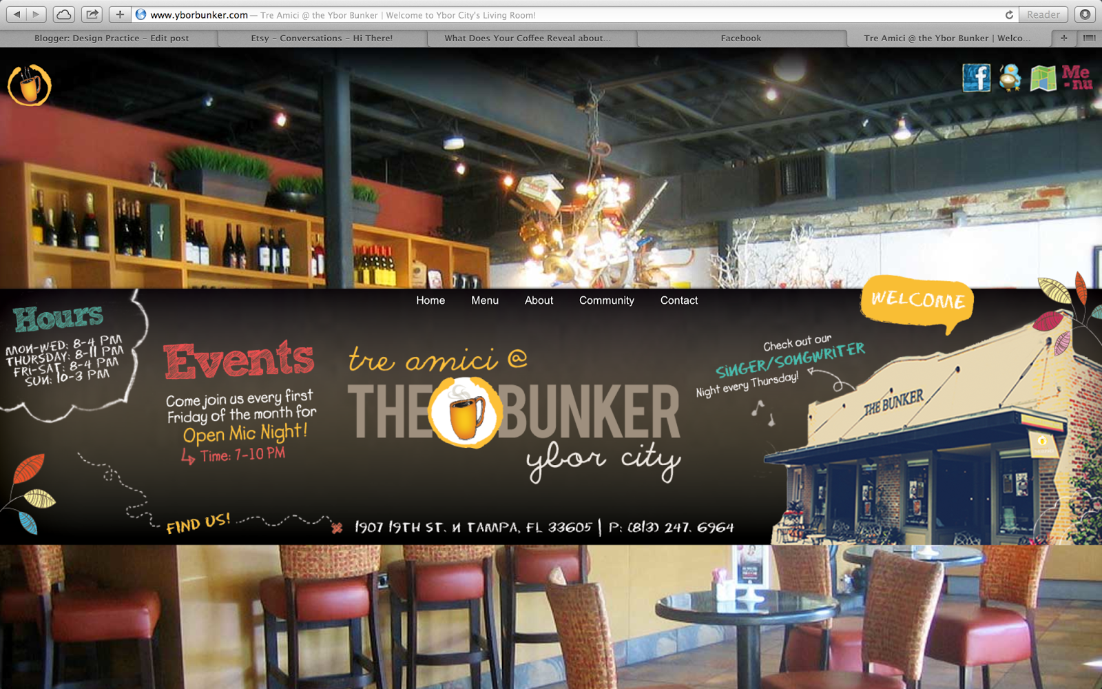
I have now started to look at websites that are more suited to what my actual site will be about, coffee. I wanted to get to grips with the types of styles and themes that were included on these websites, while also thinking about what make them successful or not.
I began by looking on 'yborbunker.com' a coffee shop in Tampa, Florida. As soon as I arrived on the homepage I felt bombard with too much imagery and chaotic type. I was not sure where to look first and felt the whole thing was slightly overwhelming - not the best initial thoughts for a website. I was unsure how to navigate the webpage which was another downfall of the site. When I came across the navigation bar on the top it slide the website over, taking me to another page. This again was in a similar look to the homepage, good for consistency but still far too overwhelming for the viewer. The mix of typefaces try to be informal with the hand-rendered look but to me feel far too childish and connote nothing about coffee. I feel this is the same for the imagery, they seem to be going for a 'collage' type appearance in how the imagery has been placed in random compositions along the block of colour, showing no grid system has been used. However instead of this coming across, in my opinion, it just looks in disorder.
Another thing I found was unsuccessful on this website was its menu. I selected the menu option on the previous page which instead of taking me to another webpage, took me to a jpeg of the menu. I felt this was a lazy option for the website. Not only that but feel the menu did not match up with the style of the rest of the website:
I then when on 'swisswater.com' who specialise in water purification and decaf coffee. I again was not overly impressed with this website as it seemed certain aspects were out of place. I feel you can see a sort of grid system within this, however certain elements such as the shape overlapping the image does not seem like it is evenly aligned. Certain elements like this, seem they have not been gridded properly. I feel there is too much body copy and how they have tried to highlight words and create some sort of hierarchy with the type is unsuccessful.
Again this is how I feel certain elements look strange. The 'experience' box does not match up with the previous pages shape. The shape is now far more condensed and the type fits in the box, were as on the previous the 'but that's ok' spills out of the shape, creating inconsistencies. What I do like on this website however, is the type for the headings. I feel the structured sans-serif connotes coffee in the sense of old-style type and how its got a high spacial framework. I do not dislike the colour scheme either, I think even though its obvious, it shows the idea of water and coffee well:
This was another coffee website I found unsuccessful. I feel there are no successful design decisions within the webpage and feel it looks very 'tacky' and 'cheap'. The imagery on the header looks childlike and the imagery showing the different sections of the website looks pixelated. It is very easy to manage due to the navigation and drop down menu at the top of the page. The gradients and obvious colour choice of brown add to the feel of it been slightly garish.
The reason I find 'Quills' coffee website appealing is due to the use of grid and type. The logo is what initially drew me to the site as I like how it has been inspired by traditional hand-rendered type. I think it shows the use of coffee quite well as it has an informal, friendly feel which would draw people into the shop and website. Although I have previously been drawn to websites with bleeding imagery, I quite like how this is contained within a box, as it shows an effective use of the grid while also been able to align information with this box. I also like how the navigation is aligned to the right, as the eye is led in its direction after looking at the imagery and the logo. The overall website is rather minimalistic and simple but works effectively because of this.
Another thing I found interesting with this website is how the gallery has been done. The use of the grid and how the imagery is positioned instantly gives the viewer an idea into what the shop and brand is about:
What drew me to 'Caravans' website was the use of type. I do not think it is an overly successful website as when you use the navigation, large text boxes appear with the content and I feel this look slightly out of place. However, the initial homepage works extremely well. The simplicity of the image with the negative space creates a breathable and artistic feel when first viewed. I love the mix of serif, sans and script as they all work in conjunction with one another as they are balanced well and no single one has been overused. This is something I am definitely going to think about when designing and thinking about type for my website. However I am unsure whether I'd be able to do this due to type restricting when designing for web? This is something I will need to think about and look into:


No comments:
Post a Comment