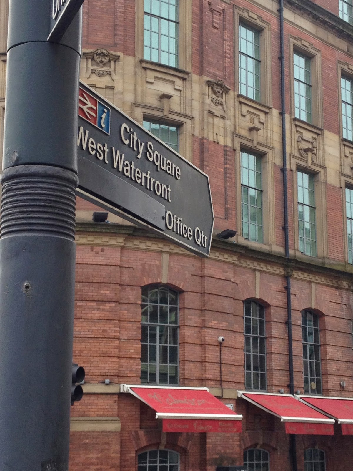
TASK - Document, Organise and Evaluate and ongoing investigation into type and typography using the principles, practices and examples introduced during the studio workshops as a starting point.
PureGym has an interesting logo within the
type. The ‘y’ is created to look like a person, which is further stood out by
the colour. Simple and strong typeface to represent the idea of a gym:
Mix of typeface created for a hairdresser’s
brand. Far too many different typefaces and too scattered across the window:
Both 'Hourglass' and 'Tempus Fugit' have serif typeface to show the traditional
building these are situated on in Leeds:
I like the ‘W’ as the overlapping element
creates something different and unique:
Logo. Use of removing the stems creates for a
‘rare’ and ‘unique’ type. Even though a big part of the type is missing, it is
still readable and legible:
Bar in Leeds:
Traditional typeface to show the
traditional element of getting measured and going to a tailors:
Clean, modern typeface. Curved to show
this. How it is etched into the side created for the industrial, formal feel. Supposed
to show luxury but I personally do not see this:
Interesting typeface as the type curves in
unexpected places for example the crossbar of the ‘T':
Readable and Legible typeface that is easy
to use when walking around Leeds:
Sans serif but where it is located look traditional.
Incorrect kerning, which makes the top type look squished and the bottom too
close together. Inconsistency throughout:
Decorative, flourished type that gives the
sense of sophistication as it reminds me of a signature. Script like fonts I usually
find too over decorative but this I quite like as it is quite restricted
compared to others:
Compared to ‘Malmaison’ this is exactly the
type of script font I find to be too over decorative. Tries to exude class but
I do not see this, I feel it look ‘tacky’:
Italian restaurant. Cross bar missing on the 'A' but still readable and recognisable:
Like the ‘Corn Exchange’ this type shows a
traditional feel due to the building it is placed on:
Script like font but subtle in its decoration
and flourishes. I do not however like the boldness of it, as to me for a script
font, it looks too ‘chunky’:
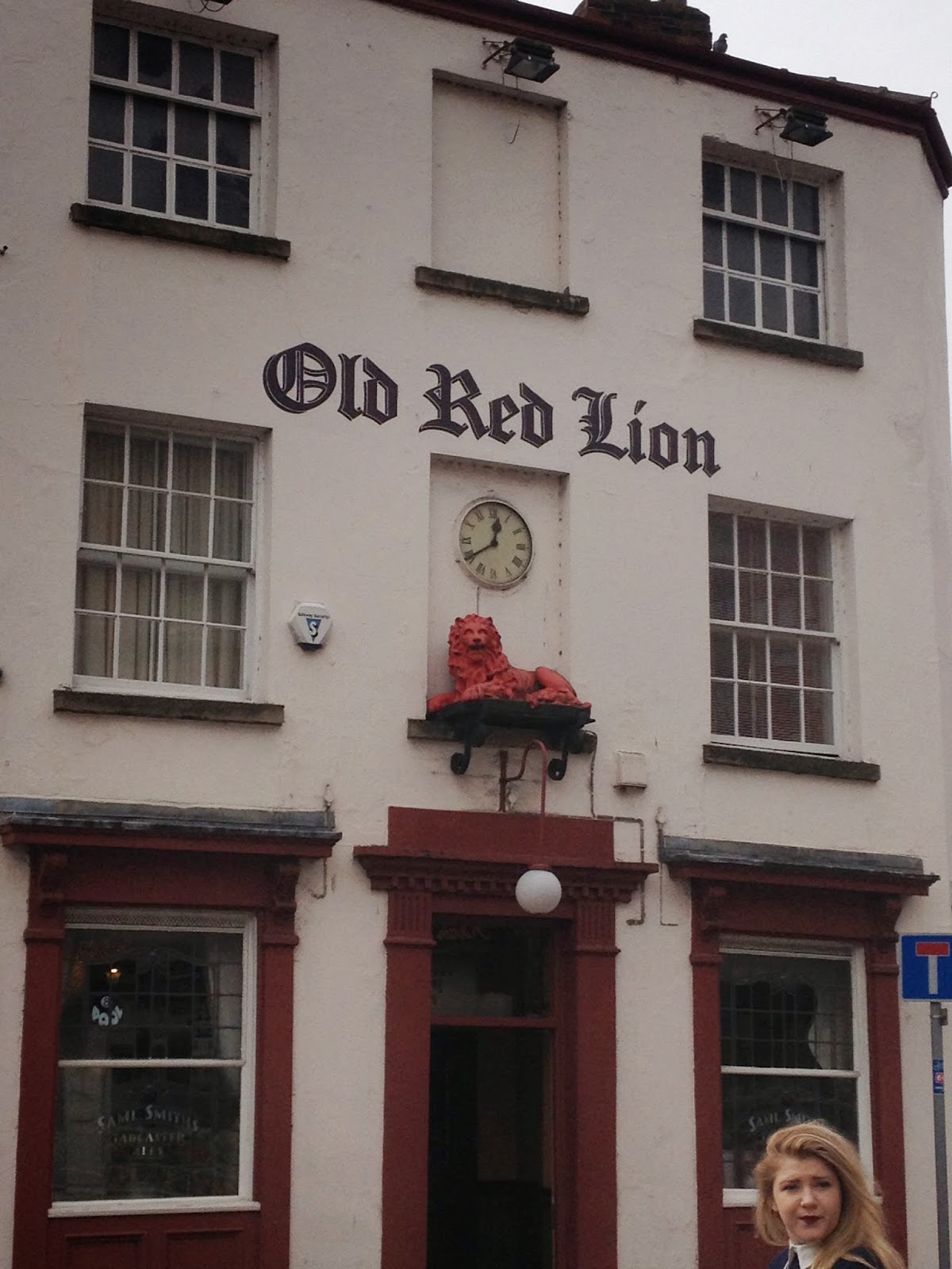
Both types for the 'Old Red Lion' have a huge contrast in looks. One is
over flourished and the other is not. Find the window type has incorrect kerning
and looks squished due to the placement on the window:
Sans serif type that is modern and its
flourishes at the corners give an appealing, friendly feel:
Historical looking type with quite wide
kerning. I feel this is to show the historical influence of the building
itself:


No comments:
Post a Comment