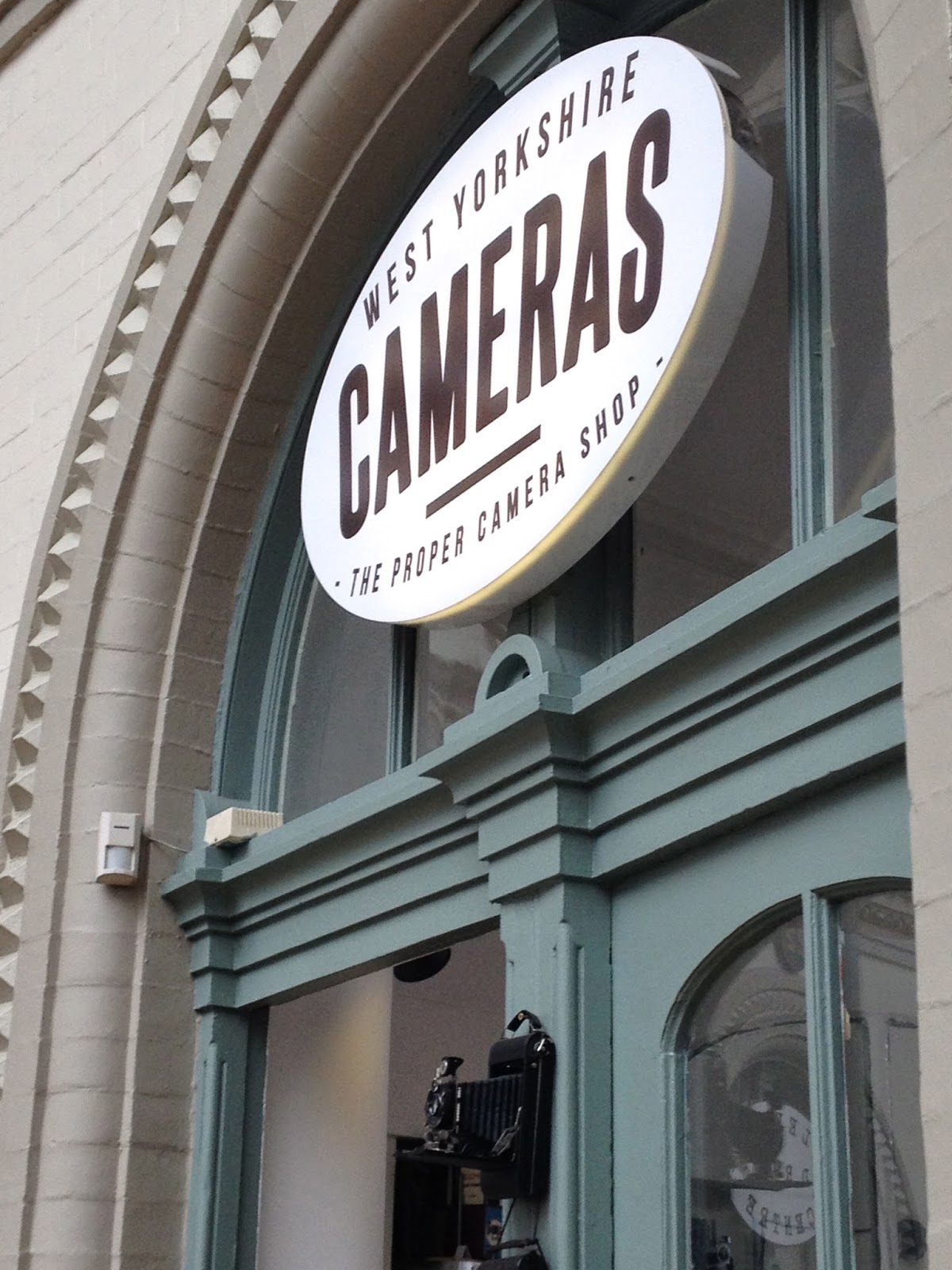
TASK - Document, Organise and Evaluate and ongoing investigation into type and typography using the principles, practices and examples introduced during the studio workshops as a starting point.
Found in Everyman Cinema. Interesting use
of block type. Incorporates both type and image together through the use of buildings
on the apex on the ‘A’:
Type found for a bakery. Tries to resemble
a mix of hand written fonts but the digital element comes across subtly. The
hand written element gives a friendly welcoming appeal without being childlike:
Bold stone type with different uses of
point size to create an interesting type hierarchy:
Traditional looking type situated in the
Corn Exchange. Showing the historical influence of the building itself:
Found in the corn exchange:
Hand written type to show the ‘vintage’ element
of the store:
Board outside the Village bookstore. I like
the use of the different point sizes and weights. The justified type makes for
a successful piece of design. I like how they have used a whole typeface with
the different font family’s within it - as this makes for better consistency:
Bar in Leeds. Silicone typeface which tries to
give an ‘old-style’ look due to the serifs and drop shadow used:
In the Topshop store window. Nice use of block
type as it is actually 3-D. Both 3D element and typeface itself creates a more
impacting look:
Found in friends house. Do not like the
grid used and scaling of the point size as it seems too much of a mix. The grid used does not
help this either:
Creates an old and traditional feel,
however it is something modern trying to look old:
Thought the numbers where interesting as
again it is something new trying to look old. I like the flourishes on the
numbers, as they give a delicate and feminine quality:
Printed type on a cupboard. Interesting as
I am not sure whether this is a design choice or not. Like the faded bold
quality, which matches the décor of the cupboard itself:
Cover of ‘Typographic Elements’ book. It has a mix
of type showing the letter ‘E’. I do not think it has an appealing quality, as
it looks jumbled and chaotic. Not effective use of typography:


No comments:
Post a Comment