Thursday, 4 June 2015

Design Practice 2 - Module Evaluation - OUGD505

OUGD505 has been one of my most enjoyable modules so far in terms of briefs and what I have produced. It has allowed me to explore new techniques as well as new skills. Due to the briefs, I have explored information that I otherwise would not have done. Biomimicry is something I now have a keen personal interest in and something that I will always look into. In conducting the research it has made me more aware of the environmental issues that are at bay within society and made my opinions more informed and relevant of the subject matter. Looking into theorist is something that I would never have done either, however through ‘Covered’ I am now keen to read and understand more of Foucault’s works. The module has made me much more confident in using the resources on my own. Normally I only use them when need be, however taking it upon myself and doing it independently now has given me great confidence to keep using the resources at my disposal, as this only benefits me and my work.

This module has made me think about new ways of working, methods such as screen-printing has only improved the aesthetic of my work. Not only that but using new materials such as spot varnish have created intrigue and depth to the work I have produced. Spot varnishing was a huge challenge for me within the covered brief, however is something that I now feel confident to try again. Looking into interactive print is a new method I have researched into through my Biomimicry work. Although I was never able to produce a lenticular image, I now have knowledge and information on the subject, which I otherwise would not have done. Another method that I used was using museums and exhibitions as key research within Brief 1.


I feel a strength within my work this module has been how experiential I have been in terms of ideas as well as production. In doing this it has added greater depth to my work and made my final outcomes that bit more interesting. I feel as though my design decisions have been much more informed and conceptual. I have used my knowledge and research to create more insightful work. There have been some challenges though within this module, time management has been a huge issue, however this was made easier with my extension. Time management is something I am normally good at, however has not been the case within the module. This is something that I will get back to doing at Level 6. Due to this I have not put as much time into things I would have liked, such as blogging. This is something I will get back to doing on a daily and weekly basis, compared to leaving it at the last minute like I have done this time. Another issue I feel that has let this module down has been primary research, both within the research brief and in general. I could have conducted further primary research for the biomimicry brief instead of just solely going to exhibitions. First hand book research could also have been used for ‘Covered. Now I know where my weaknesses have lied, I can rectify this for future modules.

Design Practice 2 - Covered: Finals and Evaluation - OUGD505


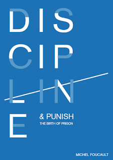
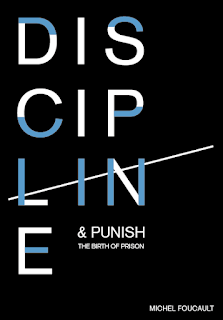
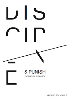
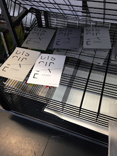
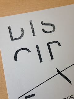
I am overall extremely pleased with my outcomes for 'Covered'. It is one of the few pieces that I actually do like and am proud of, which in itself is a high achievement for me. What I feel helped within the brief is choosing a book that I actually engaged with and had interest in. I was extremely dubious about this brief initially, as I thought the dense reading and theoretical books would be off-putting, however this was just the opposite. 'Discipline and Punish' had views and thoughts that I completely agreed with, which in turn helped think about more relevant concepts and ideas. I think it helped developed my thought process, and think deeper into conceptual design. The idea of using an inmates time and space as the basis of my concept shows a clear thought process from content of the book to final outcome. What has also been a successful within this brief is pushing myself and having the confidence to screen print on my own. Screen printing has always been something I prefer the aesthetic of compared to digital print, but due to confidence did not feel I would have been able to produce successful work. This is what has changed within not only this brief, but the module. It has pushed me to use more resources at my disposal, and in doing so, has benefited my work greatly. Experimental work has also been a improvement within this brief, trying and testing out spot varnish (although challenging) is now something I would feel confident to use again. This I feel was one weakness with this brief, I think the spot varnish did not come as strong and as noticeable as I would have liked. This was perhaps due to stock. However know I have experimented with this, I can apply my new knowledge of the material to future briefs. 

The Exhibition:

Wednesday, 3 June 2015

Design Practice 2 - Covered: Development - OUGD505

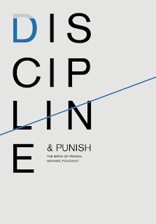
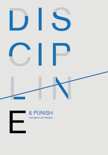
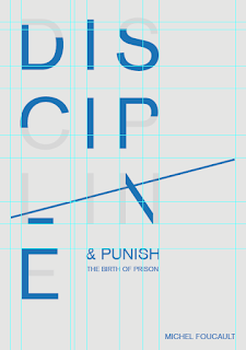
As the majority of my development was decided through sketches, there was not a lot of digital development that needed to be done. It began by removing pieces of the letter using pathfinder, and re-joining them together to create a positive. Once the letterforms had been broken up, the layout was the main element that needed to be decided. 


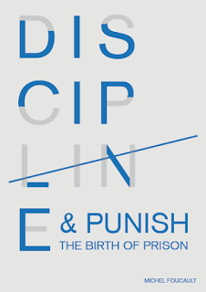
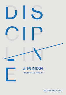
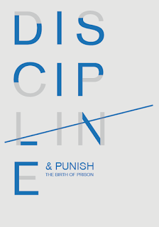
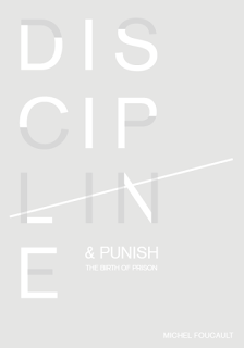
As part of my concept was including tally lines, this needed to be applied to the design. This was going to printed onto spot varnish, so it was quite difficult in knowing how this would look. The idea would be the letters 'LIN' have stems that can be used as the four main components, the solid colour line would then be struck through as the fifth. This is why the type is disordered in this way. The disorder of the letterforms show how an inmates time is broken up hour by hour, where as the structure and minimalistic look shows the timeliness and soul elements. I initially attempted the tally line to be bled of the page. however in doing this, it would not convey the message as clearly. This needs further development. 


When I came back to these designs, layout and composition was the first thing that was experimented with. The rest of the title along with the authors name were then included. A strict grid was used to work with the idea of structure and control (a key theme within the publication). The tally line was brought so it aligned more with the 'LIN' letterforms. It was exaggerated slightly so the layout could be more interesting. Experimentation were tried by aligning the author name along with this. 


Colour then needed to be experimented with and finalised. The design aesthetic needed to be minimalistic to convey the concept of timeless and the soul, the colour also needed to represent this. Black, white and grey were the obvious choices as they communicate a minimal, yet timeless feel. Blue was also experimented with as a deeper blue has connotations of a regal, powerful and serious nature. As these will be screen printed, all the colour choice can be tried and tested to which looks the most appropriate. Spot varnishing also needs to be considered, as there is no colour to this, the stock choice needs to be as dark as possible to ensure it is noticeable. 


Positives for screen printing:


After the poster was finalised, the book cover needed to be developed. This was going to be the same design as I wanted both cover and poster to link and synthesis as much as possible. The tally line was extended over the spine and onto the back to bring both sides together. The blurb was added and the positives created so this could be spot varnished alongside the poster. The same stock and colours will be used for both to create continuity. 


At first it was quite challenging getting back into screen printing as it had been so long since I last printed. I had many mistakes on my first attempt due to bleeding the screen. I had not been holding the squeegee correctly, hence the mistakes. The screen was cleaned off and the process began again. This showed me I do need to start expanding the briefs and my way of working as process and techniques get forgotten about. 


Once I had managed to print a few copies I got back into the printing and began to experiment. I tried the design on a number of different stock including deep blue, different shades of greys and white. Once dried, the spot varnish could then be applied. This is where the difficulty of the whole brief lied. After a conversation with a technician, I knew the varnish would dry quickly, however did not realise just how much. After a few pull the screen would become blocked and drag on the designs underneath. There were plenty of designs that went wrong because of this. Another technician suggested I add a small amount of water to the varnish to help with this problem, it was also suggested to get the alignment as perfect as possible and not align each individual one. I then proceeded to do both these, which then helped in more successful printing. 


Design Practice 2 - Covered: Research - OUGD505

Research began by looking into theoretical and philosophical book covers, this was to get an understanding of the types of designs that are included on such books and how they differentiate against novels and other books. As my key ideas are based around typography, this is something that needs to be looked at within this research. 
Firstly 'Slavoj Zizek, Absolut Recol' was looked into. What I found interesting within this works is the mix of types that create an interesting visual. This has been done to showcase his thoughts on the mix of naturalism and materialism and how this has failed to meet the challenges of the modern world. Has the chaotic nature of the hand-written font, against the grungy sans serif been designed in a way to show how these have not matched the challenges?(the typography not matching up) This, against the metallic nature of the covers stock creates for an eye-catching outcome. Does the material of the stock reinforce the idea of materialism itself? 


The message of this book is communicated instantly to its viewer due to the imagery, this, alongside the title 'Identity and Difference' it is obvious what the book it about. The book focuses on two key concepts the 'consciousness and the self'. The difference angles of the images are there to show these concepts. Illustrating the different sides of our identities and how they change and differentiate. The type alongside the imagery is clean and structured. This makes it so the imagery is key and the title is not overpowering, which created balance to the cover.   


'Renowned Hungarian filmmaker Béla Tarr has followed the collapse of the communist promise. The time after is not the uniform and morose time of those who no longer believe in anything. It is the time when we are less interested in histories and their successes or failures than we are in the delicate fabric of time from which they are carved. It is the time of pure material events, against which belief will be measured for as long as life will sustain it.'

Above is how Jacques Ranciere's book has been described. It perfectly sums up the design decisions on the book cover. It states how the book discusses how we are no longer interested in history, hence why a structured, detailed serif font has been used. Serif fonts connote the idea of class and history due to the origin it has, giving it a clear link the themes within the book. It also states ' the delicate fabric from which they are carved', the typography has an origin on historic influence and how type was carved from stone. The type on the book cover has been engraved, relating back to the historic influences and origin. The stock used is also a texturised stock, almost a 'delicate fabric'. Altogether the cover has been carefully thought about with the design decisions linking back to the concept and themes within the content.   


The book discusses the means of technology based communication. This is abundantly clear by the use of imagery. The sound waves like image symbolises the idea of media and technology, linking back to the content of the publication. What is also interesting is how the title has been displayed. They have included '…' which connotes something is coming after, due to the title name, the links well with how it has been written. 


In this text, Flusser explores different perspective and relations of objects from every days life, challenging the way we understand and see things. He apples a fluid and imagisitc style of phenomenology to this text. This is shown through the motion like grid that has been engraved on the cover. Flusser examines how we can perceive things differently with more understanding, this is shown in the gird as it could be interpreted differently at different angles. It changes dependent on how we see it, which is the basis of the publication. This links both cover and content together extremely well. The simplistic layout and gold colour scheme contrast well with the fluid like grid, making both text and 'image' work together. 


After looking back at my initial ideas I realised, as it was relevant, spot varnishing would be something I am interested in exploring within this brief. I have began looking into spot varnish designs, thinking about how this could be applied to both book cover and poster. I also took it upon myself to have a discussion with one of the print technicians in the screen printing resource, as I was unsure whether printing with the varnish was a different process. The technician explained how spot varnish tends to dry much quicker that normal inks, so printing needs to be much quicker. If not, the screen can become blocked. I felt like this can be done as I am quite confident with screen-printing and feel trying new techniques will only improve this. 


Design Practice 2 - Covered: Initial Ideas - OUGD505

BRIEF - Choose a publication by a theoretical or philosophical thinker who's views and thoughts resonate with me. Once an understanding has been made on the content, develop the book cover that communicates something from it, this should go work with and go alongside an A4 poster. These need to be two-colour prints plus stock. 

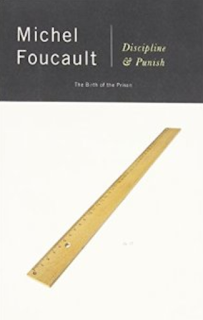
The book I have chosen to analyse is 'Michel Foucault, Discipline and Punish'. When studying different philosophers and other possible books, his work really stood out as his key points and issues within the text seem to have great interest and value. Foucault was a French philosopher, historian of ideas and social theorist, among others.  


'In this brilliant work, the most influential philosopher since Sartre, suggests that such vaunted reforms as the abolition of torture and the emergence of the modern penitentiary have merely shifted the focus of punishment from the prisoner's body to his soul.'

Other Designs of the Book


This brief began by analysing the book and taking notes on the views and thoughts of Michel Foucault. I read the summary to get an understanding of what the book was about and the types of themes that Foucault argued and examined. This was to also done to engage with the book in order to be able to extract possible concepts and ideas. 


After the publication was read and understood, ideas and concepts for the poster and book cover were thought about. The initial ideas that were thought about was the idea of power, I thought about how this could be shown through power plans or electrical boards. There was also the idea of how the books title is the birth of prison, there seemed to be possibilities within that as 'birth' is such a powerful word. Another idea that seemed to intrigue me was the idea of timelessness, as one of the themes within the book discusses how an inmates life can be controlled hour by hour, I thought this could have the possibilities to create some interesting visuals. 


Development on these ideas began by sketching out some possible thumbnails for visuals. In a critique we discussed our book and ideas to get possible feedback and further routes to go down. My peers suggested to me that the 'timeless' concept seemed the most interesting of the three. They suggested to look into how something could be removed, as though prison was taking something away from them (their time and awareness). They also suggested how different printing techniques could further this, such as spot varnishing. These idea were extremely valid and something that I then began looking into and researching. 


After research and thumbnail development, I had come up with the idea of removing parts of the title. These however would still be visible through spot varnish. This would add to the idea of removing the prisoners time, communicating the message the Foucault examines, that the torture has gone from the body to soul. As the punishment is now in the prisoners mind, I thought it would be beneficial to create my cover/poster very minimalistic, simple and structured as this fits in well with the 'soul' part of the theory. Layouts and compositions were then drawn up and sketched. Upon development and by looking back at my ideas, I came up with the idea to push the spot varnish further. I could use this to show a very subtle tally chart. This will communicate the 'time' concept further, as the inmate would be counting down the days until released. As I was extremely happy with my ideas so digitally development then began. 

Design Practice 2 - Study Task 5: Book Analysis - OUGD505

TASK - To find and examine a theoretical book of my choice. Study the book to gain an insight into its themes and content. 

The book I have chosen to analyse is 'Michel Foucault, Discipline and Punish'. When studying different philosophers and other possible books, his work really stood out as his key points and issues within the text seem to have great interest and value. Foucault was a French philosopher, historian of ideas and social theorist, among others.  


'In this brilliant work, the most influential philosopher since Sartre, suggests that such vaunted reforms as the abolition of torture and the emergence of the modern penitentiary have merely shifted the focus of punishment from the prisoner's body to his soul.'


Discipline and Punish, wrote in 1975, examines how the changes of punishment have undergone during the modern ages. Before this, criminals were disciplined by torture on the body which then changed by creating the penal system. No longer were these criminals chastised by inflicting pain on the body, but to reform and torture the soul. Foucault examines how this change created such social control, that it gave those 'in charge' more power in controlling the inmates. It was suggested in doing this, the inmate is much more tested and punished as they are now dominated. Their space, time and awareness went completely. In this text Foucault then examines how this is applied to everyday life. An inmate is controlled through a timetable, how they live, when they eat, when they go outside, is all in another persons hands. He goes on to compare what degree is this in places such as schools, factories, barracks, hospitals etc and 'how they all share a common organisation, in which it is possible to control the use of an individuals time and space hour by hour'. 

As I have just summarised the book and not read the text entirely, I am unsure just how dense the reading is. However I find the whole concept extremely interesting as it creates a valid point to how we are controlled within society. I feel both the book itself and what it stands for, as well as my interest in the subject matter, will benefit and allow for an interesting book cover and poster. 

Design Practice 2 - Studio Brief 1 (Part 2): Finals and Evaluation - OUGD505


Product, Range and Distribution has been a very enjoyable brief for me this year. My subject of biomimicry has engaged me and kept my interest for the entire brief and is something that I am now looking into developing further in a Level 6 module. Due to me enjoying my research that I conducted in part one, I was able to enjoy creating the practical side to it. The overall concept of my practical is something I am pleased with as I took on what Biomimicry is actually about and applied this to the design. My idea was based around how Biomimicry takes from one thing and apples and develops into something new. The idea of the interactive posters is something that is not only relevant to the topic at hand, but engaging also. Even though my designs had to be printed through layers of stock, the final outcome would be proposed as a lenticular. The tracing paper acts to see how this would work. 

The overall aesthetic is relevant to Biomimicry and technology due to structure and geometric forms, however I am unsure whether there is something missing from the designs. However I feel when this would be a lenticular, it would change the look completely. I was able to experiment with screen-printing within this brief, which again is something I am now much more confident with thanks to this module. I also experimented with metallic inks which is something I was interesting in trying out and testing. This is where the weakness lays within my outcomes, the metallic ink has not come out as bright and as vivid as I was hoping for. This again was due to stock choice and darker papers needed to be used. I was unsure how the metallic would print, but now I know what stock is needed, I would be happy to experiment with them again. If this brief was to be expanded the posters would be developed into a series, using the same lenticular idea. A 'shark and boat', 'mosquito and needle', 'whale and wind turbine' posters would be developed and printed. In doing this it would create more of a campaign of sorts, getting Biomimicry into the public eye more.