As the majority of my development was decided through sketches, there was not a lot of digital development that needed to be done. It began by removing pieces of the letter using pathfinder, and re-joining them together to create a positive. Once the letterforms had been broken up, the layout was the main element that needed to be decided.
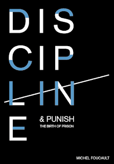
As part of my concept was including tally lines, this needed to be applied to the design. This was going to printed onto spot varnish, so it was quite difficult in knowing how this would look. The idea would be the letters 'LIN' have stems that can be used as the four main components, the solid colour line would then be struck through as the fifth. This is why the type is disordered in this way. The disorder of the letterforms show how an inmates time is broken up hour by hour, where as the structure and minimalistic look shows the timeliness and soul elements. I initially attempted the tally line to be bled of the page. however in doing this, it would not convey the message as clearly. This needs further development.
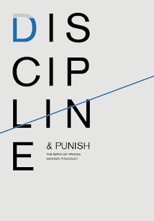
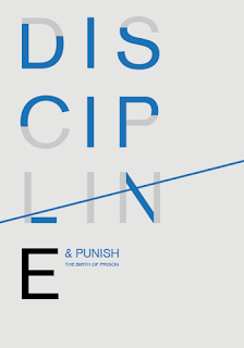
When I came back to these designs, layout and composition was the first thing that was experimented with. The rest of the title along with the authors name were then included. A strict grid was used to work with the idea of structure and control (a key theme within the publication). The tally line was brought so it aligned more with the 'LIN' letterforms. It was exaggerated slightly so the layout could be more interesting. Experimentation were tried by aligning the author name along with this.
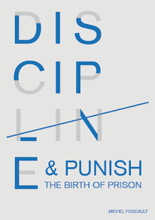


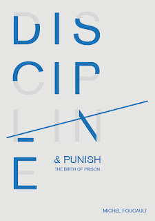
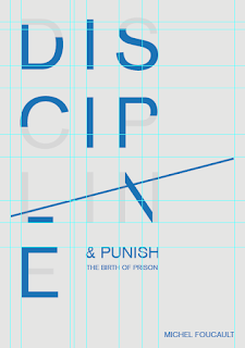
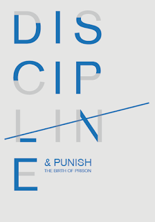
Colour then needed to be experimented with and finalised. The design aesthetic needed to be minimalistic to convey the concept of timeless and the soul, the colour also needed to represent this. Black, white and grey were the obvious choices as they communicate a minimal, yet timeless feel. Blue was also experimented with as a deeper blue has connotations of a regal, powerful and serious nature. As these will be screen printed, all the colour choice can be tried and tested to which looks the most appropriate. Spot varnishing also needs to be considered, as there is no colour to this, the stock choice needs to be as dark as possible to ensure it is noticeable.
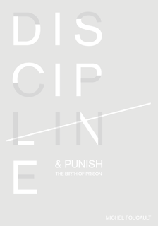

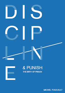
Positives for screen printing:
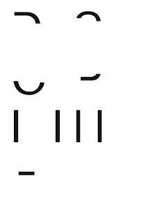
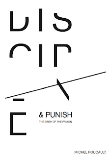
After the poster was finalised, the book cover needed to be developed. This was going to be the same design as I wanted both cover and poster to link and synthesis as much as possible. The tally line was extended over the spine and onto the back to bring both sides together. The blurb was added and the positives created so this could be spot varnished alongside the poster. The same stock and colours will be used for both to create continuity.
At first it was quite challenging getting back into screen printing as it had been so long since I last printed. I had many mistakes on my first attempt due to bleeding the screen. I had not been holding the squeegee correctly, hence the mistakes. The screen was cleaned off and the process began again. This showed me I do need to start expanding the briefs and my way of working as process and techniques get forgotten about.
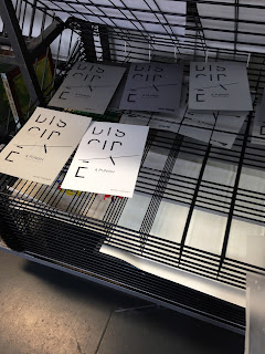
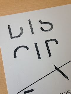
Once I had managed to print a few copies I got back into the printing and began to experiment. I tried the design on a number of different stock including deep blue, different shades of greys and white. Once dried, the spot varnish could then be applied. This is where the difficulty of the whole brief lied. After a conversation with a technician, I knew the varnish would dry quickly, however did not realise just how much. After a few pull the screen would become blocked and drag on the designs underneath. There were plenty of designs that went wrong because of this. Another technician suggested I add a small amount of water to the varnish to help with this problem, it was also suggested to get the alignment as perfect as possible and not align each individual one. I then proceeded to do both these, which then helped in more successful printing.


Thanks for information , i like your artikel becouse your artikel so nice .
ReplyDelete