BRIEF - To creatively bring to life Propercorn's ethos of 'Done Properly'. Consideration needs to go into the daily touch points of a customers life, where they will be most recpetive to engagment. This is quite an open brief so ideas and concept can be as creative as possible.
As part of the responsive module, a collaborative brief needs be done. This can be eithier a YCN or D&AD brief with as many and whoever we would like to work with. The group I am with are:
Jess Johnson
Lucy Stronach
Taylor Pycroft
We started collaboration by deciding which brief we would all like to work on. After discussing with one another we decided as Propercorn was such an open brief with fun personality to the brand, this would be suited to each of are strengths and what we enjoy doing within graphic design.
After the brief was decided on, development on Propercorn was started. We began writing down what Propercorn was all about. Whether this be what the target audience was, the personal experience Propercorn go for etc. We also thought about how we could tackle the brief, using the themes we picked up on about Propercorn and thinking how we could take these further.
We realised quite early on that Propercorn had a quirky, fun brand identity that we would like to keep in mind for this brief. It focuses a lot on being ethical and healthy and we thought this needed to be brought to people attention more. The ethos of 'Done Properly' could be shown in a number of ways, because of this we needed to think about what we wanted to zone in on within the brand. We began thinking about possible routes we could go down.
Possible Ideas:
- Propercorn boxes: more environmental friendly, recyclable, possible handle?
- Perforation of cinema tickets: two for one, 10% off, Augmented scan element?
- 'Cinema experience'
- 'Graze' Box
- Augmented: Sweded remakes
- Healthier option
After a lengthily discussion with my peers we decided on what we wanted to do for this brief. We decided to show the ethos of 'done properly' through a cinematic experience. This would mean we would convert the Propercorn bags into boxes that could be recyclable. The box would have an augmented element which viewers could scan and watch certain clips or games on their smart phones. As the target audience is young professionals, 20 - 35 year olds, we thought about how we could get them engaged. The augmented element will do this, it can be done when commuting, on dinner breaks etc. It also adds to the ethos of 'done properly' as the idea is not only environmental friendly but engages the viewers through the app also.
We devised up the research between one another. I went on to research further into Propercorn as well as looking into Sweded cinema and other possible routes to go down for the augmented element.
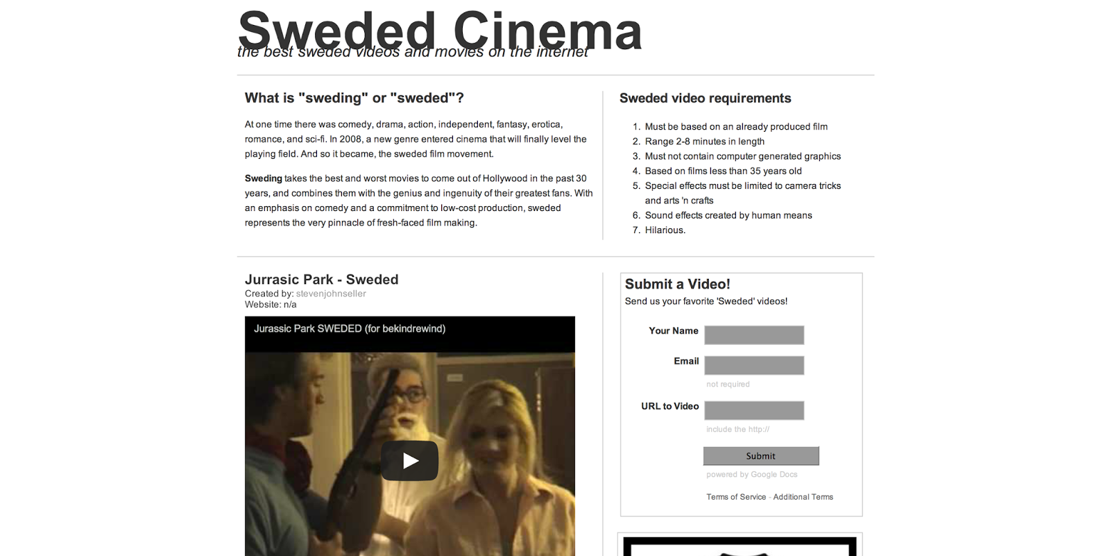
I began looking into the Sweded cinema and what it was all about. It takes the best of the publics remakes of Hollywood films and puts them out into the public eye. It focuses on comedy, however I felt it would only engage certain personalities. I personally only found one of the clips humorous, however one of peers enjoyed quite a few. I found this may not engage all of out target audience, however its focus on cinema fits in well with the theme we are trying to create.
Another youtube channel was found promoting 'Tip-ex'. It starts as a normal video but then turns into a interactive piece. It uses the 'Tip-ex' to remove the videos name so the viewer can type in what happens next. This gives the viewer control of the video which will appeal to a wide target audience. Most people respond well to interactive pieces which is what I think makes the promotion successful. As it is different to most viral pieces I think this makes it more recognisable, which in turn makes viewers notice the product that is being promoted. This may be something to think about with Propercorn, could be make the video or augmented element engaging, perhaps through a game of some sorts? This is something that will be discussed with the rest of the group.
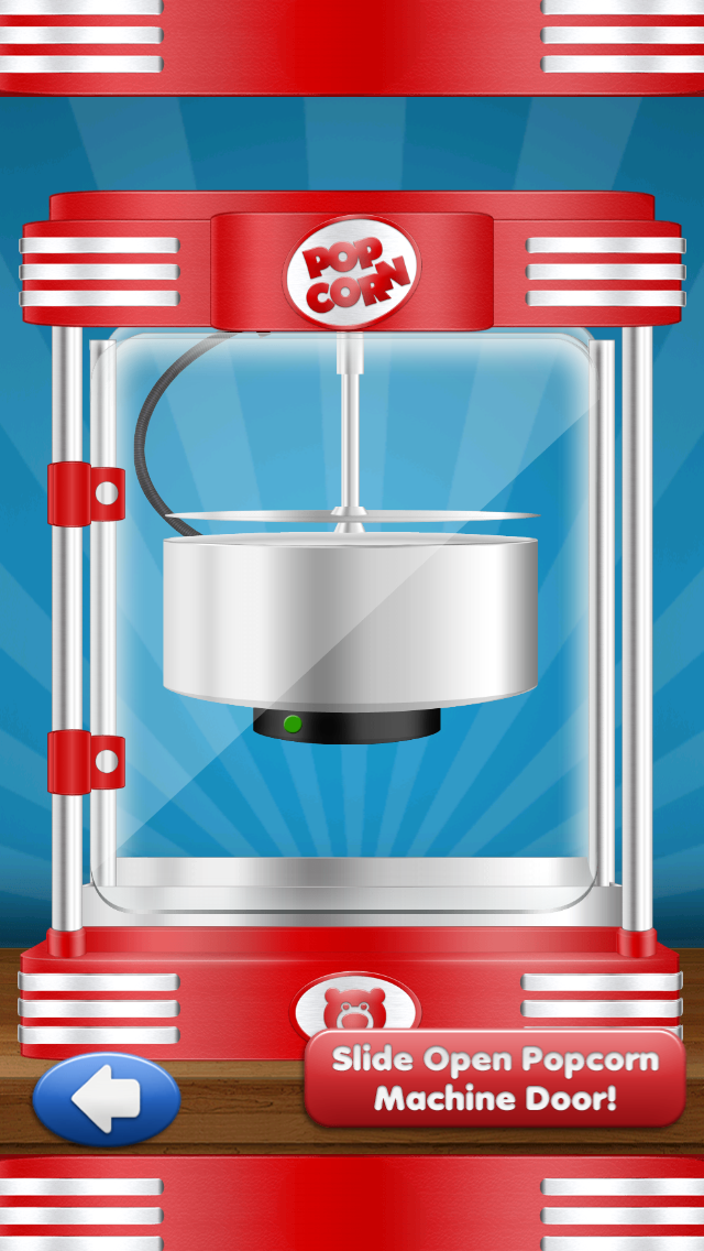
I then looked into other possible routes the augmented element could go down. The idea of a game was discussed between our group and so research was conducted to see what types of popcorn games were already out there. The first game that was found was 'Popcorn' in where the player creates there own popcorn. Very simple but fun for a younger audience. Something likes this would not be engaging to Propercorn's target audience due to not having very much depth to the game, however the interactivity of the app worked well and was easy to use.


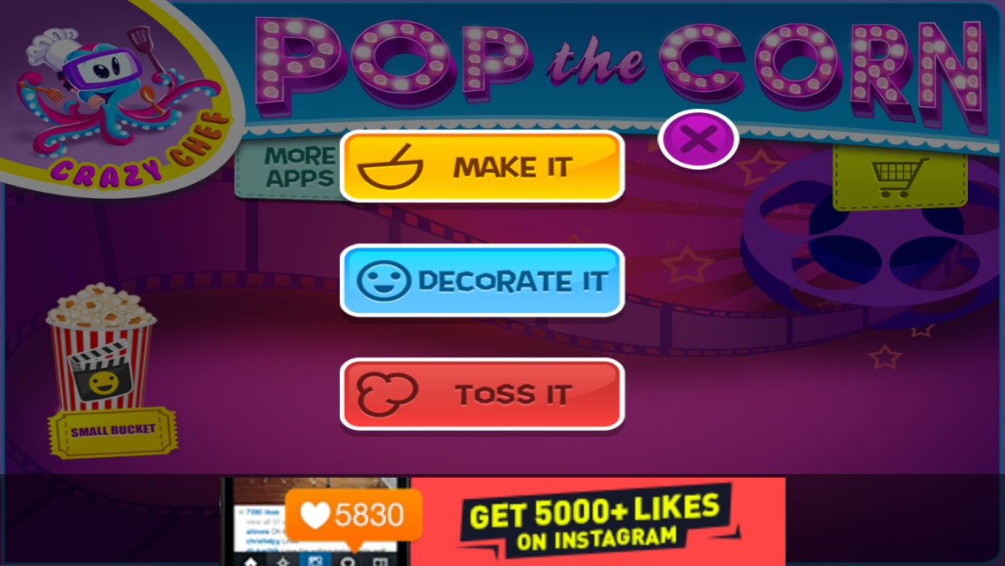
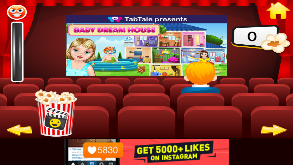
What was interesting about this popcorn game was the option to do a variety of things within the app. The 'throw' element of the game suggests the app could possibly be aimed towards an older target audience, possibly a route for the propercorn augmented element? The options allow the reader to explore the app, creating more depth. This is something to bare in mind when we settle on what our interactive element will be. The interaction was again simple and easy to use, not confusing or overwhelming to the viewer. The aesthetic however is aimed at a younger audience through the colours and vector animation style imagery that is used. We would need to produce something aimed towards an older generation however keeping in mind the fun aesthetic of Propercorns brand identity.


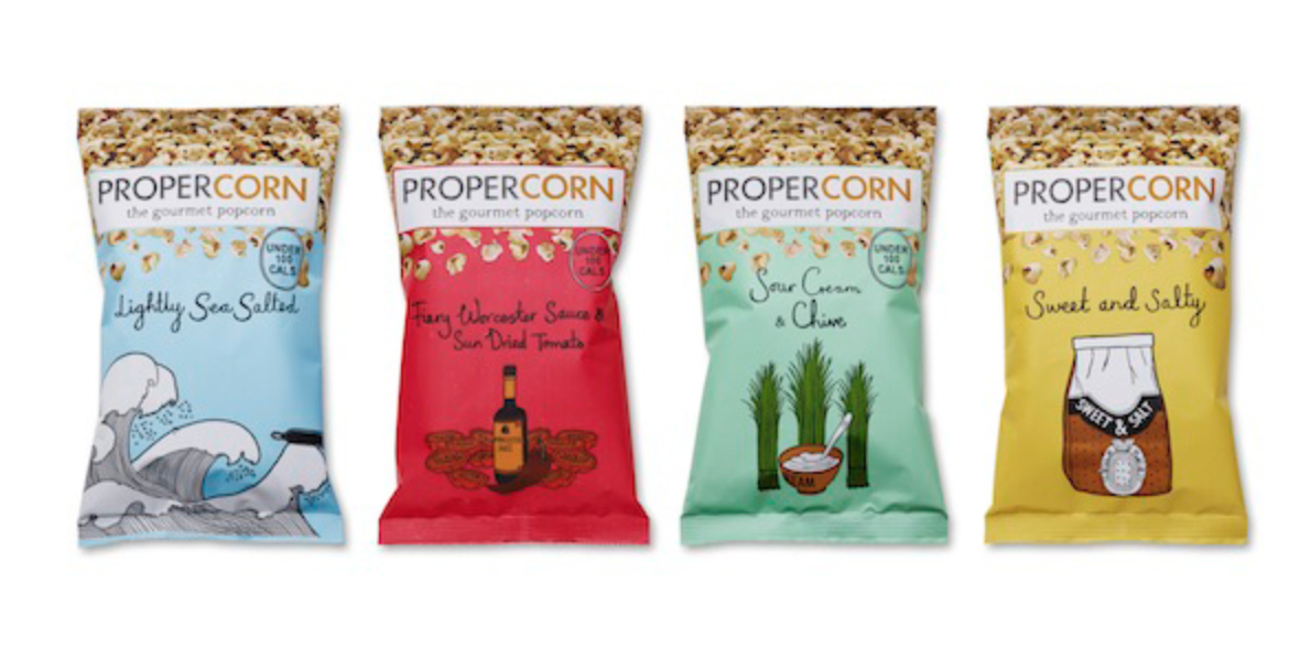
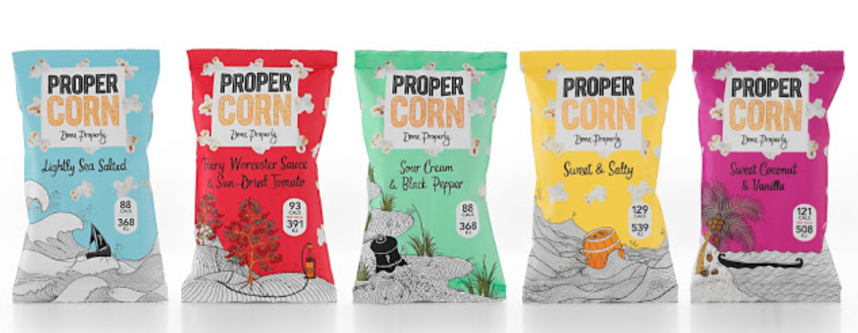
I was also given the task to research deeper into Propercorn. We knew the target audience was young professionals aged 20-35, as well as knowing the key elements that make up Propercorn. However we needed to know more about the brand identity and how we can apply their designs to our concept and ideas. From this research was started by looking into how the brand has developed, looking at the illustration style, logo and colour scheme. The colour scheme for Propercorn uses bright, fun colours which is reflective of the style of illustration that is used on their packaging. This bold design choice engages the target audience without looking childish. The hand-written like element of the type titles show a personalised feel as well as adding to the light-hearted nature of the brand.

The packaging has developed quite interestingly overly the lifespan of Propercorn. The logo has gone through a huge refinement, only suiting the brand better and better each time. Instead of having the logo a simple sans-serif typeface, they have changed this by using a more quirky hand-written element. This is much more suited to the rest of the design aesthetic. How the popcorn has been applied is also gone through drastic change (for the better) the photography of the popcorn is much more vivid in terms of colour and the less is more development certainly creates more breathing space to the packets. This is something to keep in mind when we design our campaign for Propercorn. The most recent packing has created more detail to the illustration and lessening the intensity of the logo. This makes for a much stronger look as otherwise the packing would be far too overwhelming.


I also looked into how they are packaged and used within shops. The idea of the Propercorn travelling within the cases is well suited to the imagery that is on each packet and how the illustrations show travel in some way. The colour scheme has been carried across, creating continuity across the brand.
We also knew Propercorn shows a personalised feel to their brand. When they send out the popcorn, they include a small hand-written note to each delivery. This shows the personalised feel Propercorn strive for, creating a relationship with each customer. Again this is something to keep in mind when developing our ideas.

As the first part of the brief, we have decided to create boxes for the Propercorn instead of keeping the bags they originally came in. This makes the packaging more environmental friendly and adds to the ethos of 'Done Properly'. Because of this we have decided to come up with a few ideas each of how the box should look, keeping in mind all the research we have conducted as a group. Another one of my peers with the group researched into different box styles and we decided to go for a simple rectangles box, instead of anything overly complicated to keep costs down. However I looked briefly into colourful packaging as one of my ideas was to use the bright colour palette and apply this to the popcorn as well as the box. Perhaps in a pattern of some sorts?
Looking into brightly packaged popcorn, thinking about how to apply the bold colour scheme and pattern concept together:
Taylor thought of a valid concern when researching into box packaging. Surely using paper boxes would reduce the self life compared to foil bags. An email was sent to someone she knew in the food packaging industry to ask whether using a paper bag would work.
After reviewing the email, Taylor spoke to the group and we decided that the use of paper bags, such as the ones seen to hold cereals as well as the old, 'original' popcorn packaging, would be appropriate and still work well. The shelf life would not be reduced drastically, but would have to be addressed further if our designs where to be chosen.


We each explained our ideas but decided to go with Jess' experiment. Instead of developing something new entirely she had taken the original packet design, simplified and vectorised it into the box format. A Propercorn production pack was available to download from YCN, which included the logos that have previously been used on their brands. As a group we decided to go with the popcorn logo instead of the single type logo as we felt it added more depth and interest to the packet. We felt as we are trying to promote the ethos through our ideas, the design did not need changing drastically as it then still has a clear link to the Propercorn brand. We are trying to apply their brand to our campaign ideas rather than designing new packaging. For this reason Jess' idea was the more appropriate route to go down.

As a group we decided to each take the four remaining flavous, vectorise and develop them into the box format. I chose to develop the 'Sweet Coconut & Vanillia' popcorn. Using the same illustrations I vectorised these in a similar way, however simplifying the design slightly. We had added a play button to show where the buyer would scan to use the augmented element. The viewer would use their smart phone to scan the image, taking them to our Propercorn augmented element.
The Five Finalised Box Designs
I was extremely pleased when we put our designs together, I felt as a whole they came together extremely well. We felt the boxes would be much more appropriate now we had tackled the issue of shelf life. The augmented element also fits in well with the design of the box:
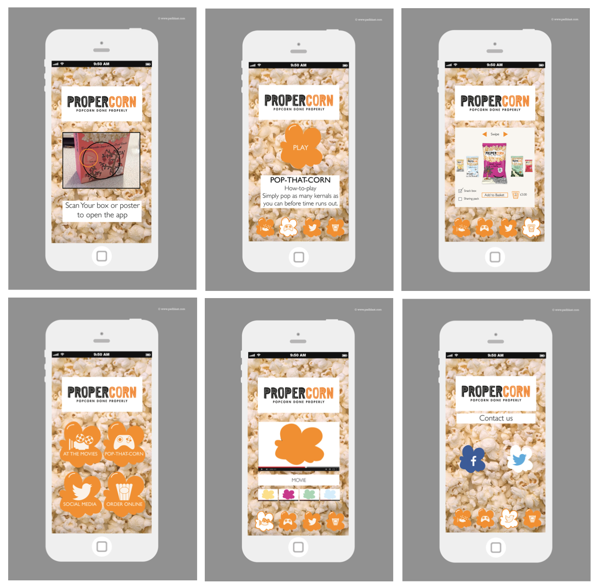
We needed to decide what was going to be used as our augmented element. We went back to our research and looked at our initial ideas. We though about how we had initially said videos, but felt that may be quite limited. Using our research we decided on an app. The app would four different categories on it:
- Videos: Sweded remakes or Trailers of upcoming films.
- 'Pop-That-Corn' Game.
- Order Online.
- Social Media.
We thought having a mix of different categories will create a more interesting app. The viewer would download the app, using this they could scan the augmented element of the box, unlocking the different sections of the app to watch, play or buy. Lucy and Jess created the app, which uses the orange from the Propercorn logo instead of having to use colour elements of each packet:


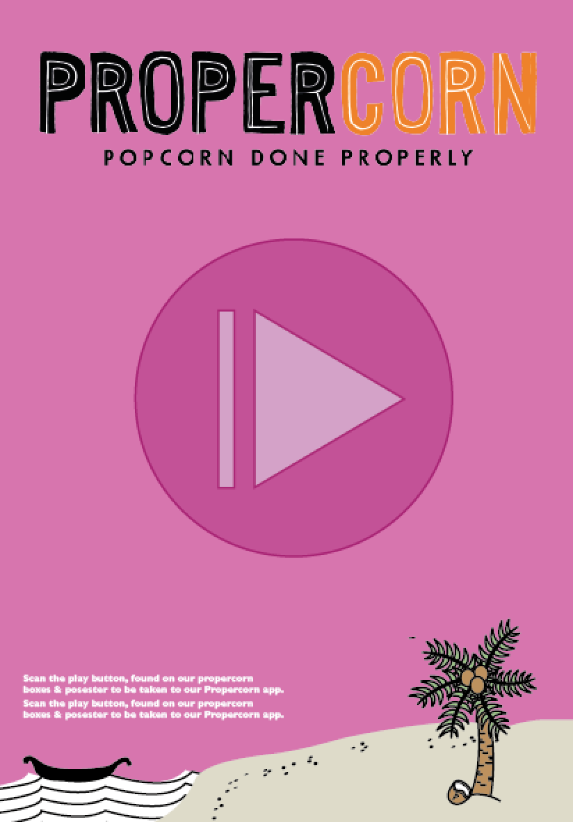
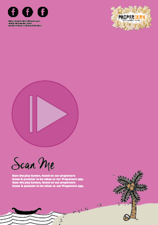
We also needed promotional material for the app and boxes, showing how the augmented element works. From this we decided on a poster series that would also be augmented. This not only promotes the app but Propercorn as well. I began development on possible different layouts and compositions, using the illustrations from the boxes to show consistency. However when starting the poster it began by looking like identical versions of the boxes and this is not what we were trying to show. I played around with different compositions, scaling the logo as well as changing the size of the play button. Information on how the app works and what needs to be done was also included on the poster:


 After a range of trials and tests I came up with a design both me and my group were happy with. Using the same layout and idea the other posters needed creating using the other imagery and colours from the other four boxes. Me and Taylor finished these posters, applying the different colour schemes to the series. Tayor then mocked up the posters to show the scale and where they would be situated:
While development was started on the posters and the app, Taylor started development on the rest of the box. She started by creating both the box, including the necessary nutritional information, as well as the paper bag that would hold the popcorn. The box would also help in not squishing any of the popcorn, making the product sturdier.
We each then applied our box design to the net she had created. The net also includes the instructions on how to work the augmented element, making sure the viewer understands the aim of the augmented element. This will also create intrigue into buying the product.
I then mocked up my design, printed and created the box:


