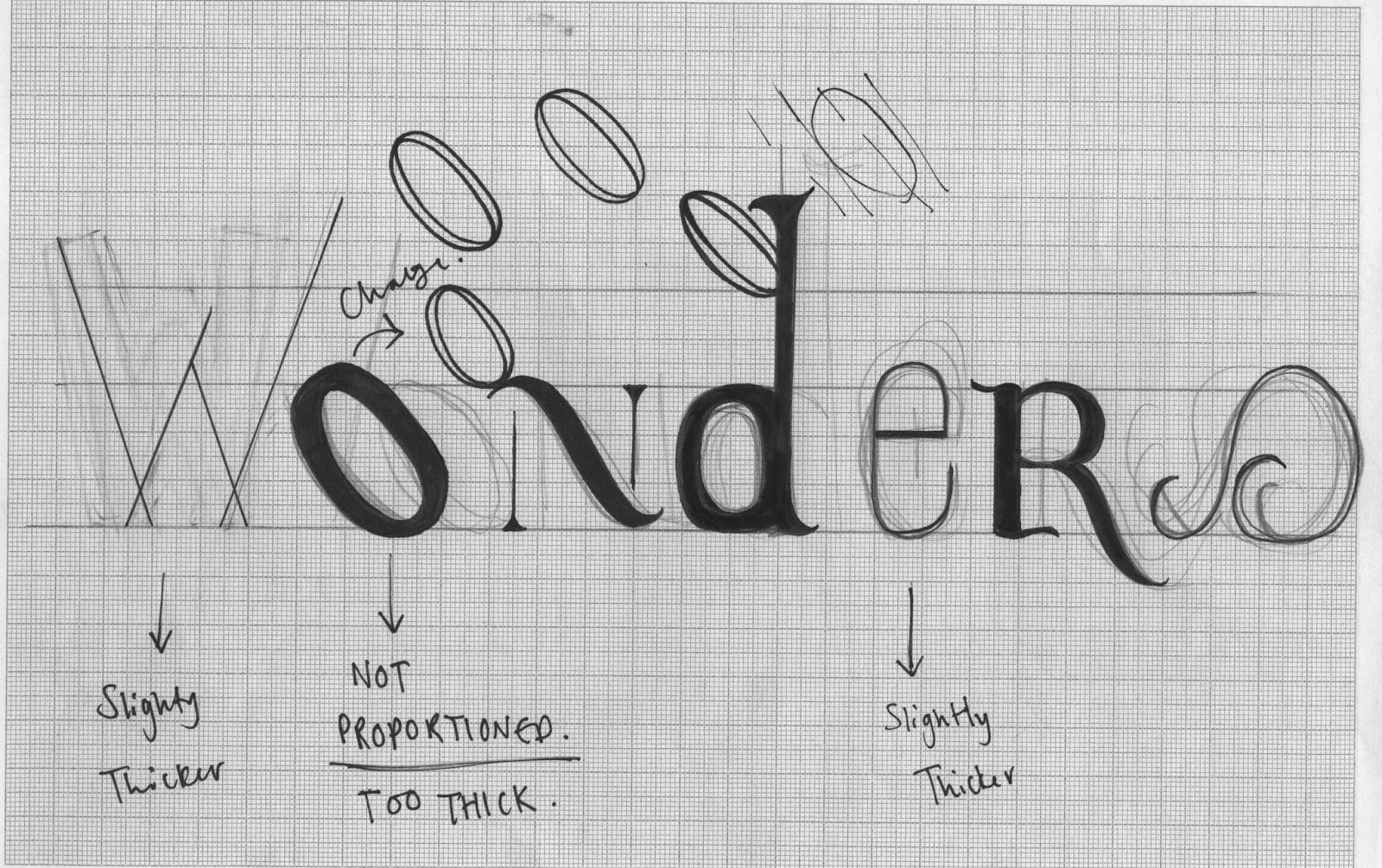
After looking back at initial ideas, development was begun by starting the typography for the seven wonders of the world. Seen as 'wonders' has seven letters, developing a letterform for of the seven building will create an interesting relationship between concept and outcome. Initial sketches of each letter were produced then taken on to form the full word.
Even though they were rough sketches. The 'wonders' showed an interesting relationship between each letter. There was an off-balance between some letters, however the aesthetic still seemed to work in conjunction with one another. Once taken digitally the line weight will be much more concise, making all letters much more suited with one another. At the minute certain type such as the 'W' looks slightly out of place due to it being so thin. This can be increased digitally so it fits in with the rest of the typography.
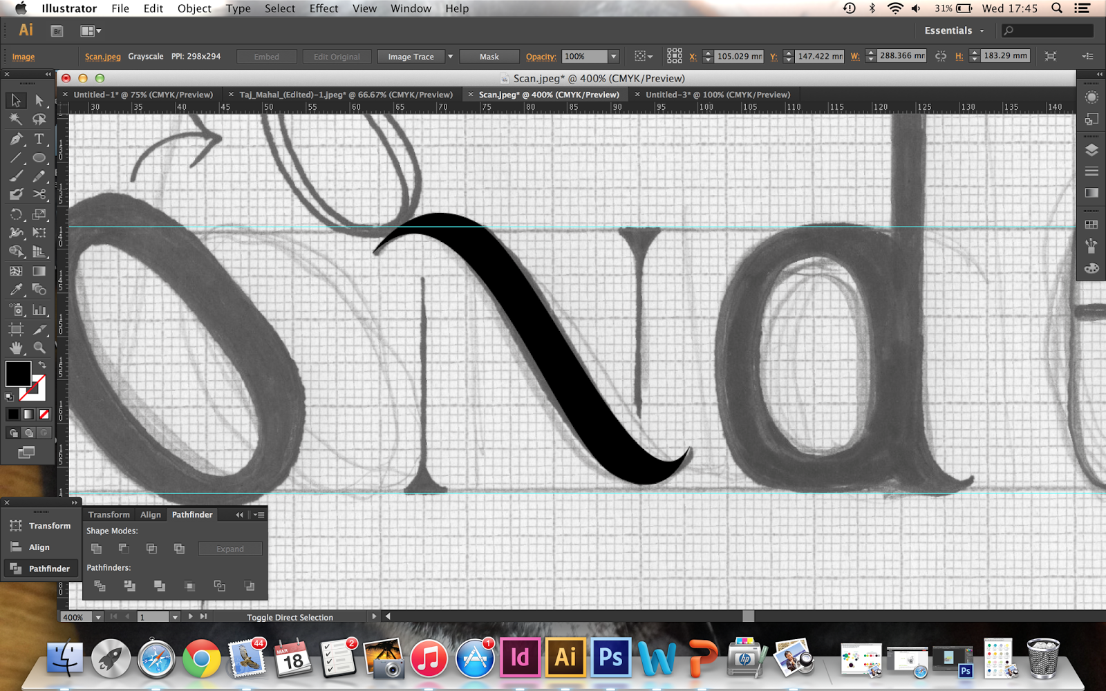
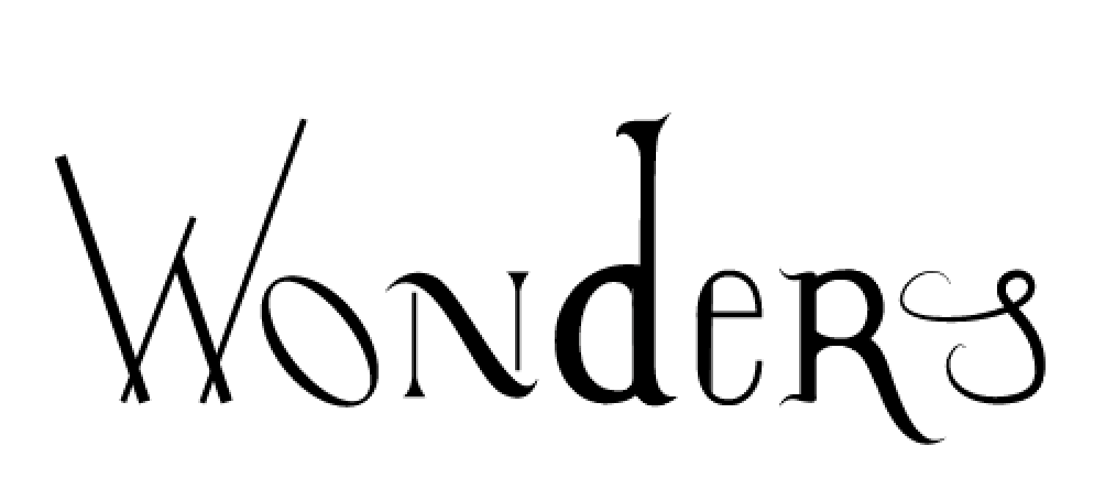
Once the sketches had been scanned in to be taken digitally, the pen tool was used to re-created and vectorise the type. Once it had all been developed, the outcome was rather disappointing. The letterforms had not turned out as planned, certain letters such as the 'N' worked quite well once digitised however others not so much. They looked rather unbalanced and the line weights were messy and uneven. Refinement was conducted but the outcome was not developing how I had imagined it to.

I recently have had a critique with my tutor. I was extremely worried that this brief was not coming along like I would have hoped. This YCN brief was supposed to be one of the 'big' briefs within the module, however due to developing Best Buds and Secret 7 so largely this took a step back, however I still wanted to create something for Moo. Because of time frame I knew I would not be able to develop outcomes that I would have liked to. My tutor suggested that as I have a strong concept, that the outcome could become more simplified instead of over thinking it. This is exactly what I begun to do. The 'wonder' typography was not going to plan and so after looking back at my initial ideas, a poster series will now be created instead. The seven wonders concept will still be kept but produced in a much simpler way.
Development on the posters then began, by using imagery of each of the seven wonders a poster will be produced of each. There is a strict colour scheme within Moo and so this is going to be kept within the poster series I create.
The posters began by trying to apply the bold colour scheme to the seven wonders imagery. This was to enhance the fun and bold element of Moo through the colour while showing the concept through the photos. Experiments were then attempted by applying coloured vectors over the imagery. Moving the imagery into half-tone was also tested, as it then hid some of the pixelation from the imagery as well as creating texture to the posters.
Further experimentation with typography was also tried. I attempted to included the 'Wonders' typography to the posters to see if it would show as a series better. The aim would be each poster would have a letterform, reading as 'Wonders' when put together. However the type I created was still not suitable for the imagery used, as it seemed mismatched and was not communicating the correct intentions. From this the typeface that is used across all Moo's identity was then applied, trying to link both brand and posters together.

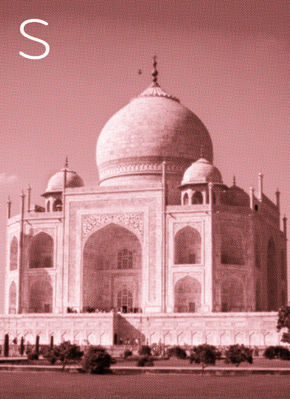
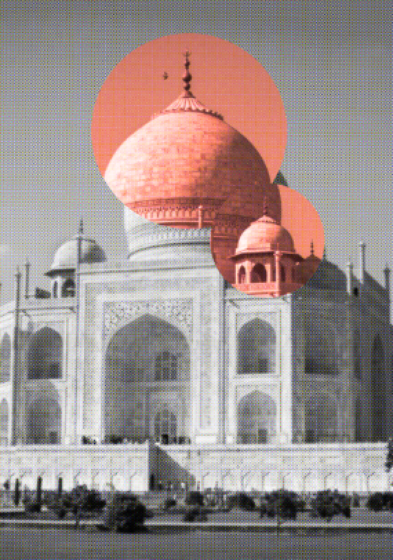
The original idea of the Seven Wonders typography was taking certain inspiration from each building and applying it to a letterform. The concept for this is still really strong and so it would be a shame not to use this in some way. Because of this reason I attempted to show this within the posters but in an entirely new way. Using circle vector shapes, I used these to highlight certain features of the building that was used as inspiration for the 'wonders'. Even though the type may not end up getting used, the link and concept still link in with what the poster is trying to communicate. The Moo colour scheme was still used within the shapes to show the boldness of the brand through the colour. A circle vector was used to represent the idea of imagination and 'wonders' through a think bubble. The circle shape subtly represents this as well as highlighting the curve of the building that represents the beautiful design and 'wonder' of the building.
Bodycopy was applied to the posters, explaining the design choice of each building. This fits in well with the whole concept as the building have been designed and the slogan is 'Design Works Wonders'. However, due to the half-tone texture the type was illegible. I attempt different colours as well as overlaying the type onto a coloured background. However the overall aesthetic was still not working.
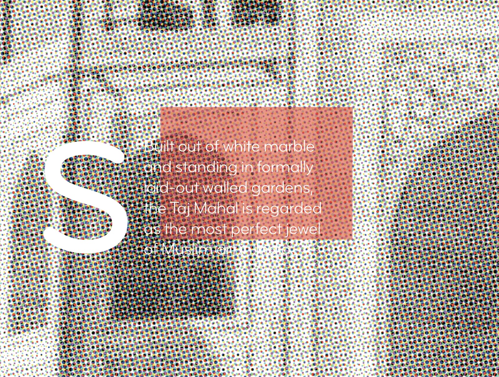
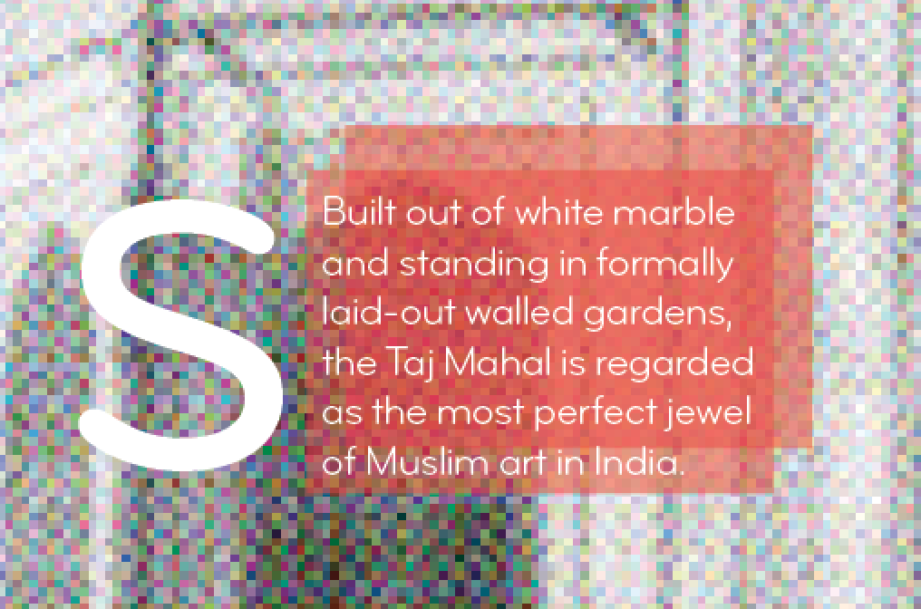
Different scales of the letterform was then attempted, however the type was still looking out of place. After a small critique with my peers it was brought to my attention that possible it did not need the typography. The imagery communicates the concept through the series of posters and so the type seems slightly unnecessary. It seems odd to try and add something to the poster if it did not need it. The images still work as a strong visual and still communicate the seven wonders of the world.
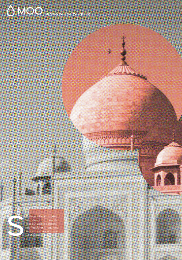
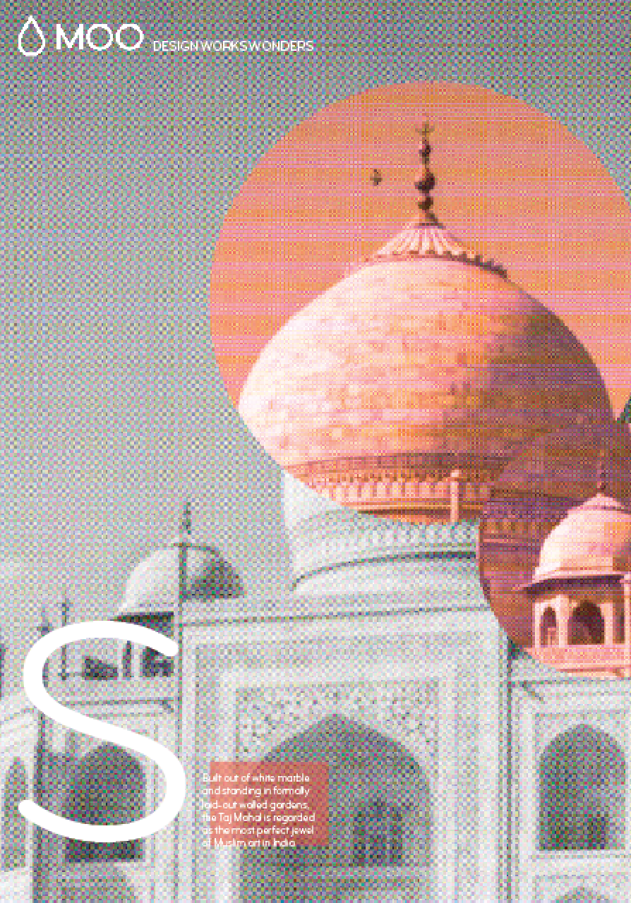
After it was decided that the type was unnecessary it was removed, leaving behind the visual with the Moo logo on the posters.
The same technique was then applied to the rest of the seven wonders. The images were converted into half-tone to hide any pixelation. They were also changed into black and white to make the design inspiration of the building stand out through the circle vectors and colours. The colours stand out more when on the black and white images and so making this the focal point needs to be the main element. Some of the images were cropped to make each poster the same format so they fit in as a series more appropriately.


No comments:
Post a Comment