After research was conducted into business cards and stationary further development has started to be conducted. The idea of a series of different flowers on the business cards is something I found extremely interesting. The series could focus on using the flowers that were in the Best Buds bouquet. This would link both the flowers and the business together, creating a personal feel for the client. Sketches were then produced based on certain flowers that were found in the arrangement i.e. Gerbras, Chrysanthemums, Thistles, Bamboo and Lillies. From the research conducted it was found that a number of mediums have been used within florist business cards. It would be beneficial for as much experimentation to be done as possible to see which would be the best for the outcome. Because of this both pencil and pen were used as well as experimentation's with ink and watercolour.


Certain flowers were then scanned and re-drawn on to experiment with digitising the textures made with the watercolour and ink.

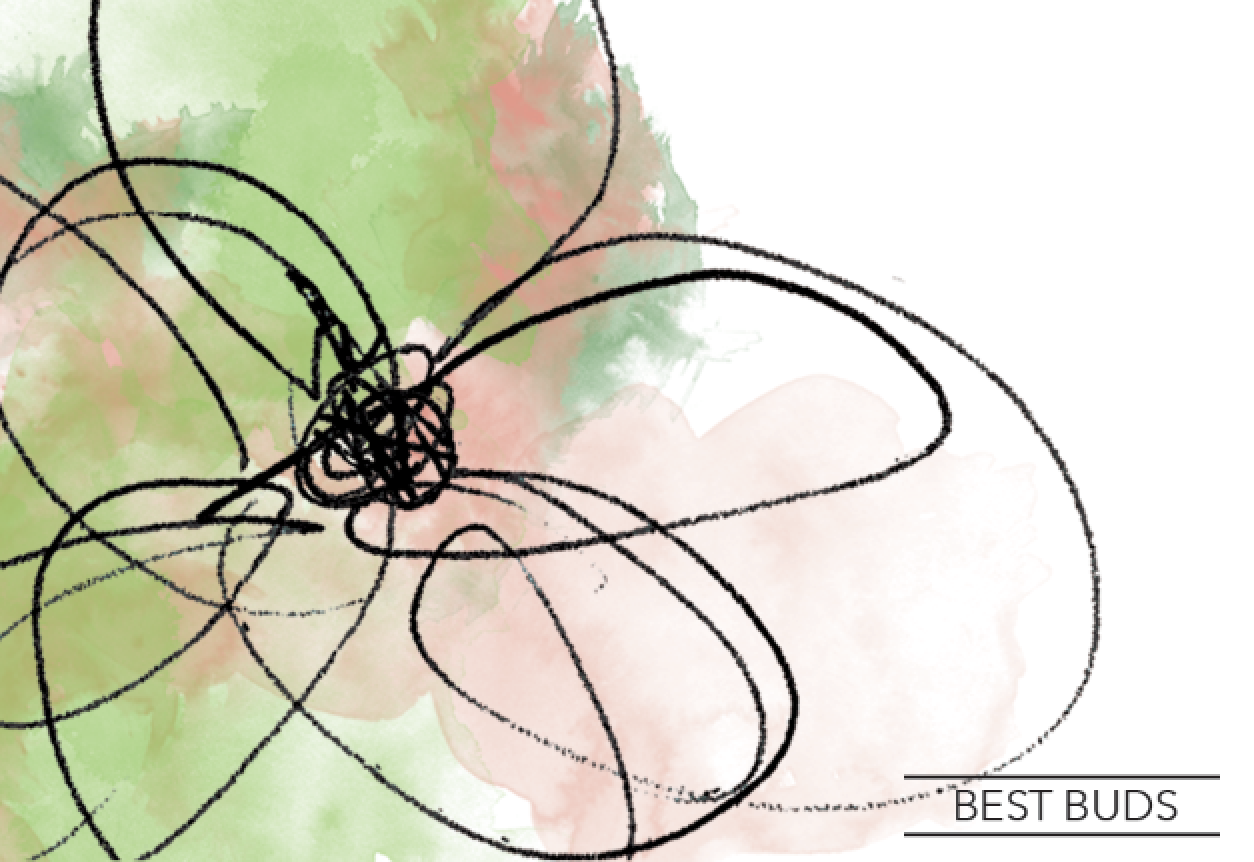
Through developing my sketches it was found that is was not feasible to produce a whole series of different business cards. This was due to the clients restricted budget and how many of each card would needed to be printed as well as costs of different coloured inks. This would get too expensive and so I went back to my research and initial ideas and began sketching again. After looking into these and realising only one strong design needed to be done it was found that a more lose, less detailed illustration could be a route to go down. This is due to the femininity that is communicated through this type of illustration, which is what the client was looking for. However the flowers drawn are still based of the flowers given in the original bouquet, keeping with this 'personal' idea.

The illustrations were then scanned in and refined digitally.

Through the previous experimentation it was found that the most appropriate medium to apply colour was through a watercolour texture. Using some textures that had previously been scanned in, combined with the brush tool colour was applied to the illustration. Green needed to be used due to the colour scheme of the Best Buds bouquet using a series of different greens. However a secondary colour needed to be found in order to create a more delicate and feminine feel.


Experimentation was done by applying different colours but it the outcome was still looking unfinished. I thought this was due to how the watercolour had been applied and so tried a new way of applying the colour:

Using the brush tool the colour was applied as an outline however this looked visually unappealing due to it looking more like felt tip rather than watercolour. Because of this the previous way of applying the colour was more appropriate. However through this experimentation the layout was developed. The flower has been cropped and laid out in a much more pleasing composition. This is due to the flower having more of a focal point as the negative space creates a more breathable outcome.


The final colour scheme of green and coral was decided by the client. The experimentation's where shown and due to the coral being a delicate colour, relating well to the flowers, it was decided that she thought this was the most appropriate. The flower was then moved into the left composition, bleeding off the page, which related well the medium used of watercolour and how that 'bleeds'.


The logo then needed developing, a script, decorative type was initially tested due to the connotations of delicacy and womanly like features. This was tried in a few different compositions as well as being applied to a business cards mock-up. However after discussing in a critique it was found it was too overly obvious and slightly obvious. This is something I knew I wanted to avoid with this brief as the client wanted femininity but it needed to be something new and exciting.


I then began developing a few different mock-ups of other possible logos. A more structured sans-serif was the most suitable for the logo as it balanced of the decorative flower and watercolour which created more structure to the whole brand. This was then applied to the front of the card, however in doing so it took away the negative space making it less breathable. Because of this it was decided the information and logo needed to go on the back of the card.


The logo and imagery was then applied to what could be the invoice for Best Buds. Using the watercolour as an background to link both business card and invoice together.

I then though how the identity could be applied to the wrap of the flowers using cellophane wrap or tissue paper. This would create continuity across all the brand if the client were to develop this across the whole of Best Buds.


No comments:
Post a Comment